lady and the tramp

17 03 2009

these recreated backgrounds from disney’s 1955 LADY AND THE TRAMP were not really necessary to do because the originals still exist in the ARL, disney’s ANIMATION RESEARCH LIBRARY. but I did them anyway because the originals are never published in their entire length and – because I just wanted to see them. the background art ( as well as the animation ) in this film is stunning…

lady-0001

lady-bbb1

lady-a1

lady-ccc

lady-fff

lady-hhh

ladytramp-aa

© disney enterprises, inc


layout

12 02 2016

historic

the layout in traditional animation is the ‘blueprint’ of a scene, the line and tonal version of a background including camera instructions and field sizes, as well as rough sketched key poses of the animation. in the past the dark and light values were drawn with blue or black soft pencils, in the forties ( BAMBI ) the layout was ‘painted’ with graphite dust and gasoline, highlights erased with eraser-pens. all that was done on vellum what made it easier to trace the lines onto background cardboard. a lot of those layouts from the old days are masterpieces, they look like painted in graphite. in the archives they were not treated as well as most backgrounds, folded several times, a lot of them torn because of the vellum thin quality. following I want to show you a few layouts from some of the older disney animated shorts and feature films. they are treasures of a lost art…

1937 clock cleaners
KONICA MINOLTA DIGITAL CAMERA

1961 101 dalmatians
KONICA MINOLTA DIGITAL CAMERA

1939 the practical pig
KONICA MINOLTA DIGITAL CAMERA

1942 bambi
KONICA MINOLTA DIGITAL CAMERA

1939 donald’s lucky day
KONICA MINOLTA DIGITAL CAMERA

1940 fantasia
KONICA MINOLTA DIGITAL CAMERA

1948 melody time – once upon a wintertime
KONICA MINOLTA DIGITAL CAMERA

1938 mickey’s trailer
KONICA MINOLTA DIGITAL CAMERA

1940 pinocchio
KONICA MINOLTA DIGITAL CAMERA

1938 the moth and the flame
KONICA MINOLTA DIGITAL CAMERA

1959 sleeping beauty
KONICA MINOLTA DIGITAL CAMERA

1947 fun and fancy free – bongo
KONICA MINOLTA DIGITAL CAMERA

1940 fantasia
KONICA MINOLTA DIGITAL CAMERA

1967 the jungle book
15jungle book 664

1955 lady and the tramp
KONICA MINOLTA DIGITAL CAMERA

2002 lilo and stitch
17lilo+stitch 722

1999 tarzan
KONICA MINOLTA DIGITAL CAMERA

© disney enterprises, inc


disney in space 3

5 11 2015

here now compilations of scene-captures from the limited animated segment in disney’s MAN IN SPACE, directed by WARD KIMBALL. this DISNEYLAND TV-episode aired on march 9, 1955. imagine, a small group of artists worked in the studio on such stylized designs during a time where LADY AND THE TRAMP was close to be released and SLEEPING BEAUTY already in pre-production. the style was heavily influenced by UPA and their shorts, as well as by the animated advertising commercials of that time. on the comic strip market the pioneering satirical magazine MAD had been started in 1952 by editor HARVEY KURTZMAN and shaped after a world war a new generation of skeptical kids. SAUL STEINBERG, who was very popular with his cartoons during that time, might have been of some influence.

man in space anim.1
man in space anim.2
man in space anim.3

© disney enterprises, inc


albert hurter

7 01 2013

albert hurter AA
albert hurter on pinocchio

ALBERT HURTER was the first visual development artist in the disney studio, most of characters and environments for the disney shorts in the thirties, the SILLY SYMPHONIES, but as well as for the features SNOW WHITE AND THE SEVEN DWARFS, PINOCCHIO, DUMBO, FANTASIA and THE RELUCTANT DRAGON were designed by him. born in switzerland in 1883 he studied architecture in zurich and went then for seven years to an art academy in berlin. probably because of the dangerous situation and the beginning of WWI he left europe in 1914 and went to new york where he was introduced to the animation film industry. in the barre-bowers studio he worked on the MUTT & JEFF cartoons and became very fast well known for his amazing drawing talents. around 1930 he applied for work at the disney studio where he was disney’s VISUAL SKETCH ARTIST for more than a decade, drawing whatever came to his mind, playing with the ideas of a new story and working on films they would be produced long after his death, like PETER PAN and LADY AND THE TRAMP. I am sure that he introduced the disney artists to european masters like HEINRICH KLEY, WILHELM BUSCH and the caricature artists of the SIMPLIZISSIMUS. in 1942 he died of a weak heart, and seven years later a book HE DREW AS HE PLEASED was pubished, put together by TED SEARS, one of the story artists hurter had worked with. the book has about 700 of hurter’s sketches throughout his years at disney, and a lot of them have always been my favorites. I post them below in a bigger size.

michael sporn has posted the complete book in 2 parts on his blog – you can find it here and here.

hurter book
hurter2106
hurter2107
hurter2109
hurter2108
hurter2113

© albert hurter and disney enterprises, inc


style 8.1

23 06 2010


EYVIND EARLE was born 1916 in new york city, but moved already after two years with his parents to hollywood. his father, ferdinand, was a professional painter who had studied with ADOLPHE WILLIAM BOUGUEREAU and ABBOTT McNEILL WHISTLER. he soon became a busy art director and scenic artist in hollywood. from early on eyvind was educated by his father in the arts. when he was ten the parents divorced and eyvind followed his father on longer trips to mexico and europe. already after a few years, age 14, he was good enough to have his own art show in southern france. later at the age of 21 he crossed the northern american continent on his bike, painting a watercolor on each of the 42 days it took him. already three years later the metropolitan museum of art bought one of his watercolors for its permanent collection. the same year eyvind started his own christmas card company, printing them as serigraphs. 1951 he joined disney as a background painter, working on FOR WHOM THE BULLS TOIL, MELODY and TOOT,WHISTLE, PLUNK AND BOOM. finally he was offered the position as production designer, color stylist and background painter for SLEEPING BEAUTY. paralell during that time he designed for the shorts PIGS IS PIGS, GRAND CANYONSCOPE, PAUL BUNYAN and LONDON BRIDGE. he colorstyled the night/park sequence in LADY AND THE TRAMP and designed 5 murals for disneyland. in 1958 he left disney and started his own company, producing commercials and title graphics, as well as the logo trademark trailer for universal pictures. later in his life he dedicated all his time to painting, becoming very successful with exhibitions in museums and galleries around the world. in 2000 he passed away, 84 years old.


I want to concentrate in this post and the next ones on EYVIND EARLE’S unparalelled stylistic design for SLEEPING BEAUTY. from what I have heard from artists they worked with him, he must have been a very difficult character to deal with, very demanding. well – look at all the designs and BG-paintings he created for SLEEPING BEAUTY! masterpieces! usually I am not a big fan of extremely detailed backgrounds, but in this case it is different. all the detail in his artwork works as a texture like in the medieval gobelins. he was very careful with the design of these textured elements, like the plants and trees in the forest, the interior of the cottage or the stone walls in the kings castle and the different more mossy walls in maleficent’s ruins, that the paintings never feel overworked. on the contrary, they are the perfect stage for the very designed and less detailed characters. the color-combinations throughout the whole film are some of the most beautiful and tasteful in animation.


© disney enterprises, inc


format

3 01 2010


disney’s – LADY AND THE TRAMP, released july 1955.
 the first of very few CINEMASCOPE films the studio would produce in the years to come. 
in the cinemascope format a single background is already 
impressive, but when you look at the enormous length of 
pan-BG’s you are speechless. it is very interesting the way
 the camera was used in this format, the character always
leads the camera-action. that means, a character starts to
 move first, then the camera follows moving in the same 
direction later. the format is so big that in some of the 
scenes a camera movement was not even necessary, the 
characters have enough room for their movements sideways. 
close-ups are more critical. in a normal head-shot you still
 have a lot of ’empty’ space next to the character. it must 
have been a very intense learning experience for the layout 
team that was used to deal with 3:4 normal size formats 
over all these years. cinemascope means a format 1 : 2, you have to 
compose a scene a lot different in that stretched size.


you have to see the original backgrounds, there are
 fortunately a lot of them left in the disney archives. 
they look so loosely painted, created by absolute 
professionals. the style is close to realism, with a
 simplified ‘disney’ touch. but the painters were so 
skillful after all the movies behind them, that their 
work looks effortless. very rough brushstrokes when
 you look close, but from a distance all these strokes 
reveal something new, like in a matte painting. I would 
want to show you more, but I don’t know where to 
start. and all my recreations are not even halfway 
close to what the real, the original painting looks like.
 hopefully there will be a publication with all these 
masterpieces in the future… 
besides the beautiful look of the backgrounds they 
are just perfect as what they are – the stage. the 
characters work so well in front of them. the color-
balance is incredible. very different from another 
one of my favorites a few years later – SLEEPING 
BEAUTY, where the BG.s are such incredible art-
pieces by themselves, that you are most of the time 
overwhelmed by the look and can not follow the
 most beautiful animation. here in LADY AND THE
TRAMP you get just enough detail to know what 
you need to know, it is never confusing or over-
whelming, – until you see the ORIGINALS!


the BG-artists – 
CLAUDE COATS, DICK ANTHONY, RALPH HULETT,
 ALBERT DEMPSTER, THELMA WHITMER, EYVIND EARLE,
JIMI TROUT, RAY HUFFINE, BRICE MACK.
 but the layout crew was equally important – 
KEN ANDERSON, TOM CODRICK, AL ZINNEN, 
A.KENDALL O’CONNOR, HUGH HENNESSY, LANCE 
NOLLEY, JAQUES RUPP, MC.LAREN STEWARD, DON
 GRIFFITH, THOR PUTNAM, COLLIN CAMPBELL, VICTOR
 NABOUCH, BILL BOSCHE.
 what a team!


NANCY BEIMANN wrote in her comment – 
KEN O’CONNOR told me that this was one of the hardest projects he ever did, since LADY was released in SCOPE in only a few theatres; the majority of the prints had standard screen ratio. this meant that all his layouts had to have the main action take place in the centre of the screen, with unimportant stuff on the sides. but he had to keep the sides active and interesting for the widescreen version. the scope-version noticeably slows down the camera moves. if you run the RAT FIGHT sequence at standard ratio, the camera moves are fast and dramatic. they are leisurely, almost a drift, in the widescreen version of the same shots. you also see more of the rat at the beginning of the sequence. with the standard version, suspense is stronger since you see the rat enter the shots much later on.

 O’CONNOR had characters moving through the frame or toward the camera to help shots work in two formats. and he actually built those victorian houses in the studio woodshop.

 other sequences of the film are more static and sometimes show their technique when dealing with the two format layout. In the BELLA NOTTE sequence, watch for the cook stepping out the door, then rapidly stepping to screen left so that he doesn’t leave centre frame. It looks a little strange in the widescreen version.

© disney enterprises, inc


a legend

1 08 2009

the first time I met JOE GRANT was in a story meeting back in 1990 when I had started my freelance design-work on ALADDIN. joe was a consultant for story, characters and all other possible problems on that project. it was for him the first time to be back in a studio he had left over 40 years ago. in that meeting joe was sitting right next to me, what turned me into a speechless student.

1joe grant

when I joined the the studio in 1994 fulltime and we had moved into that useless animation-building with the funny hat at the entrance, I had my office next to joe grant’s. he shared it with burny mathinson. it took a while to get to know joe a bit closer, he was not unfriendly, but he was waiting how this ‘new guy turned out’. well, we became good friends and spent a lot of time together, time I wouldn’t want to miss. he was one of the warmest people I had met in L.A. for a long time. and there was nothing he was not informed about, politics, film, the arts. he saw most movies, he read the most important news.

joe 11-98b

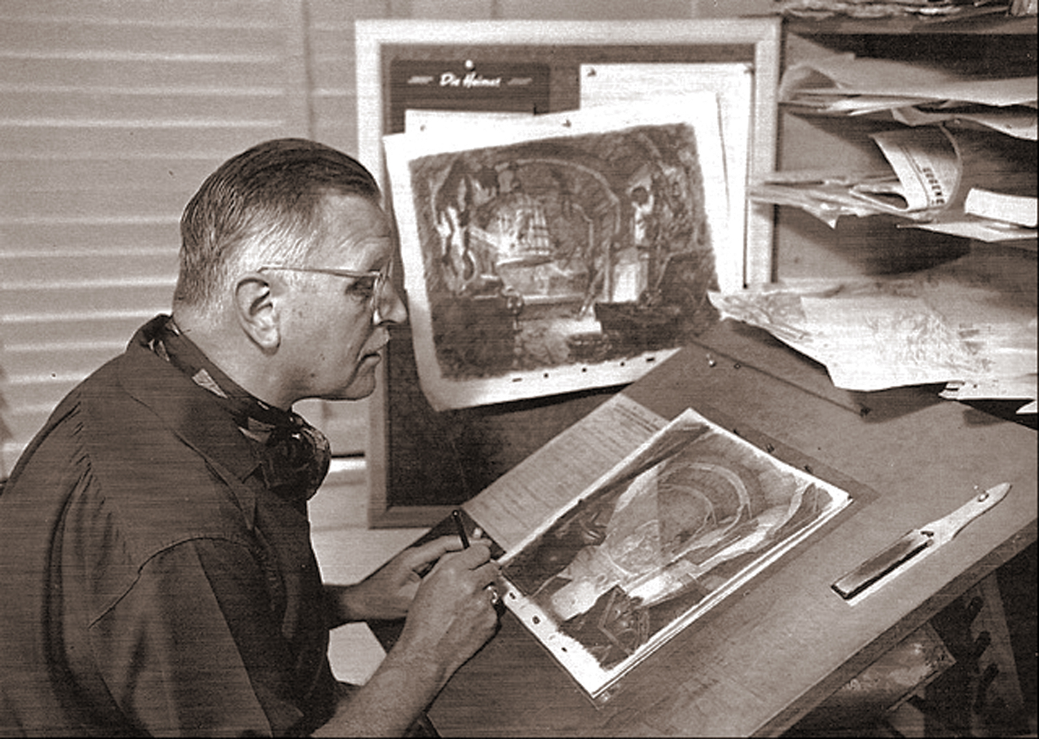
joe gave me color xeroxes of these pictures in 1998. burny mathinson had bought a huge agfa scanner and the biggest epson printer on the market at that time. he and joe had so much fun with their computers and all that new equipment. they were doing all their presentations for new projects nicely edited in the computer, printed and bound. amazing. I had just got my own mac and had no idea what to do with it…

2joe+regis

usually we would sit together once in a while in the morning in his or my office and bitch about some stupid decisions of mangement. they would invite him as an advisor to the more important story meetings and screenings. later tom schumacher, the president of animation, would invite him once a week, to get his critical comments.

joe 11-98d

sometimes joe would give me xeroxes or prints of some historic stuff he had found at home, some of his early drawings, or historic photos from the past disney days and of course a lot of his sketches and his calligraphy.

joe078

you very rarely saw joe without his fountainpen in his hand. he was drawing all the time. beautiful little sketches of all different cartoony characters and situations. and he came up all the time with some funny gags. he had a good humor and remembered some really funny anecdotes.
what a full life! born in 1908 at the east-coast, he told me once, when he came to L.A. for the first time, I think it was 1918, he described crossing over the hills on cahuenga pass. and on the top he could smell the incredible smell of thousands of orange tress, blossoming down in the san fernando valley. he said there were trees and white blossoms as far as you could see. probably a lot like in JOHNNY APPLESEED. I can’t even imagine how beautiful it must have been in those early days.

Grant

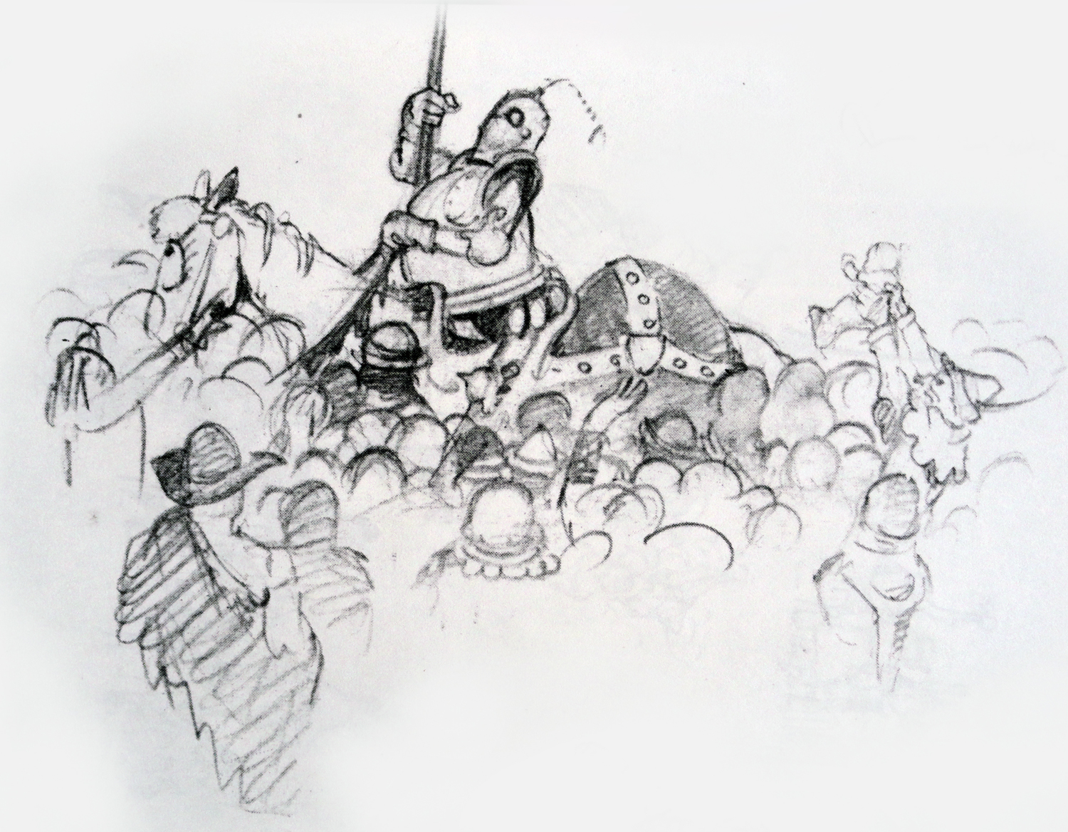
SIMPLIZISSIMUS was a very critical, satirical magazine during the early yeas of the last century in germany. some of the most famous german artists started with that magazine, like OLAF GULBRANSSON, THEODOR HEINE, KARL ARLOLD, EDUARD THOENY, KAETHE KOLLWITZ, HEINRICH KLEY and GEORGE GROSZ. joe was so happy to talk about these artists, he had a lot of collected volumes of the simplizissimus magazine at home. in the studio, he said, nobody knew what he was talking about – german art! but he introduced a lot of that reference and it was used in feature films like FANTASIA.

pinocchio393065

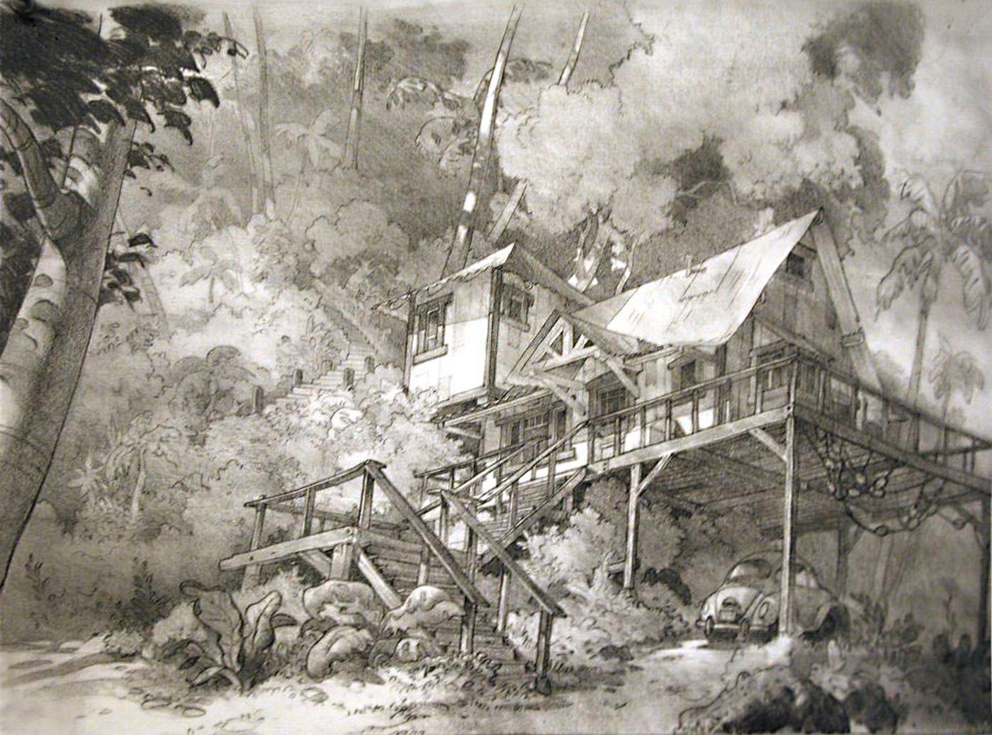
one day he invited me to his house. it was hidden in the glendale hills and overgrown with bushes and trees. the house was built in the mid 30s, when nobody lived in that area yet. joe’s wife found the property and designed the house when she was in her early 20s.  She remodeled it several times over the years being a talented designer and artist in her own right. what a house! it was a museum, a library, an art exhibition. history and memories wherever you looked. thousands of books, drawings and sketches in piles everywhere. a treasure island in the middle of boring glendale!

12-03 joe d

he showed me photos of his late wife. she had the idea for LADY AND THE TRAMP, based on her own cocker spaniel dog. joe came up with the whole story concept in the early forties, WARD GREENE took over much later. and joe never got screen credit for that film, what must have hurt him a lot, since he was walt disney’s closest advisor and friend for so many years. I guess that was the reason why he stayed away from the studio for so many years. he did not really want to talk about that, he still was disney’s biggest admirer.

joe 11-98c

he had so much wisdom, so many worlds in his imagination, was so open for everything new and critical about it. I was convinced he would always be there.
joe grant passed away on may 6, 2005. he died from a heart attack while he was drawing at his workdesk at home.

© disney enterprises, inc
© joe grant, Jennifer Grant Castrup


style 6

19 07 2009

MARY BLAIR, born in 1911, was married to LEE BLAIR ( brother of PRESTON BLAIR, well known for his ‘how to animate’-booklet ). both became very well know watercolor artists, LEE even was at the age of 23 the president of the CALIFORNIA WATERCOLOR SOCIETY. lee blair joined disney in 1938 and became one of the art directors on PINOCCHIO. MARY BLAIR went to work for MGM – animation.

0156.mary blair

0173.mary blair

0181.mary blair

0194.mary blair

but in 1940 she left MGM and started at the disney studio as well, in the CHARACTER MODEL DEPARTMENT, headed by JOE GRANT. for joe’s idea of LADY AND THE TRAMP she created numerous watercolor sketches. during the early war years, in 1941, disney and a group of designers and animators went on a good will tour through southern america. mary blair joined the group and got walt disney’s attention with some concept designs for the by this trip inspired features SALUDOS AMIGOS and THREE CABALLEROS.

0225.mary blair

0311.mary blair

0405.mary blair

0422.mary blair

from the mid-forties on she designed most of the disney films, all the way through CINDERELLA, ALICE IN WONDERLAND and PETER PAN. in 1953 she left the studio to follow her own ideas in paintings, children books and other areas incl. some major advertising campaigns. disney asked her to come back in the sixties to design attractions for disneyland. she died in 1978.

0576.mary blair

0667.mary blair

PICT0009
PICT0012

mary blair’s influences were very different. they came from contemporary commercial art like european advertising posters, VOGUE fashion designs, NEW YORKER covers as well as folk art and the colorful southern-american culture.

PICT0013

PICT0014

PICT0018

© disney enterprises, inc


style 1

18 06 2009

as I mentioned in one of the last posts, WALT DISNEY did not hide the fact that he hated the look of 101 DALMATIANS. well, I think he should have known from day one in visual development how the film might look like. as head of the studio he would have had the power to change the style of the film very early. but I am sure he knew that this look was the only way to combine the new animation-XEROX-technology, that made it possible to show 101 black-spotted characters, with a more modern non-fairytale environment, and – for a very low budget! a MARY BLAIR-style fifties-london would not have worked. even a LADY AND THE TRAMP-like more realistic BG-style would have been too soft and probably even more expensive. I admire the solution these artist, especially KEN ANDERSEN, came up with.

ken98

ken099

ken097

when I met KEN ANDERSEN in 1991 he talked about the first test screening of a part of the film. walt disney was with his back towards him and said to someone ‘I hate this stuff, KEN did!’ for ken andersen that was like a shock. he worked for another year to finish the film and during that time walt disney never talked to him anymore. ken remembered, walt always wanted to have nearly 3-dimensional animated characters, like in live action films, so the audience would forget they watched animation. that’s why he hated clear contours, especially the ‘inches-thick’ xeroxed outlines blown up on the big screen. ken said, walt disney was not willing to finance more films for over $ 8 million after SLEEPING BEAUTY. that’s why he, ken, had pushed the development of that very complicated and revolutionary technique,that made it possible to produce the DALMATIANS for only $ 3.5 million. he recalled the moment when he saw walt disney returning from the hospital after his lung-surgery. ken saw him shortly on the stretcher, walt did not look very good but he was happy to see ken. so, said ken, finally 2 weeks before his death he did forgive him.

ken91

ken92

ken093

© disney enterprises, inc


dogs

20 02 2009

disney’s LADY AND THE TRAMP, released july 1955, the first of disney’s CINEMASCOPE films. you have to see the original backgrounds! there are fortunately a lot of them left in the disney archives, ARL. they look so loosely painted, created by absolute professionals. the style is close to realism, with the typical simplified DISNEY-TOUCH. the painters were so skillful after all the movies behind them, that their work looks effortless. very rough brushstrokes when you look close, but from the distance they give you the feel of reality, the same way MATTE-PAINTINGS work.
all my recreated BG’s are not even halfway close to what the original paintings look like. hopefully therewill be a publication with all these masterpieces in the future…
besides the beautiful look of the backgrounds they work just perfect as what they are – the stage. the characters read so well in front of them. what a color-balance! these backgrounds are very different from the ones in SLEEPING BEAUTY, released only a few years later and actually in the works paralell to LADY AND THE TRAMP since the early fifties. EYVIND EARLE, the production designer of ‘sleeping beauty’, was very involved in the BG-creation of ‘lady and the tramp’ as well. you see stylistic similarities especially in the romantic night sequence. or when you study some of the hedges, the same foliage design like in beauty’s forest. his later style in SLEEPING BEAUTY is so overwhelming with all the incredible textures, stylized details and stunning colors that you have once in a while problems to follow the flawless animation. different here in ‘lady and the tramp’, where you just get enough detail to know what you need to know, it is never confusing or overwhelming.

ladytramp-ddd1

ladytramp-eee

ladytramp-fff1

3lady-kkk

1lady-ggg

4lady-lll

the background artists –
CLAUDE COATS, DICK ANTHONY, RALPH HULETT,
 ALBERT DEMPSTER, THELMA WHITMER, EYVIND EARLE, 
JIMI TROUT, RAY HUFFINE, BRICE MACK.

but the layout crew was equally important –

KEN ANDERSON, TOM CODRICK, AL ZINNEN, 
A.KENDALL O’CONNOR, HUGH HENNESSY, LANCE
NOLLEY, JAQUES RUPP, MC.LAREN STEWART, DON 
GRIFFITH, THOR PUTNAM, COLLIN CAMPBELL, VICTOR
 NABOUCH, BILL BOSCHE.

what a team!

© disney enterprises, inc


aquarell

7 02 2009

I mean – WATERCOLOR, in that technique most of the backgrounds of the late 30s and 40s were done. at disney the BG-painters started to use a different technique, to paint with gouache color, from the mid-forties on. there seems to be a change during BAMBI, where most of the BG’s were painted in oil, a few in gouache. then from CINDERELLA on, everything is painted in gouache. one of the reasons might have been the simplified style MARY BLAIR introduced. earlier, in PINOCCHIO the wooden textures had been pretty realistic, the environments were very close stylistically to childrenbook illustration of that time, TENGGREN and NIELSEN were at the studio as designers. later, especially in ALICE IN WONDERLAND, the environment is way more stylized. with LADY AND THE TRAMP the studio returned to a more naturalistic look, but still painted in gouche. SLEEPING BEAUTY is a different story, because disney tried to create an epic film in style and format. so it had to have its own very specific look. we all know that after the film’s moderate success the studio had to come up with a cheaper way to produce a look, what resulted in a new technology.
anyway – here are 4 backgrounds painted in that beautiful watercolor technique, they are recreated from disney’s DONALD AND PLUTO, sept. 1936 – and MGM’s BOWLING ALLEY CAT, july 1942. as you can see, no matter what studio, the look is very similar.

donaldpluto-comp-aa

donaldpluto-comp-ffit

bowling-alley-cat-bbb1

bowling-alley-cat-comp-aa3

© disney enterprises, inc
© MGM


pure beauty 5

30 09 2019

© walt disney enterprises, inc © john hubley storyboard © studio zagreb


The Hidden History of Oz

Discover the Secrets of an Enchanted World

WordPress.com

WordPress.com is the best place for your personal blog or business site.

The Hidden History of Oz

Discover the Secrets of an Enchanted World

WordPress.com

WordPress.com is the best place for your personal blog or business site.