


© disney enterprises, inc
© disney enterprises, inc


© disney enterprises, inc


© disney enterprises, inc


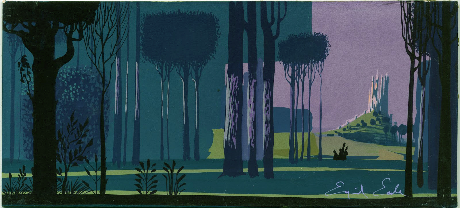
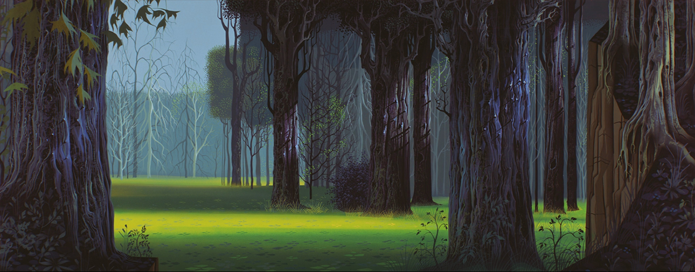
it’s very interesting to see the style evolve over the months EARLE was working on it. how he comes up with a special technique, the use of a sponge, to give the bark on the forest trees their typical look. and how he repeats the same sponge look on the stone walls in the castle. somehow he needed to bring the look of the forest and the castle interior together, another element was the long stretched cathedral-like pillars in the castle, and similar stretched trees. the cottage interior was easier, since there was a lot of wood and bark, together with repetitive textures, repeating what he used on the forest floor, grass patterns. and that came from the persian miniatures.


the choices of color are amazing as well. very tasteful and moody combinations, especially in the forest where the colors range from fresh springlike to very somber and subdued. today, painting in photoshop, it is easy in the last steps to adjust the color range. that way you don’t really have a problem to make dozens of backgrounds painted by a dozen of background painters look similar, and in the exact same color range. but, imagine in those days – everything had to be painted in acrylics and gouache, with a touch of airbrush once in a while. not just the absolute same colors in a sequence, all the details and textures painted the same way. looking at the backgrounds in SLEEPING BEAUTY, they nearly all look like painted by one artist.


the LAYOUT artists –
RAY ARAGON, TOM CODRICK, BASIL DAVIDOVICH, DON GRIFFITH, VICTOR HABOUSH, JOE HALE, JACK HUBER, HOMER JONES, ERNIE NORDLI, MCLAREN STEWARD
and the BACKGROUND artists including EYVIND EARLE –
AL DEMPSTER, DICK ANTHONY, FRANK ARMITAGE, RALPH HULETT, BILL LAYNE, FIL MOTTOLA, WALT PEREGOY, ANTHONY RIZZO, RICHARD H.THOMAS, THEKMA WITMER
© walt disney enterprises

first I would like to refresh your memory with an art timetable, where you can locate the different style epochs and their according years in time.
![]()
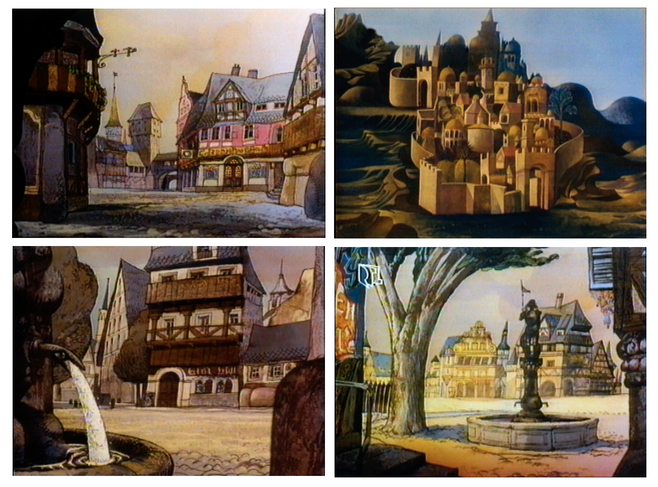
wherever you go to study the architectural details of some of the GOTHIC cathedrals, CHARTRES, REIMS, PARIS, COLOGNE, ULM, MILAN, AMIENS, or SALISBURY, you will find the same style elements. it is interesting to compare those characteristics with the style of the handwritten lettering of the manuscripts. it is mainly the emphasis on the vertical and the playful ornamental opening-letter designs that seem to be repeated in the supporting beams outside the cathedral as well as in the stainless window structures.


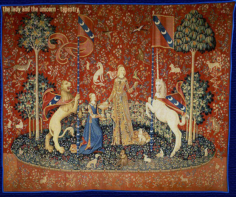
what EARLE doesn’t mention in his autobiography, is one of the key reference elements for the style of SLEEPING BEAUTY, the french tapestries around the UNICORN. THE HUNT FOR THE UNICORN and THE LADY AND THE UNICORN, 15th century. JOHN HENCH, one of the old timers, – layout, background and production design -, had seen the tapestries and recommended them to EYVIND EARLE.


tomorrow I will post the last part…
© walt disney enterprises
I was many time in that library, the treasure cove, where additional to all these illustrated books all editions of SIMPLICISSIMUS, PUNCH, FLIEGENDE BLAETTER, NATIONAL GEOGRAPHIC, GRAPHIS, GEBRAUCHS-GRAPHIC, ARCHITECTURE-digests, FILM-journals and so much more were stored. a big room with very tall shelves. you could get lost.
of course, like in EYVIND EARLE’S case, you needed to know what to look for. I am sure he went through all the illustrations of the master-illustrators, and a lot of classical art books. but I guess he knew what he wanted to create from the very beginning. he only needed to check a few ingredients from all that reference.
below the first layout shows an early approach, it could be even JOHN HENCH’S layout EYVIND EARLE mentions in his autobiography. the following designs illustrate how the style evolved to the final look.


here LES TRES RICH HEURES DU DUC DE BERRY from 1410 influenced the look in costume and style for the opening of the film.


more tomorrow…
© walt disney enterprises

imagine, once upon a time – there was no internet. you could not ask google whatever you needed to know. well, I remember1990, when I worked on ALADDIN, I accidentally heard about the ORIENTALISTS, painters who painted the middle east around the second half of the 19th century. I had to order those very rare coffee table books in a specialized bookstore in cologne ( walter koenig ), wait for some weeks and then pick them up, 300DM each, 4 books. their weight was probably 6 kg, and they had to be brought to L.A. in my suitcase. google is so much lighter. and cheaper!
when EYVIND EARLE needed his reference art-books, it was easier for him. WALT DISNEY had on his several months long trip to europe in the mid thirties bought whatever he could find about art and especially illustrated children books. JOE GRANT had given him a list what to look for. so DISNEY shipped all those ‘treasure’-books, illustrated by KAY NIELSEN, GUSTAF TENGGREN, EDMOND DULAC, HERMAN VOGEL, LUDWIG RICHTER, ARTHUR RACKHAM, WARWICK GOBLE, GUSTAVE DORE and more, to L.A. where they became the reference for future art directors and production designers.


GUSTAF TENGGREN and KAY NIELSEN had even worked in the disney studio, from the mid thirties to early forties. during that time KAY NIELSEN created many designs for future possible productions, like SLEEPING BEAUTY, but as well THE LITTLE MERMAID, and a beautiful piece THE SWAN OF TUONELA.
more tomorrow…
© walt disney enterprises


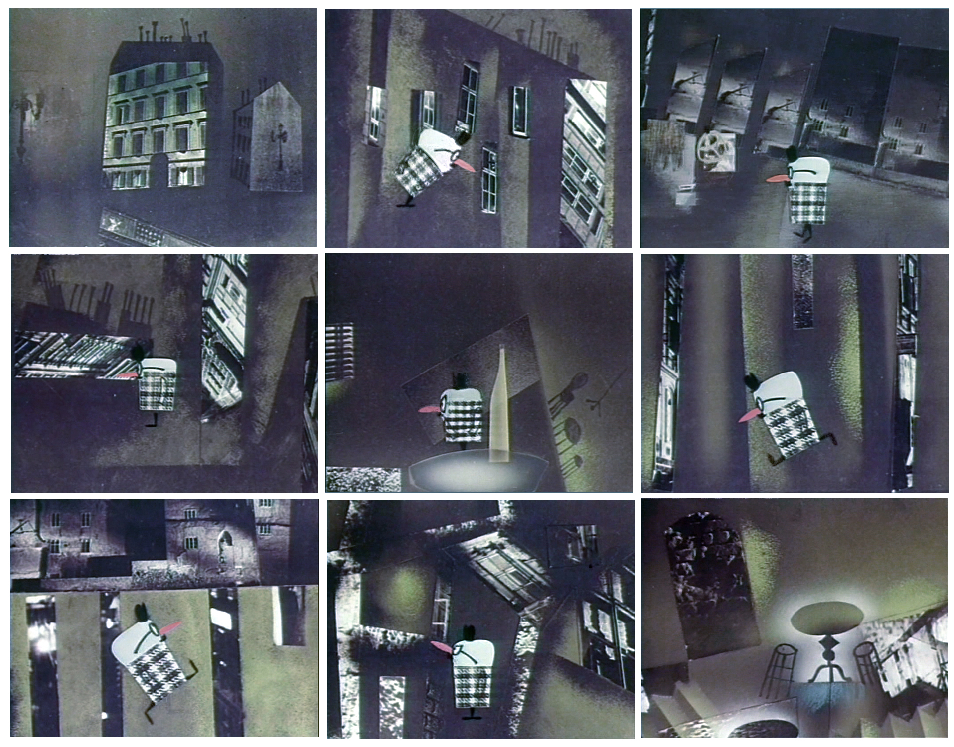
EYVIND EARLE, the production designer, developed the style of the film. he described it in his book – HORIZON BOUND ON A BICYCLE –
‘I knew I was going to style SLEEPING BEAUTY, as well as paint all the key backgrounds, and all I had to was to do it in my own style … at home I began practicing doing sleeping beauty’s forest scenes. after all my favorite artists were ALBRECHT DURER, VAN EYCK and BRUEGEL, and all GOTHIC ART, and THE HOURS OF THE DUKE DE BERRY. the whole project fit me like a glove … JOHN HENCH had just about finished two masterful layout drawings in black and white of two forest scenes. they were given to me to paint as I wished. JOHN HENCH’S renderings were RENAISSANCE ROKOKO to my mind. I wanted stylized, simplified GOTHIC. straight tall perpendicular lines like gothic cathedrals. the figures should be straight and tall and thinned out and elongated like gothic sculpture. I took john hench’s masterpieces and straightened up the curving bending winding trees. I used one-point perspective. I rearranged the bushes and trees in geometrical patterns. I made a medieval tapestry out of the surface wherever possible. all my foregrounds were tapestry designs of decorative weeds and flowers and grasses. and since it is obvious that the gothic style and detail evolved from the ARABIC influence acquired during the CRUSADES, I found it perfectly permissible to use all the wonderful patterns and details found in PERSIAN MINIATURES. and since PERSIAN MINIATURES had a lot in common with CHINESE and JAPANESE ART, I felt it was ok for me to inject quite a bit of JAPANESE ART, especially in the close up of the leaves and overhanging branches … I started taking close up photographs of every different bush or tree I could find in the san fernando valley, and then I took VAN EYCK, and PETER BRUEGEL, and ALBRECHT DURER, and BOTTICELLI, and THE HOURS OF THE DUKE DE BERRY, and the PERSIAN, JAPANESE and GOTHIC ART, and on top of that all that I injected a little piece of EYVIND EARLE.’


© walt disney enterprises


© walt disney enterprises

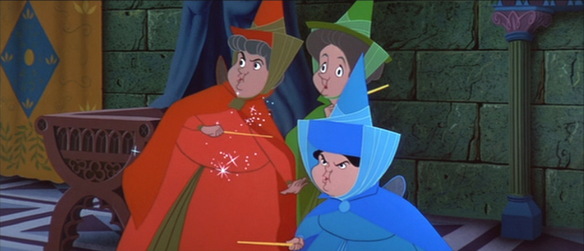
I am starting this new series with one of my favorite animated feature films, a classic artistic masterpiece from 1959 – SLEEPING BEAUTY. you might know the details about the film, so I won’t bother you with that. I am interested in the artists who created this very unusual piece of art and you will see a lot of those behind the scenes pictures. enjoy…


© walt disney enterprises
looking through some old artwork I found this poster design I created in the early days around february 2002 for a very new project FRAIDY CAT, that went into visual development.

in the past years I published several posts about FRAIDY CAT and I still like one from 2009 a lot, that’s why I republish it, with a few additions.
it is funny to read all different articles and speculations why apparently such interesting looking projects in the past at disney were shelved. well, – it was pure incompetence, believe me. let’s just look at FRAIDY CAT, not the FRAIDY CAT that JOHN MUSKER and RON CLEMENTS restarted in 2004. I am talking about the very first version that was offered to me late in 2000 as a 3 page treatment. I started with a lot of environmental and a few character designs and after I showed the story to ANDREAS DEJA he wanted to contribute some character explorations. he loved the treatment as well.
let me explain the reasons why a project like that could fail. one major reason – because the management at that time was for some never explained reasons convinced that a good final story develops out of over and over destroyed story-versions. I remember a meeting after a screening of some major sequences of another project, where TOM SCHUMACHER, at that time sr.vice president and head of feature animation, answered a statement of a storyboard artist that it looked great and worked well, ‘then let’s do it all over again, because it only can get better’. – I don’t think so!
to be frank, I always thought that this procedure was completely stupid and had only one effect – immense costs and a lot of wasted trees. I remember on MULAN were in the end about 10 different writers involved. coming back to FRAIDY CAT – the poor writer who had come up with this stunning treatment would have never had a chance to write the final script. unfortunately he was not too well known, but more important – he was the first one and to continue you need to throw dollars after a second one. after story-discussions in a team of vice presidents in development ( I always thought they were there for decoration and to fill some luxury offices ) the story had to move to another writer and that could happen several times.
but that was not really the main reason for the systematic destruction of a good idea. that reason was obvious in another department, but nobody else apparently saw it. usually a script ends up first in the storyboard department. one storyboard artist takes care of a sequence. as far as I remember in FRAIDY CAT’S case about 6 or 7 were involved. now there is a major problem – all the top talent in storyboard is busy to fix the disasters in the running production(s). that’s why usually only ‘apprentices’ are thrown into a starting new project. I don’t want to say that there couldn’t be a major hidden talent in such a fresh team, well, usually that is not the case. that means that, what this team comes up with as an interpretation of a third generation script, is not the best of possible versions. in a presentation to the highly competent jury of vice presidents this interpretation must look like a story that needs to be fixed, – back to another writer, and the game starts all over. you can imagine, after several redo’s there is nothing left of an original and once charming story. unfortunately nobody ever had the idea to at least look what others might have done in earlier versions. FRAIDY CAT is not the only project where I saw this happen, it was the same with MY PEOPLES, RAPUNZEL ( inclusive other major problems ), WILD LIFE ( with a ton of more and very serious other problems and directors too arrogant to listen to warnings ) and SNOW QUEEN ( OMG ). the FRAIDY CAT affair ended after I left in 2003 and ron and john tried to fix it afterwards with major artistic talent like CARTER GOODRICH and PAUL FELIX. apparently it did not help because some of the ’emperor’s new clothes’ guys thought it was not a good idea afterall. after 5 yaers and probably 50 million dollars, not to talk about thousands of pieces of art – down the drain.
usually it’s not my style to write that much, but – this had to be said
© walt disney enterprises

digging through my archives I found this caricature I did of VANCE GERRY in 2000. vance gerry, 1929 – 2005, had been with DISNEY since 1955, had worked in layout on 101 dalmatians and sword in the stone, and moved then to storyboard during the production of the jungle book. from then on he worked in story on most of the feature films. towards the end of his career he worked closely with JOE GRANT and BURNY MATTINSON on the development of new ideas for future productions. that was, around 2000, when we shortly worked together on an idea joe grant had brought up, MR.POPPER’S PENGUINS written by richard and florence atwater and published in 1966.

joe grant’s idea was a mix of live action and CG, with penguins similar like in mary poppins, just animated in the new technique. I created a few designs and then never heard about the project anymore.


much later I found out that the story had been produced and released in 2011 by 20th century fox, MR.POPPER’S PENGUINS, a live action/CG mix with jim carrey.

© walt disney enterprises © 20th century fox © richard+florence atwater
I found some more designs ALEX NINO created in 1995/1996 during pre-production on disney’s MULAN.


© walt disney enterprises, inc / alex nino

during the first months in 1995 working on the style development for MULAN I was researching everything I could get from china, books about traditional art, photography of the environment and graphic novels. I call them graphic novels, because they are so different from the comic strips we are used to in our western world. CHEN-YI CHENG, who was responsible for the character design, and myself went through chinatown in L.A. and found after a while treasures of artwork.
below you will find one of these graphic novels, it must have been created by a real master! I wish I knew his name and could see some more of his work. maybe there is one of my chinese viewers who can help.


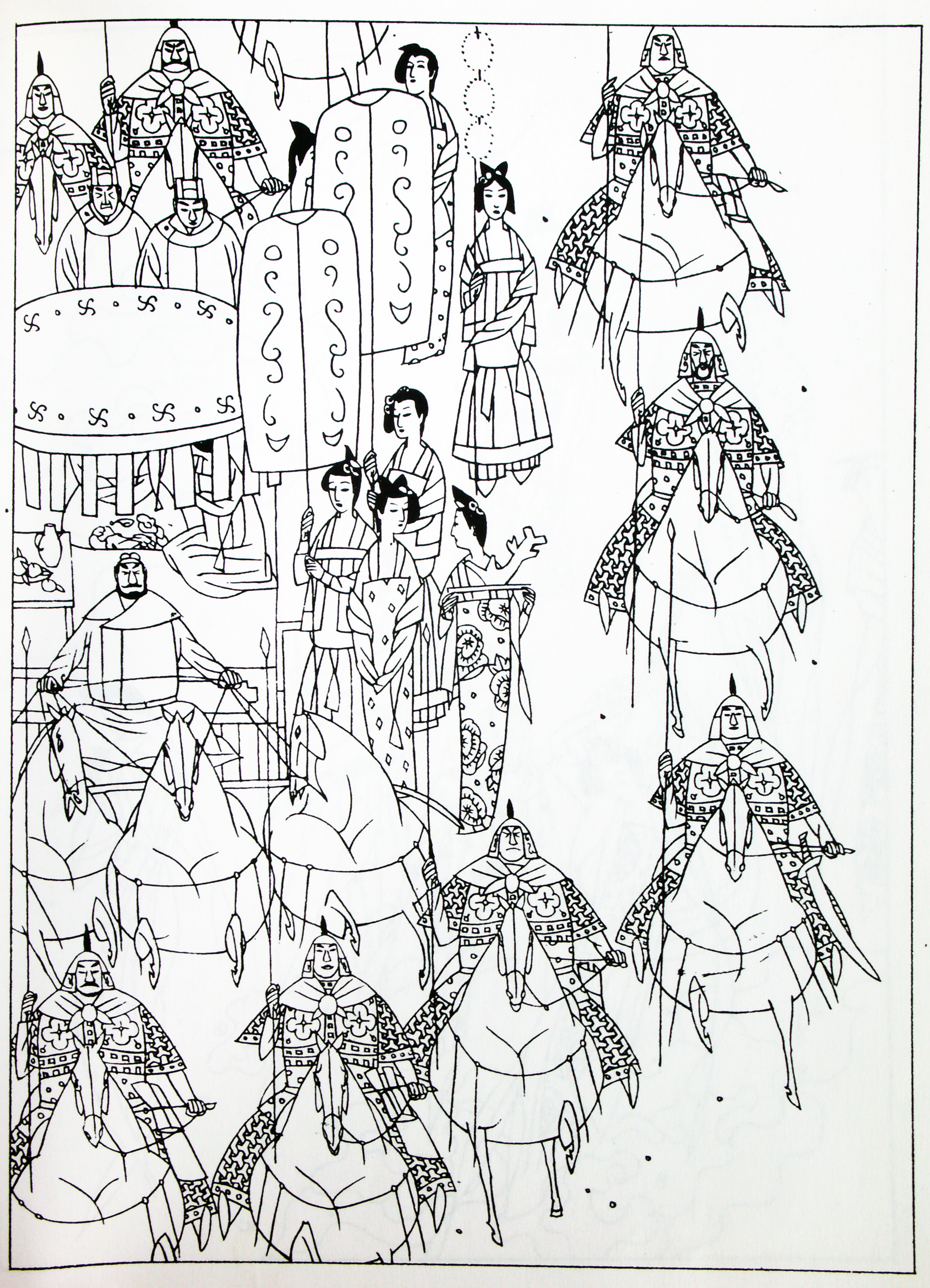


© ???


© mary blair / disney enterprises, inc


© disney enterprises, inc
since there is not that much else to do, I have lots of time to organize my collection. going through hundred thousands of images sounds like a hell of a job. but in these chaotic, depressing and dangerous times it lets me dive into a different world. how could you not enjoy such beauty that all those endless artists created so many years ago. with the next posts I want to share some of the jewels in the collection, and I hope it helps you in case you are not in the best mood.


© disney enterprises, inc


© disney enterprise, inc © paramount © zagreb studio © fischerkoesen
© edelmann © WB © UPI © richard williams © jan lenica © toccafundo


© disney enterprise, inc © paramount © zagreb studio © fischerkoesen
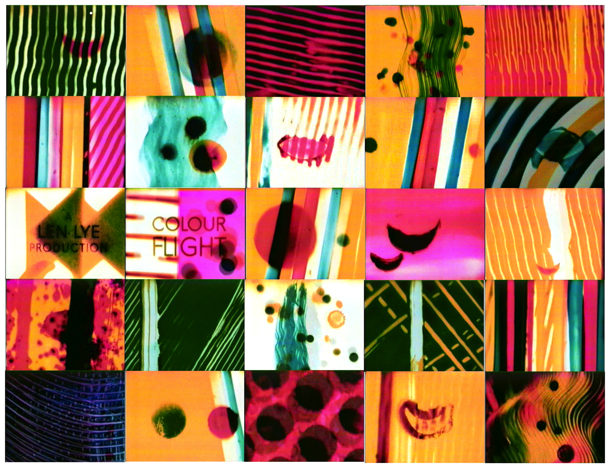
© len lye © edelmann © WB © UPI © richard williams © purdum animation
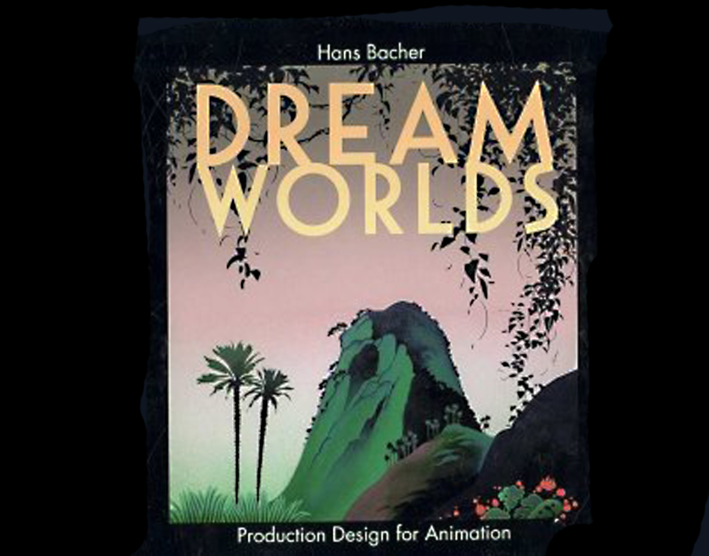
my name is hans bacher, – I work as production designer in the animation film industry. for the last 45 years I lived and worked in exciting places around the world. after 7 years of teaching in singapore I am back at my homebase in manila, working on a few more books.

Discover the Secrets of an Enchanted World
WordPress.com is the best place for your personal blog or business site.
Discover the Secrets of an Enchanted World
WordPress.com is the best place for your personal blog or business site.


Recent Comments