


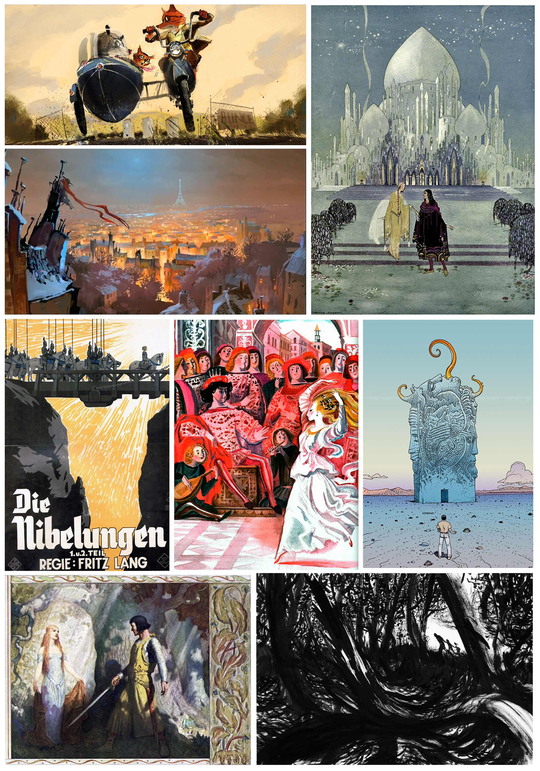
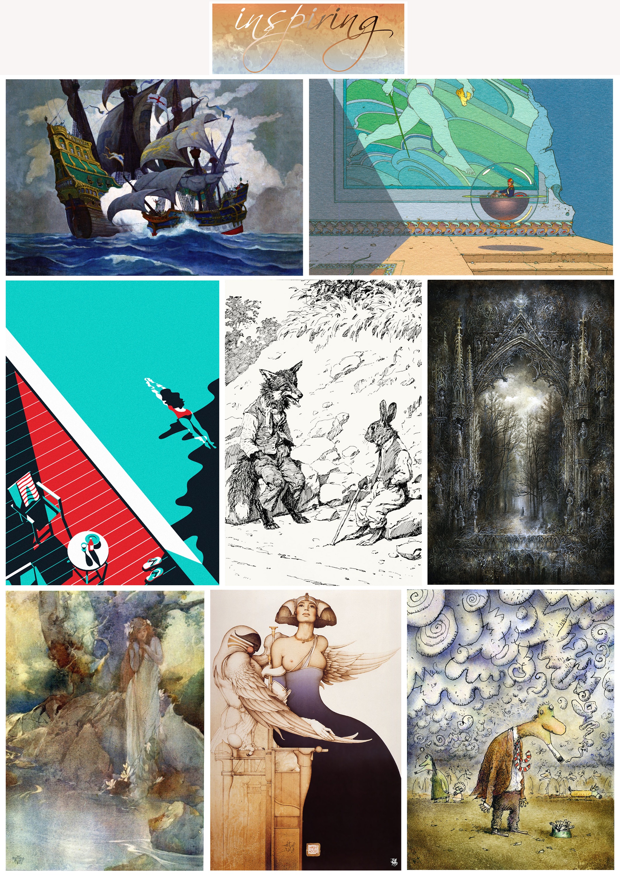
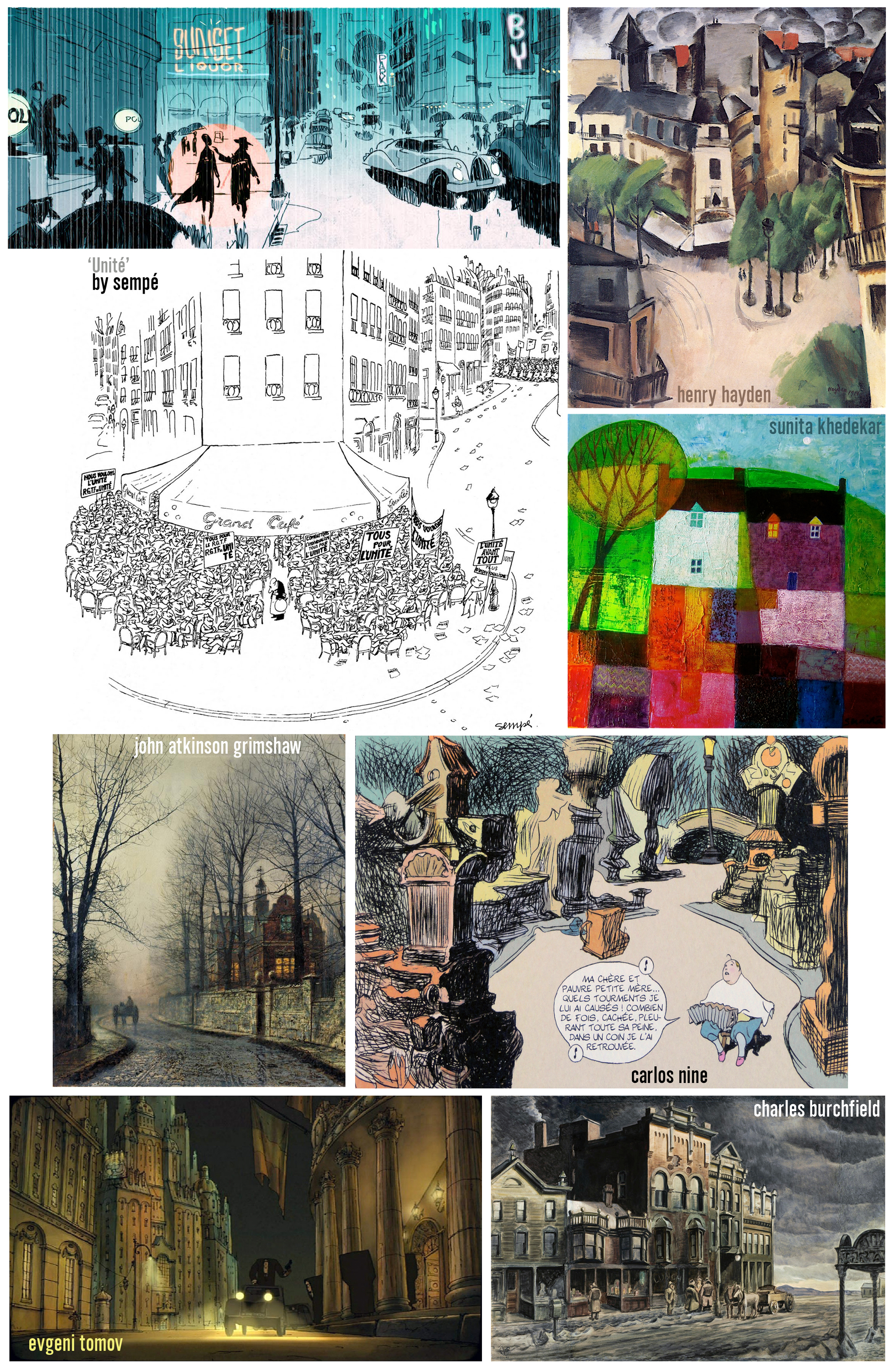
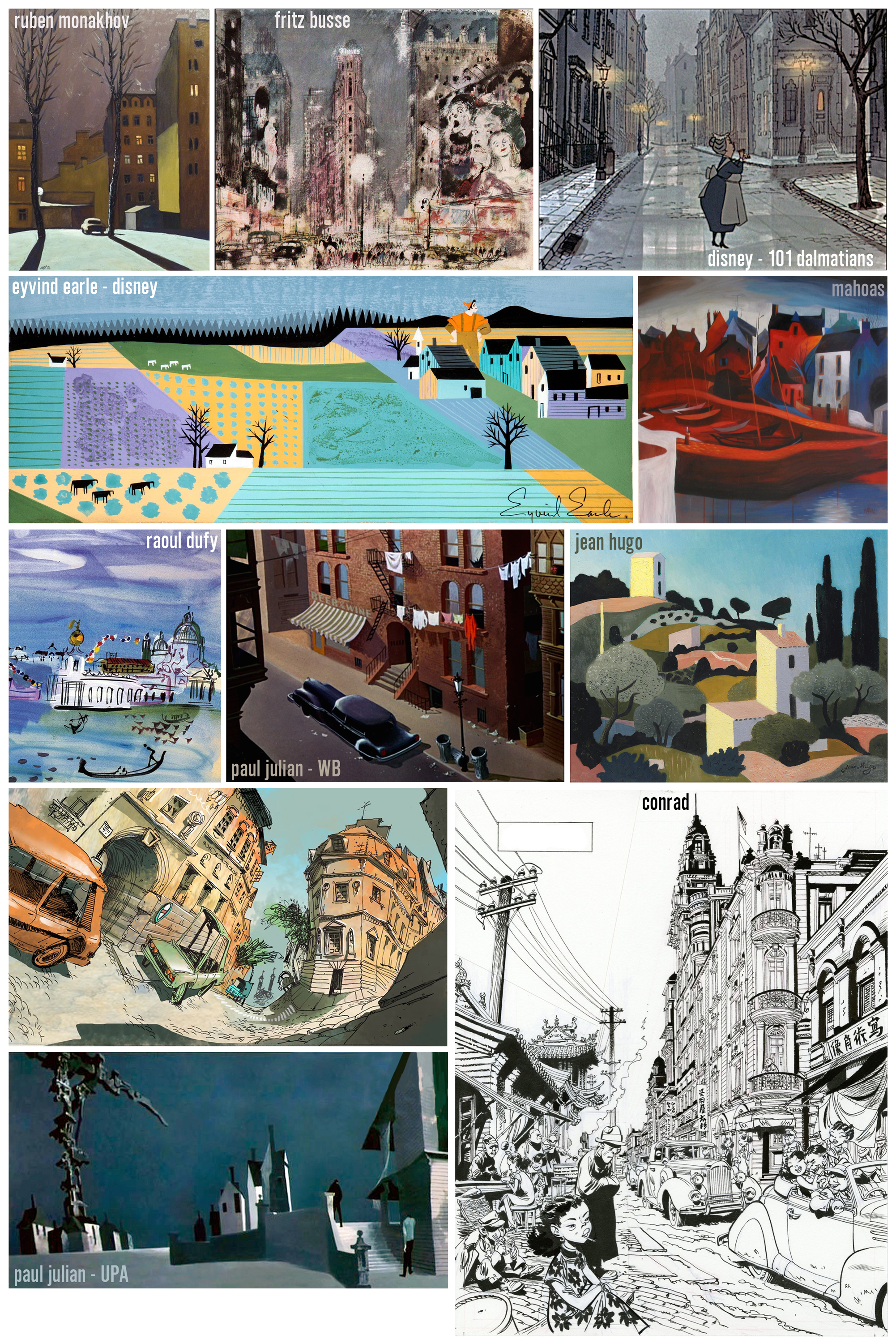
you might have recognized one or the other artist in the past INSPIRING posts. there were only some files where I had noted the name of the artist, so I decided not to add names in the image compilations at all, it’s more about the art that inspires us, not the name. but – I understand that some of you are curious about some more work a particular artist might have created. below is a list of the, in my opinion, most important comic strip-, cartoon-, caricature and character-design artists, whose work is already represented in the past posts, or will be in the upcoming ones. I am still working on a second list of most important illustrators and concept designers.
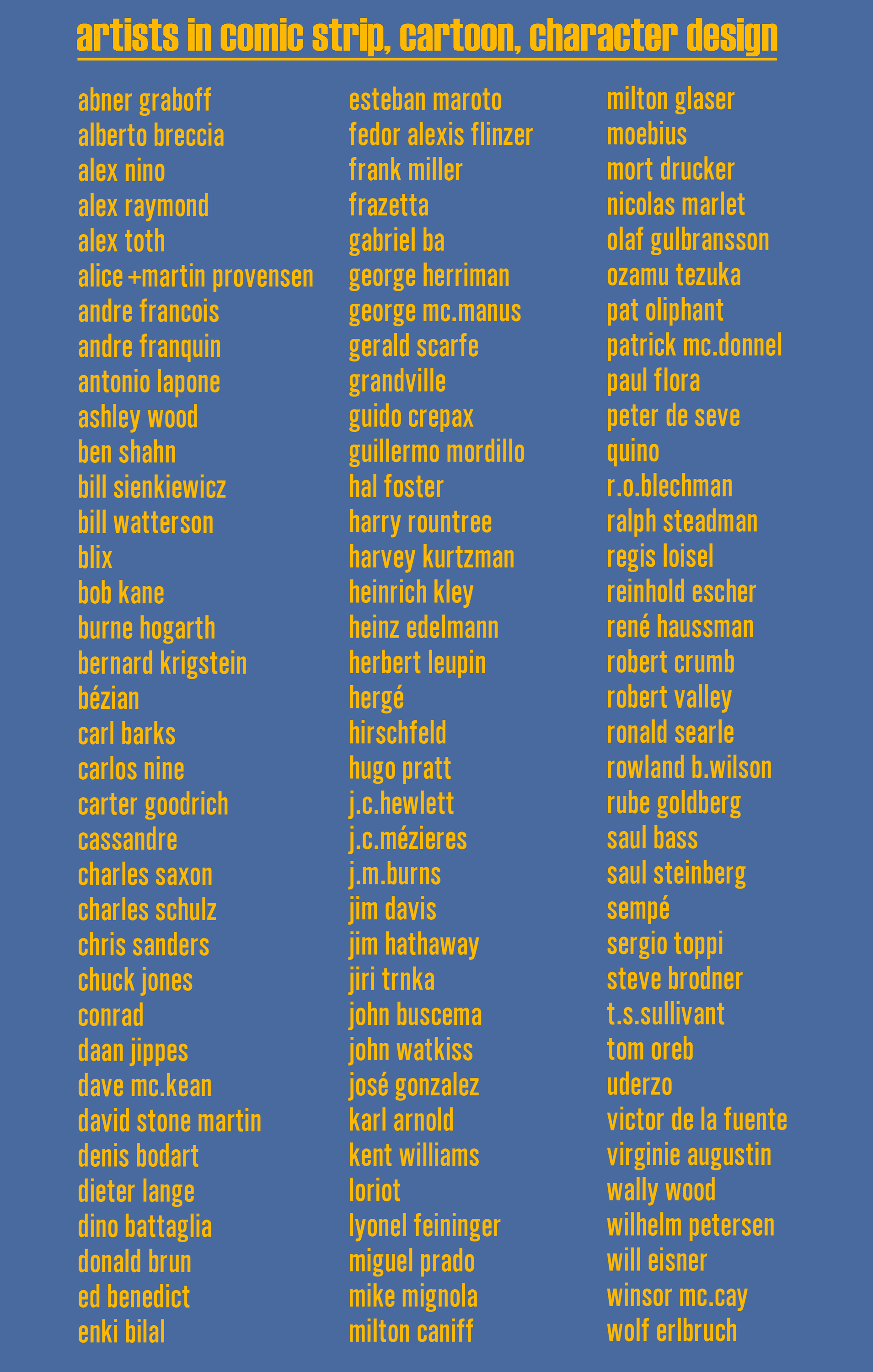
after realizing I forgot some important artists I changed the list.


art students are usually asked to create an INFLUENCE MAP, assembling artwork of artists that infuences them the most. classical paintings, contemporary illustrations, comic strips, character-/concept-designs from animated movies are among other things where we consciously or subconsciously borrow elements, techniques or looks from. as an artist we always need to be inspired, we get a lot of that from life around us. and the endless resources within the world of the internet provide us with all the information and reference we could dream of.
before the time of the internet most illustrators had a huge cut-out archives, reference images cut from magazines and books, and archived alphabetically. I still have cabinets full with those treasures. it took forever and was not cheap. today google is much cheaper and more important – faster.
probably about 15 years ago, when the internet speed in this part of asia where I live, improved, I started the same what I had done years ago, to collect all different reference images – but this time downloaded from the internet and nicely archived ( not always ) in folders for easier locating them. reference photography, classical art, children book-/magazine-/book-illustration, concept art and production design for live action and animation, comic strip. so far some million files.
during this pandemic, for longer than six months I am more or less stuck at my home, what gave me the opportunity to dig through my collections. you have seen already some of the results in my last posts, more to come.
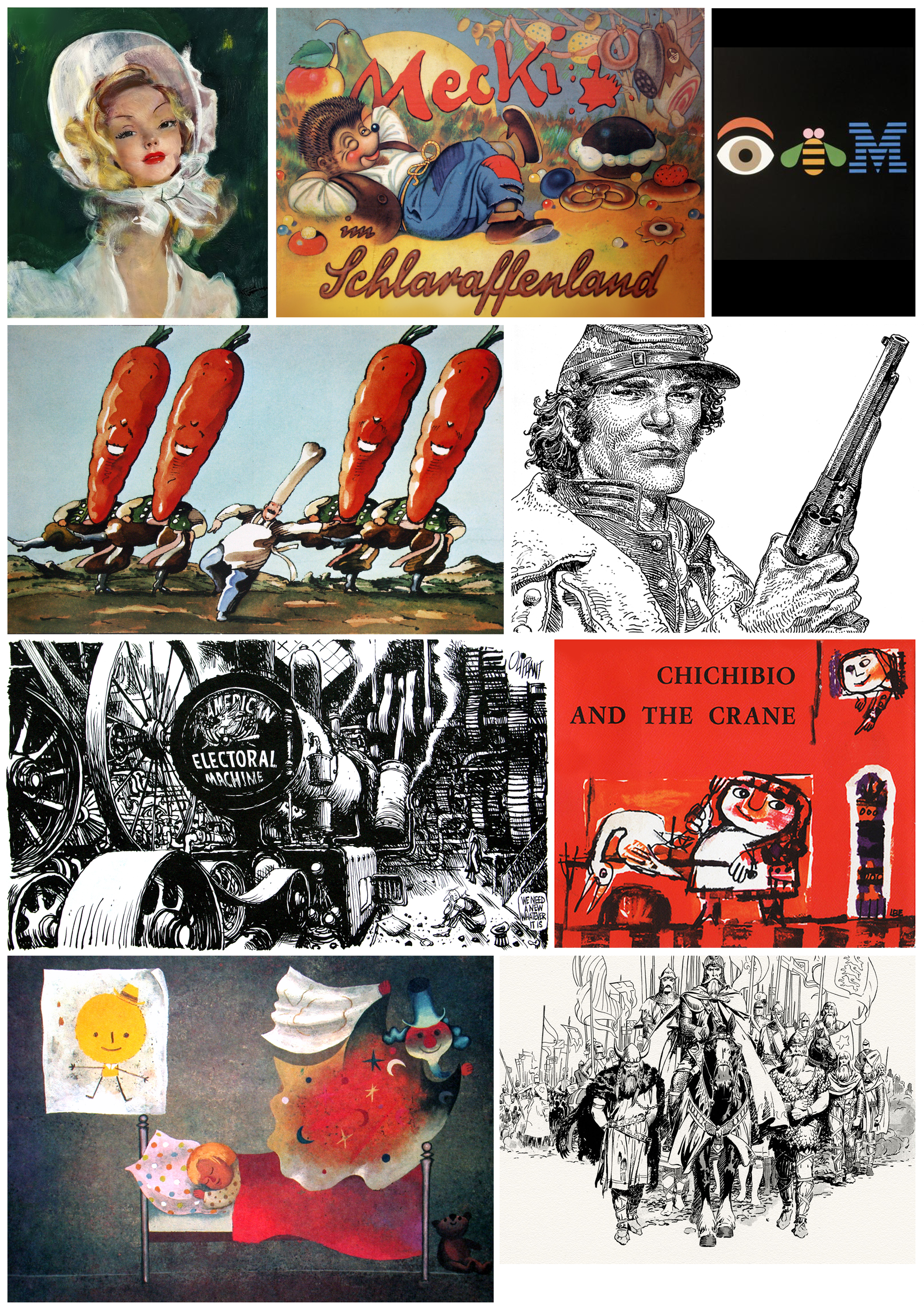
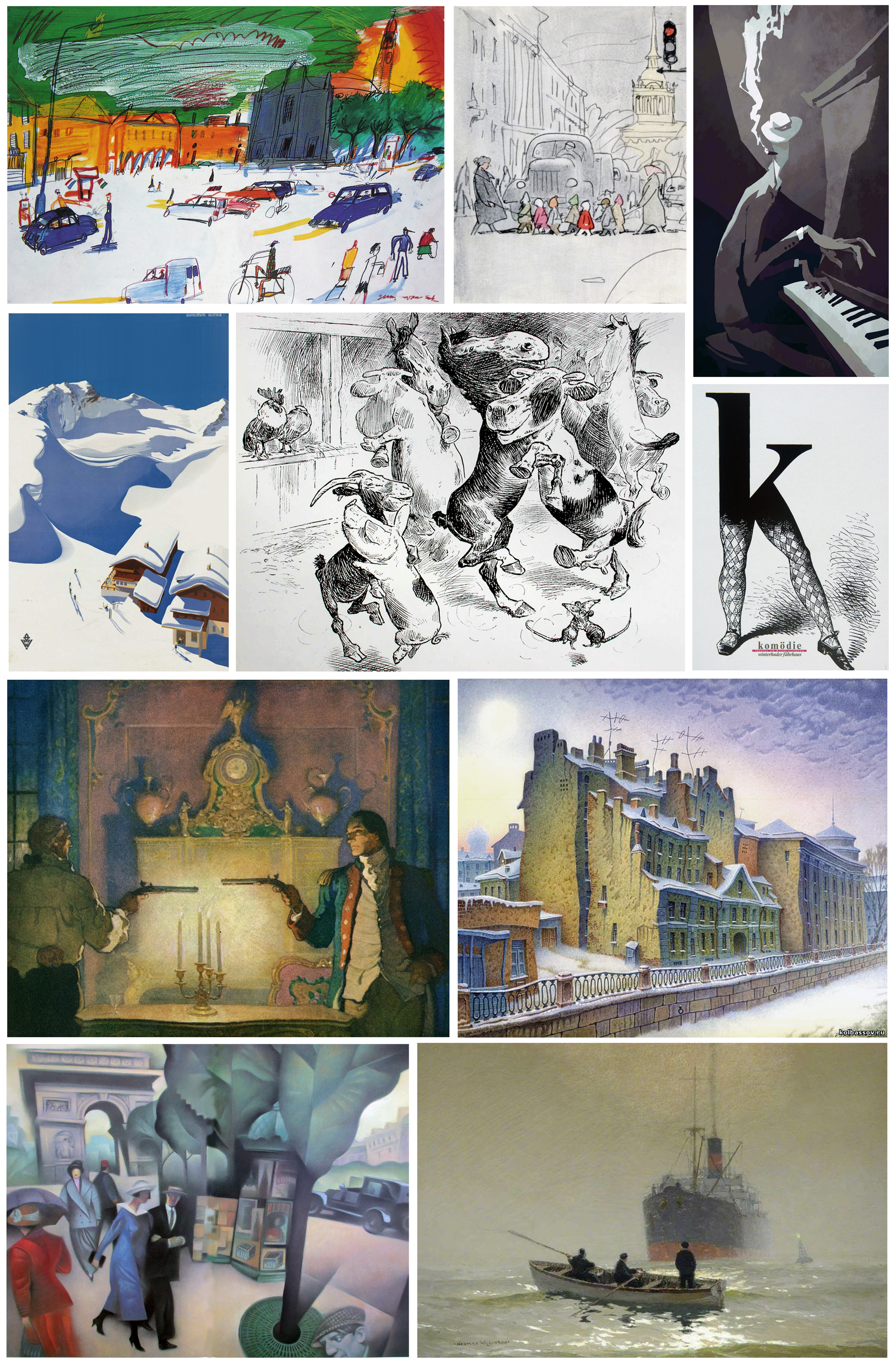
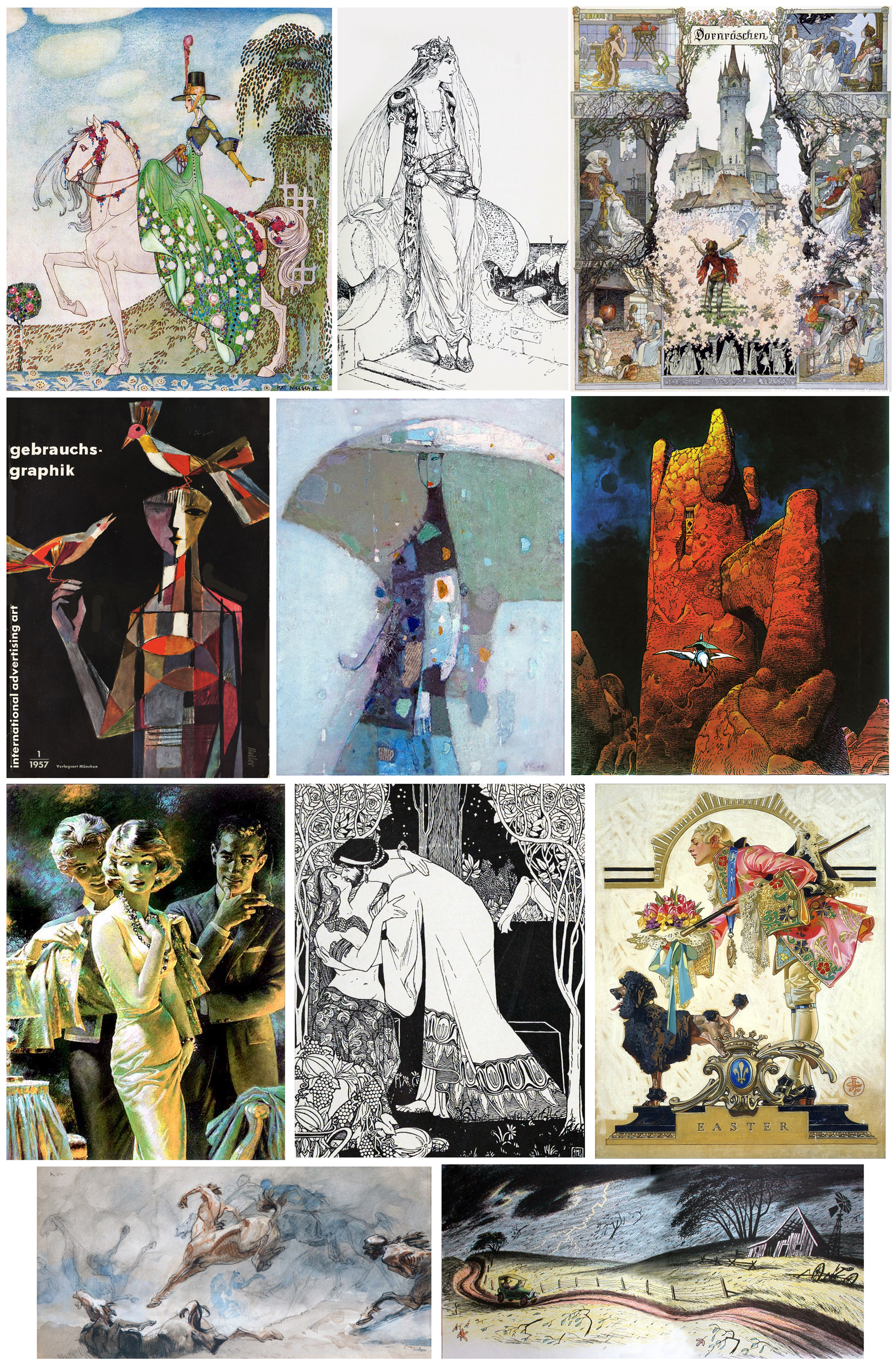
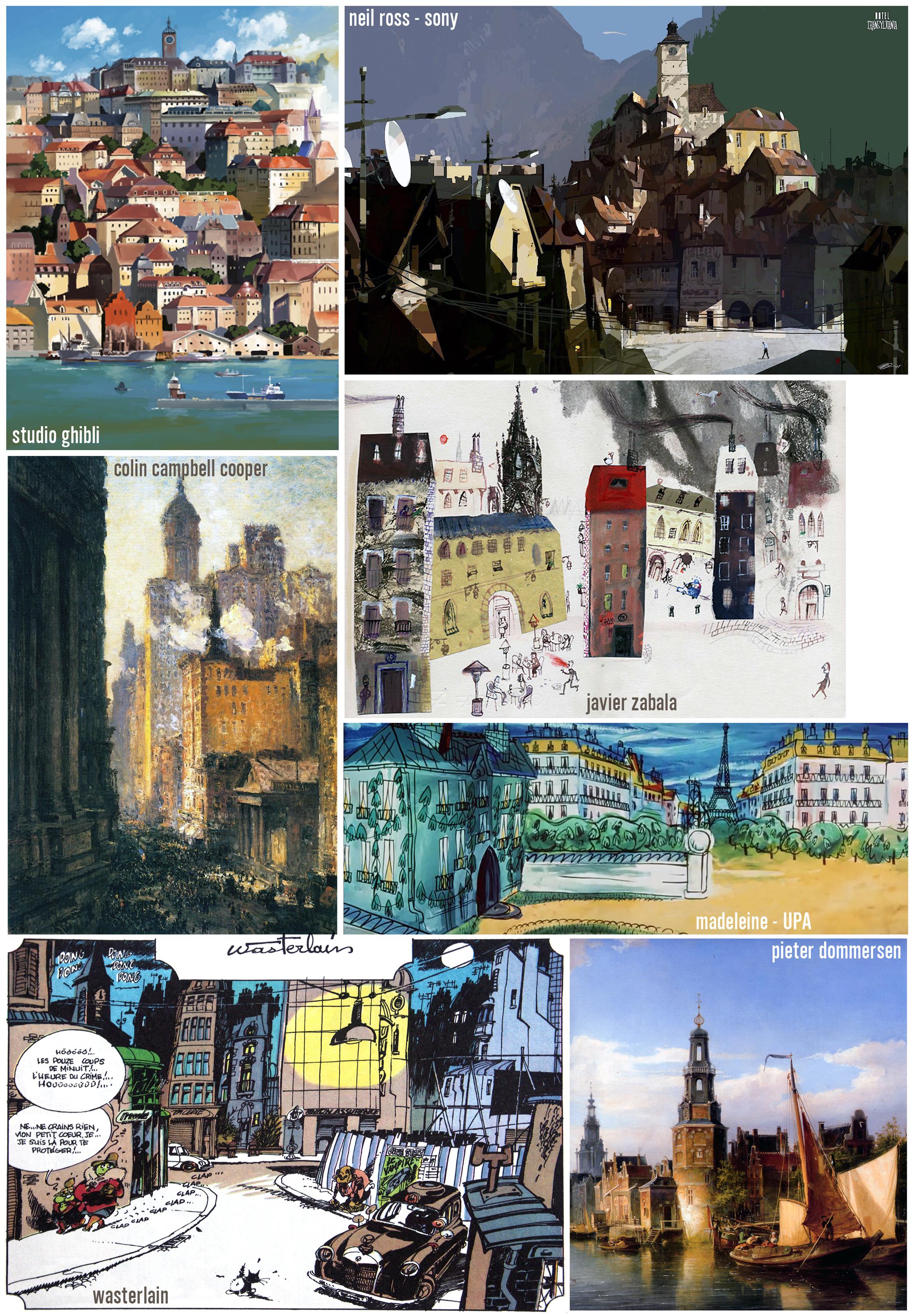
today i wanna show you my version of influence maps, compilations of inspiring artwork that I put together randomly, from those thousands of reference folders.


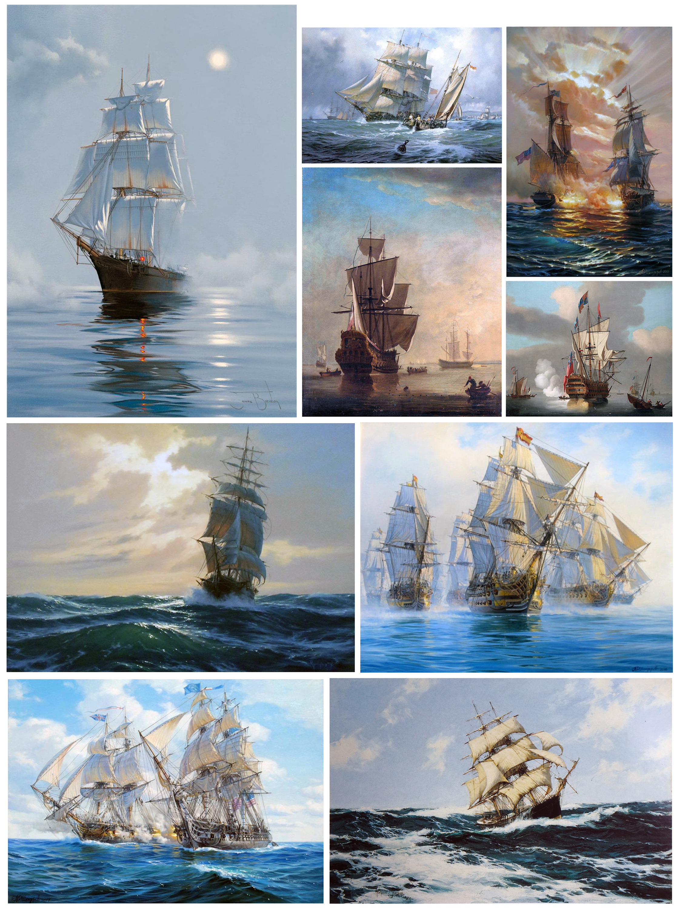

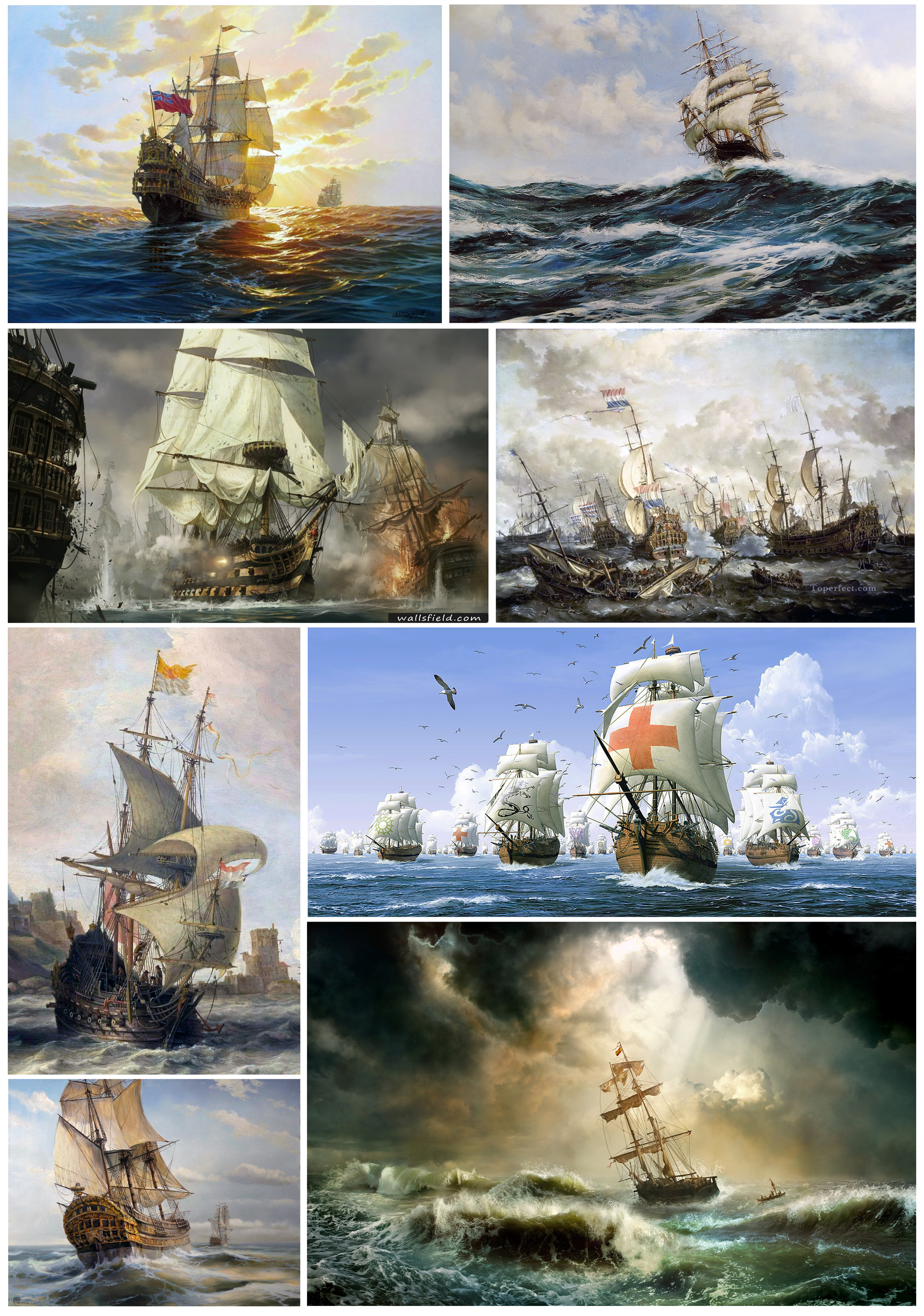


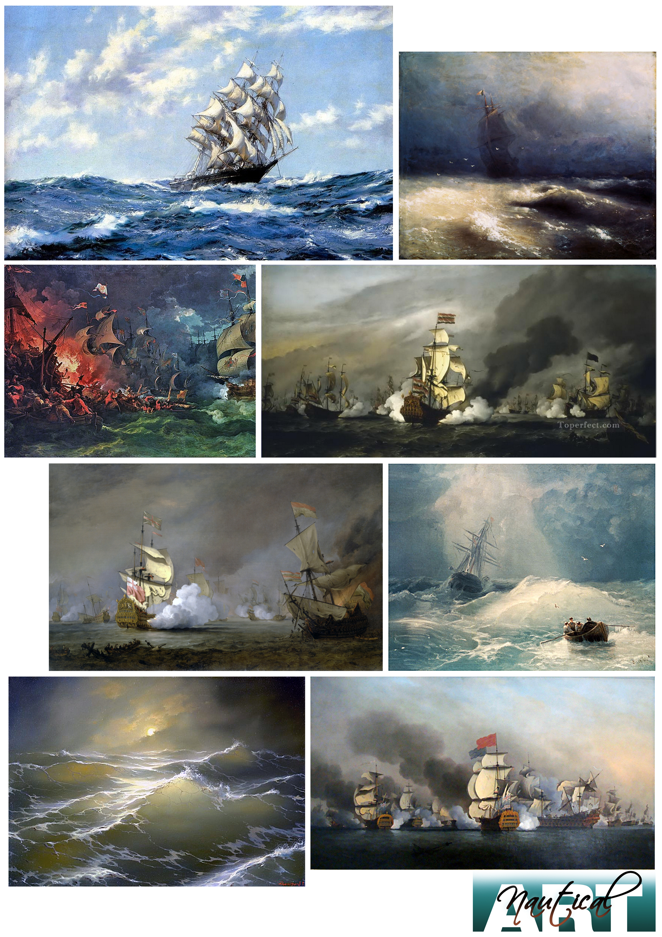
maritime artists –
ivan konstantinovich aivazovsky , pieter bruegel the elder, bryan booth, jacob loutherberg, samuel scott, montague dawson, john stobart, marek ruzyk, geoffray huband, yves berube, alexander shenderov, winslow homer, willem van de velde, geoff hunt, william hodges, james brereton, patrick o’brien, caspar david friedrich, roger morris, andy simmons, samuel atkins, ludolf bakhuizen, joseph mallord william turner, philipp jacob loutherbourg, alexey bogolyubov, george hyde chambers, peter monamy, nicholas pocock, charles brooking
as long as I can remember there was this fascination with pirates. I loved to read PETER PAN and STEVENSON’S TREASURE ISLAND, and then there were the old hollywood swashbuckler classics like CAPTAIN BLOOD, THE BLACK CORSAIR, THE BUCCANEER, THE SEA HAWK, THE BLACK SWAN and of course lately THE PIRATES OF THE CARIBEAN.
but it was not just the adventurous stories, the sword fights and buried treasures, that made it all so interesting, for me it was the world where all that took place – those huge sailing ships and the endless oceans, the huge waves and the storms.
a while ago I found more accidentally beautiful artwork that depicted this world, paintings done by MONTAGUE DAWSON and IWAN KONSTANTINOWITSCH AIWASOWSKI. and recently, with more time, I started to search more intensively through the endless world of the internet, and found hundreds of the most amazing paintings. this genre is called NAUTICAL-, MARINE- or MARITIME ART depicting the world of ships and the seas.
in a lot of cases these paintings are available without the name of the artist and the year they were painted. thats why I decided to give you just a general list of maritime artists and you can find out more about them in case you are interested.


maritime artists –
ivan konstantinovich aivazovsky , pieter bruegel the elder, bryan booth, jacob loutherberg, samuel scott, montague dawson, john stobart, marek ruzyk, geoffray huband, yves berube, alexander shenderov, winslow homer, willem van de velde, geoff hunt, william hodges, james brereton, patrick o’brien, caspar david friedrich, roger morris, andy simmons, samuel atkins, ludolf bakhuizen, joseph mallord william turner, philipp jacob loutherbourg, alexey bogolyubov, george hyde chambers, peter monamy, nicholas pocock, charles brooking


since HENRI MATISSE is another one of my favorite artists, I did a study inspired by his 1950s cut-out nude series

one of my exam students is developing a style for an animated film and chose one of my favorite painters, WASSILY KANDINSKY, and his style during the BLAUE REITER PERIOD around 1907 t0 1914. I got myself so inspired by his work that I started to create dozens of very special brushes, in a way ‘kandinsky’ brushes. as tests I painted in photoshop with my new brushes several pieces, – my KANDINSKY interpretation. below is one of them…

ROBERT COTTINGHAM was born in 1935 in brooklyn. in the late sixties he was member of a group that became well known as the PHOTO-REALISTS, as a reaction against ABSTRACT EXPRESSIONISM. cottingham documented urban signage, especially colorful advertising billboards, with his camera and transferred the images into meticulous paintings and prints. I am fascinated by his work – see yourself, some of his artwork below


© robert cottingham
I wanna thank BILL PECKMAN for introducing me to the artist and
POUL WEBB for his fantastic BLOG
![]()
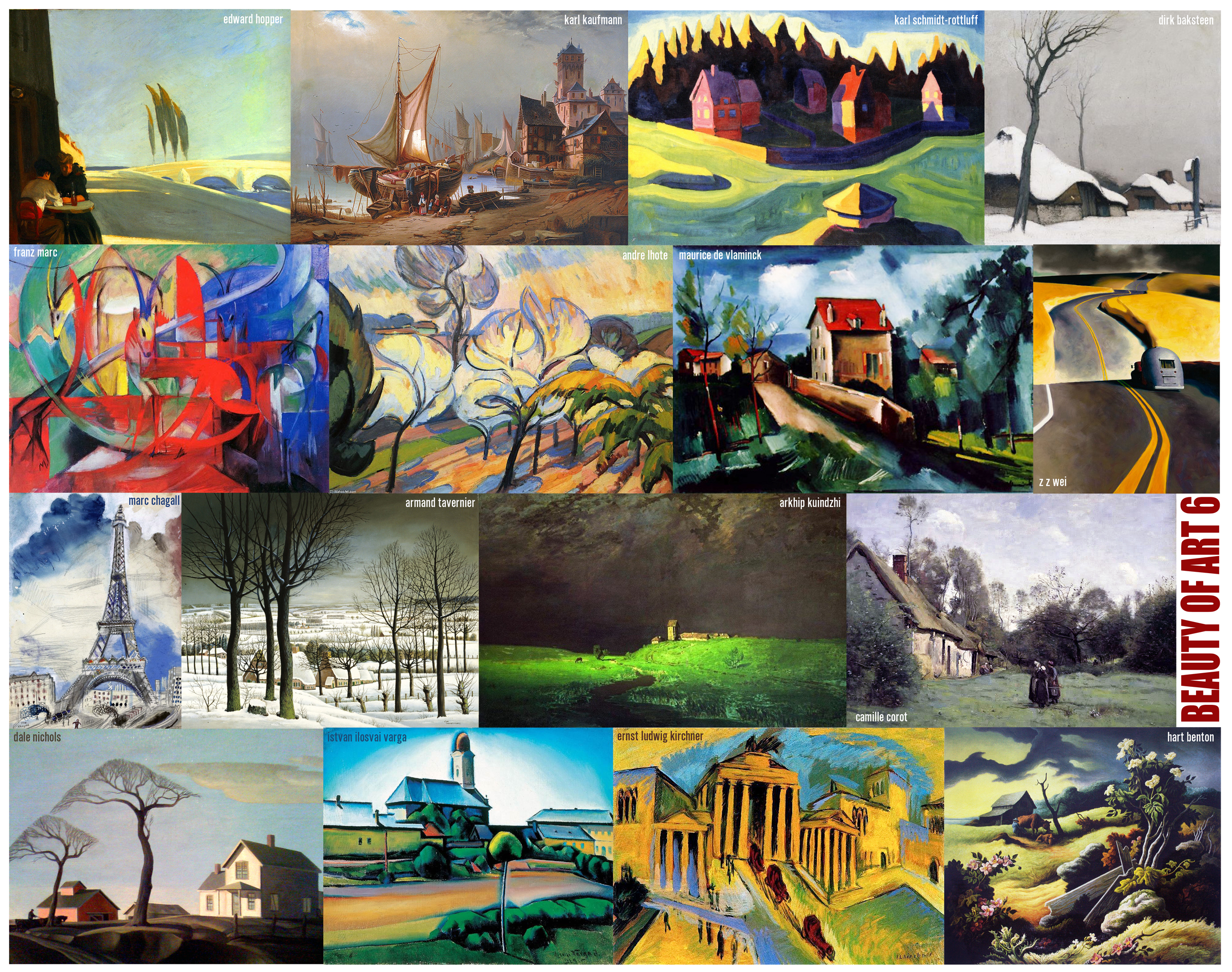
the choice of the right color seems to be a challenge, that’s at least what I hear from a lot of my students. of course you can trust your intuition or get inspired by the right music, but I think it might be safer to collect enough information, in this case – visual reference. maybe you have enough photos in your archives to choose from, but in any case you can find everything and fast on the internet. as an example I picked the theme WINTER.

when I did the production design for BALTO I had to do a lot of research about alaska, snow covered mountains and deep forests, whatever I could find about the cold northern winter. without checking photographic- or art-reference you probably would go for a lot of white with some greyish-blue colors. in case of BALTO we wanted to avoid that cold color-range as often as possible. the white with blue color combination feels cold and you don’t want your audience to start freezing.
when you look at the collected photos you will find blue as the dominant color, but as well a lot of other balancing colors you could use to go into a different warmer range.

in the second big compilation you can study a wide range of artwork from around the world and from over the last two hundred years covering the same theme. here as well the color choices of the different artists were not just blues and greys. you can check that very well in my color-picks.


that is how I usually start, in case I need to come up with a color script. you select all the colors from whatever reference you use and then condense the color-picks to the range that fits your storyline the best, and – you choose colors harmonizing with each other. according to the story you are working on, a lot more goes into the choice of the right color, especially in your color script, where you need to translate the development of the drama and illustrate the mood. in some cases your story in the climax part of the film might need even in a winter snowy environment completely different colors, colors that symbolise the idea and not the reality.

more stylistic variations, looking at people in ART


some more people in art…


I continue with the STYLE-series, this time with PEOPLE IN ART. it is amazing to see such a variety in styles to portray the human figure over the last few centuries in painting alone…


storytelling and the visual arts are very close connected. look at the stories on the walls of the caves of lascaux. or most religious art throughout the middle ages, like the illuminated manuscripts or the stained glass windows of the christian cathedrals. art helps us to perceive aspects of reality we could not see otherwise. a chinese proverb says – one picture is worth ten thousand words, or – what ivan s.turgenev wrote 1862 in his novel ‘fathers and sons’ – ‘the drawing shows me at one glance what might be spread over ten pages in a book.’
in the compilation of artwork below I have collected some stories from all over the world. note besides the content their composition, the way the artists lead your eyes through their story. and study how the color is used to support the atmosphere, to help the viewer develop an emotional feeling.


it is obvious that we are surrounded by different styles, just look around. there is the latest fancy mobile phone, the new haircut of a friend, the look of an ‘in’-magazine. even more so when we look around in our cities, – architecture, sportscars, the latest fashion. in museums or books we can get familiar with styles developing over the centuries, and in movies we are confronted with phantastic looks of the future. we are constantly influenced by these images and they affect our own visual ideas.
as I wrote in the first chapter, I am interested in my field – the design in animation – in the creation process of the most stunning styles in some of the films in the past and will try to analyze and document how the artists who were involved worked.


I had some STYLE-posts a little while ago. this now is the start of a general analysis of STYLE in ANIMATION in several chapters and probably the early beginning of a new book.
you can find STYLE-trends everywhere – in fashion, car-designs, modern architecture, fancy food in expensive restaurants, in art of course, painting, sculpture, graphic-art, typography, film and in lifestyles. it is everywhere. we are surrounded by them and we get influenced by them. in this new series I want to concentrate on ANIMATION and specifically on the look-development of some animated feature films and shorts. in most of these works the backgrounds define the look more than the characters. who developed and designed them and how did these artists get their ideas? what influenced them in their time, what of their work was and still is used today, and has been further developed, influenced again by more modern trends.
this is of course an important subject for me, since I have to come up with new looks as a production designer all the time. I want to talk as well about the process how to find a style and about the different ingredients.
here first some examples of very different styles in animation…


…to be continued.
all artwork and text is copyrighted by HANS P BACHER, unless otherwise attributed to the respective copyright owner. it is illegal to publish, print or use in any other manner any such artwork or text without the written permission by the artist or copyright owners.
© disney enterprises, inc / WB / universal pictures / paramount / hubley / lenica / studio zagreb / UPA
my name is hans bacher, – I work as production designer in the animation film industry. for the last 45 years I lived and worked in exciting places around the world. after 7 years of teaching in singapore I am back at my homebase in manila, working on a few more books.

Discover the Secrets of an Enchanted World
WordPress.com is the best place for your personal blog or business site.
Discover the Secrets of an Enchanted World
WordPress.com is the best place for your personal blog or business site.
 </a
</a


Recent Comments