jean paul surin

28 07 2013

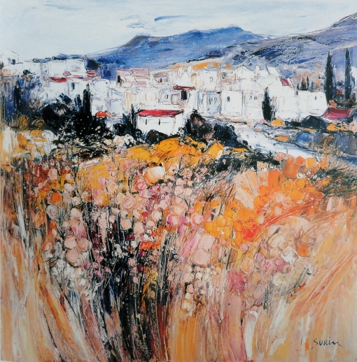
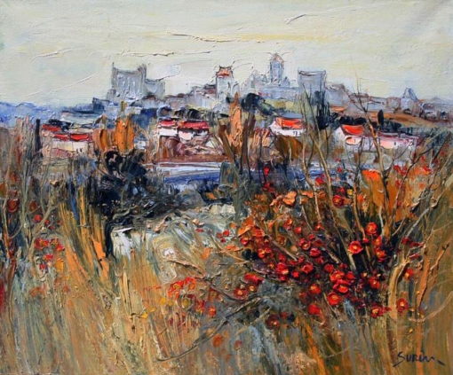
on my last trip through southern france I stayed in a hotel in ROUSSILLON, provence. a mural in the entrance hall caught my eye because of its vibrant colors and expressive brushstrokes. it reminded me of VAN GOGH, the motif was one of the villages in the neighborhood, GORDES. I found a catalogue of the artists work on a table next to the wallpainting. JEAN PAUL SURIN, born in 1946 in the ardennes, france, a student of the ecole des beaux arts in paris is for some years now represented in galeries throughout the world. he is a nature painter, applies the oil colors in thick layers on the canvas using a palette knife as well as brushes, sometimes it looks as if he wanted to sculpt his paintings with the palette knife. I am fascinated by his color combinations, you have to spend some time in southern france to believe they really exist. no wonder that most beautiful spot on earth attracted so many artists in the past and still does. see yourself below and let me know what you think…

surinpaintg.0000
surinpaintg.0001
surinpaintg.0002
surinpaintg.0003
surinpaintg.0004
surinpaintg.0005
surinpaintg.0006
surinpaintg.0007
surinpaintg.0008
surinpaintg.0009
surinpaintg.0010
surinpaintg.0011

© jean paul surin


seasons in art 1

29 06 2013

art logo 2

seasons 1


studies 2.11.13

11 02 2013

readability 2


color study 797

29 12 2012

BG 10-2220


bay sunset

2 11 2012


left

10 06 2012

from the book


bleached sunset

3 05 2012

…from the book


color 1.1

19 04 2012

the choice of the right color seems to be a challenge, that’s at least what I hear from a lot of my students. of course you can trust your intuition or get inspired by the right music, but I think it might be safer to collect enough information, in this case – visual reference. maybe you have enough photos in your archives to choose from, but in any case you can find everything and fast on the internet. as an example I picked the theme WINTER.

when I did the production design for BALTO I had to do a lot of research about alaska, snow covered mountains and deep forests, whatever I could find about the cold northern winter. without checking photographic- or art-reference you probably would go for a lot of white with some greyish-blue colors. in case of BALTO we wanted to avoid that cold color-range as often as possible. the white with blue color combination feels cold and you don’t want your audience to start freezing.
when you look at the collected photos you will find blue as the dominant color, but as well a lot of other balancing colors you could use to go into a different warmer range.

in the second big compilation you can study a wide range of artwork from around the world and from over the last two hundred years covering the same theme. here as well the color choices of the different artists were not just blues and greys. you can check that very well in my color-picks.


that is how I usually start, in case I need to come up with a color script. you select all the colors from whatever reference you use and then condense the color-picks to the range that fits your storyline the best, and – you choose colors harmonizing with each other. according to the story you are working on, a lot more goes into the choice of the right color, especially in your color script, where you need to translate the development of the drama and illustrate the mood. in some cases your story in the climax part of the film might need even in a winter snowy environment completely different colors, colors that symbolise the idea and not the reality.


style 10.6.1

15 04 2012

the change of seasons is something I am missing since I live in this part of the world close to the equator, where you have only one season all over the year. I put together some paintings from around the world and from the last five hundred years illustrating that amazing change of colors and mood in very different styles.


moments 20

3 04 2012

compiled from some of my favorite commercials these captured moments are meant to be for your inspiration in every visual aspect, especially composition and color.


empty

17 12 2011

another one for the book


more…

1 11 2011

…from the book

© bilderfabrik


color study 1151

14 05 2011


Nr.444

21 02 2010

as everything else the color is perfect in disney’s 101 DALMATIANS as well. responsible for the overall look and the production design, as well as the art direction of the film was KEN ANDERSON. but he relied on one exceptional artist for the right color choices in every single sequence – WALT PEREGOY. in hundreds of small mostly abstract color sketches he defined the right color combination of the characters and the backgrounds. see below some of his work compared to the final result in the film.


© disney enterprises, inc


earring

22 09 2009

JOHANNES VERMEER, 1632 – 1675, is today considered as one of the greatest painters of the DUTCH GOLDEN AGE. that was not so during his lifetime, maybe because he only created a relatively small amount of paintings. he is best known for his masterly treatment and use of light, and for a special color, he used in most of his work – the VERMEER GREEN. DELFT in the netherlands, where vermeer lived, was at that time the center of optical experimentation and lens-making, what suggests that vermeer used a CAMERA OBSCURA in composing his pictures and handling colors and values. his portrayed figures are perfectly embedded in their environment, the atmosphere is peaceful and has a mysterious feel.

one of vermeer’s most well known paintings is THE GIRL WITH A PEARL EARRING. the film with the same title, released 2003, is one of my favorites. directed by PETER WEBBER, art direction BEN VAN OS, costume design DIEN VAN STRAALEN and – cinematography EDUARDO SERRA. eduardo serra was the cinematographer of the 1997 WINGS OF THE DOVE as well. the visuals in the vermeer film are stunning, the whole film looks like vermeer’s painting come alive.
I combined some scenes of the film with a few of vermeer’s paintings to show you, how well films can be done completely without tons of special effects.

pearl 1

pearl 2

pearl 3
pearl 4

© archer street productions


interpretation

28 11 2008

the biggest difference between traditional animation and most of the CG movies of today is, that at least the good 2-D films tried to show an interpretaion of reality, whereas CG tries to copy it. most of what I have seen so far is hopeless overloaded with detail, superrealistic textures, foilage even visible on trees miles away. when you have a look through this blog you will find a lot of examples from traditional animated films, where you can feel the atmosphere and don’t get a headache from detail-overkill. TYRUS WONG, the production designer of disney’s BAMBI, did not paint every single leave in the forest – he made you feel they were there. an approach like that is in my oppinion much better for the imagination of the audience. it gives us a chance to see what we like to see. anyway – maybe these days will come back at one time in the future…
below is an example where I just used a few ‘monotype’ brushes, as you can see them as well, to give you the idea of rocks in snowy mountains.

color-test-hu

monot


red

22 10 2008

here some official definitions of the color –
red is any of a number of similar colors evoked by light consisting predominantly of the longest wavelengths of light discernible by the human eye. longer wavelengths than this are called infrared, or below red and cannot be seen by the naked human eye. red is used as one of the additive primary colors of light, complementary to cyan, in RGB color systems.
red is hot. it’s a strong color that conjures up a range of seemingly conflicting emotions from passionate love to violence and warfare. red is cupid and the devil. red is power, hence the red power tie for business people and the red carpet for celebrities and VIPs. flashing red lights denote danger or emergency. stop signs and stop lights are red to get the drivers’ attention and alert them to the dangers of the intersection.
in some cultures, red denotes purity, joy, and celebration. red is the color of happiness and prosperity in china and may be used to attract good luck. red is often the color worn by brides in the east while it is the color of mourning in south africa. in russia the bolsheviks used a red flag when they overthrew the tsar, thus red became associated with communism. many national flags use red.

I designed them for – disney’s LION KING, a manila environment project, a shelved disney short I AM from 1999, an early logo design for elton john’s broadway musical AIDA, a stage design, disney’s HERCULES ( with gay/ventura ), one more LION KING, the same manila project and another I AM.

© disney enterprises, inc


studies 2

30 09 2008

some more of my color studies…


diagonal

18 09 2008

this very long diagonal pan from disney’s BAMBI is another masterpiece. the scene shows bambi’s father running down from the dark part on the right into the light opening on the left. but it is not just a simple color- and value-change from dark to light, as you can see in the very simplified blending example below, the dark/light change is happening in steps, back and forth. and corresponding to the background color/value you have the color/value of the ground changing opposite.
light in front of dark, dark in front of light! even the colors are opposite – violet and yellow. to create depth an additional faster moving foreground was added.

© disney enterprises, inc


greens

16 09 2008

everybody who has ever painted outside in nature knows how difficult it is to judge what colors he sees and how to translate them onto the canvas/computer-screen. the problem is that we know the basic color-direction, yellows, reds, blues and so on, but there are millions of shades of each of them. and – even worse, the colors surrounding the color we are concentrating on influence our perception of that color. imagine, the same red inbetween dark greens or light yellows will look to us completely different. that makes it tough to mix the right color either in oil or photoshop. well, when you are a background painter and you are supposed to choose the colors for a layout, you need to invent all those colors. of course you can use reference photographs or look at paintings and study how the ‘masters’ were dealing with that problem. but in the end – it will be your choice. it has a lot to do with your education, how much experience you have, how much you have ‘seen’ and stored in your brain, your cultural and geographical background ( artists from southern, lighter and sunnier countries use more colorful color combinations than the ones from northern, cooler countries ) and of course there is ‘taste’.

look at this recreated pan-background from disney’s BAMBI. the first reaction is – nice forest colors, all different greens. but what kind of greens? that becomes clearer when you separate some of them. then you see that there are only a few pure greens, most of them are mixed with greys and browns.
as you can see in the patches I add below.

the bottom row shows the more ‘pure’ greens. that’s how most backgrounds in tv-productions today look like. nothing wrong with it, they look fresh and friendly. nothing for me though, my eyes start to hurt after a while and everything looks artificial. below an example how that background might look today…

actually – as far as I remember the sequel looked a bit like that. there might be reasons for that. the executives during that time liked bright colors. during MULAN I constantly heard criticism from them – why does it have to look that dull? and can’t you add a bit more detail? the audience will say, disney can’t afford some richer look. anyway, it’s nice to look at the ‘old’ treasures and dream…

© disney enterprises, inc


The Hidden History of Oz

Discover the Secrets of an Enchanted World

WordPress.com

WordPress.com is the best place for your personal blog or business site.

The Hidden History of Oz

Discover the Secrets of an Enchanted World

WordPress.com

WordPress.com is the best place for your personal blog or business site.