disney historic 1.4 part 4

13 06 2020

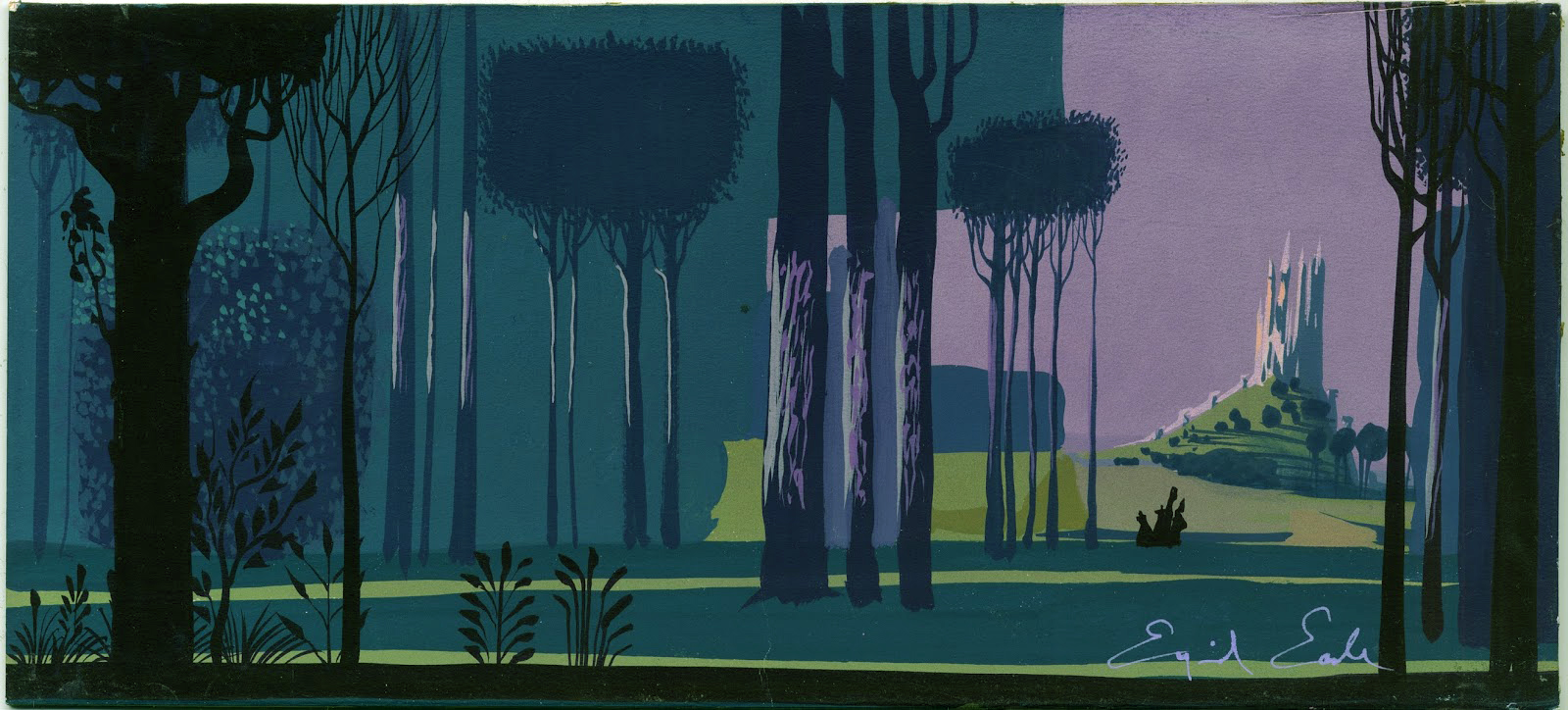
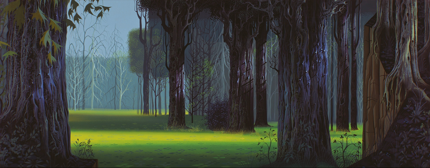
it’s very interesting to see the style evolve over the months EARLE was working on it. how he comes up with a special technique, the use of a sponge, to give the bark on the forest trees their typical look. and how he repeats the same sponge look on the stone walls in the castle. somehow he needed to bring the look of the forest and the castle interior together, another element was the long stretched cathedral-like pillars in the castle, and similar stretched trees. the cottage interior was easier, since there was a lot of wood and bark, together with repetitive textures, repeating what he used on the forest floor, grass patterns. and that came from the persian miniatures.

the choices of color are amazing as well. very tasteful and moody combinations, especially in the forest where the colors range from fresh springlike to very somber and subdued. today, painting in photoshop, it is easy in the last steps to adjust the color range. that way you don’t really have a problem to make dozens of backgrounds painted by a dozen of background painters look similar, and in the exact same color range. but, imagine in those days – everything had to be painted in acrylics and gouache, with a touch of airbrush once in a while. not just the absolute same colors in a sequence, all the details and textures painted the same way. looking at the backgrounds in SLEEPING BEAUTY, they nearly all look like painted by one artist.

the LAYOUT artists –
RAY ARAGON, TOM CODRICK, BASIL DAVIDOVICH, DON GRIFFITH, VICTOR HABOUSH, JOE HALE, JACK HUBER, HOMER JONES, ERNIE NORDLI, MCLAREN STEWARD

and the BACKGROUND artists including EYVIND EARLE
AL DEMPSTER, DICK ANTHONY, FRANK ARMITAGE, RALPH HULETT, BILL LAYNE, FIL MOTTOLA, WALT PEREGOY, ANTHONY RIZZO, RICHARD H.THOMAS, THEKMA WITMER

© walt disney enterprises


disney historic 1.4 part 3

12 06 2020

first I would like to refresh your memory with an art timetable, where you can locate the different style epochs and their according years in time.

wherever you go to study the architectural details of some of the GOTHIC cathedrals, CHARTRES, REIMS, PARIS, COLOGNE, ULM, MILAN, AMIENS, or SALISBURY, you will find the same style elements. it is interesting to compare those characteristics with the style of the handwritten lettering of the manuscripts. it is mainly the emphasis on the vertical and the playful ornamental opening-letter designs that seem to be repeated in the supporting beams outside the cathedral as well as in the stainless window structures.

what EARLE doesn’t mention in his autobiography, is one of the key reference elements for the style of SLEEPING BEAUTY, the french tapestries around the UNICORN. THE HUNT FOR THE UNICORN and THE LADY AND THE UNICORN, 15th century. JOHN HENCH, one of the old timers, – layout, background and production design -, had seen the tapestries and recommended them to EYVIND EARLE.

tomorrow I will post the last part…

© walt disney enterprises


disney historic 1.4 part 2

11 06 2020

I was many time in that library, the treasure cove, where additional to all these illustrated books all editions of SIMPLICISSIMUS, PUNCH, FLIEGENDE BLAETTER, NATIONAL GEOGRAPHIC, GRAPHIS, GEBRAUCHS-GRAPHIC, ARCHITECTURE-digests, FILM-journals and so much more were stored. a big room with very tall shelves. you could get lost.

of course, like in EYVIND EARLE’S case, you needed to know what to look for. I am sure he went through all the illustrations of the master-illustrators, and a lot of classical art books. but I guess he knew what he wanted to create from the very beginning. he only needed to check a few ingredients from all that reference.

below the first layout shows an early approach, it could be even JOHN HENCH’S layout EYVIND EARLE mentions in his autobiography. the following designs illustrate how the style evolved to the final look.

here LES TRES RICH HEURES DU DUC DE BERRY from 1410 influenced the look in costume and style for the opening of the film.

more tomorrow…

© walt disney enterprises


disney historic 1.4 part 1

10 06 2020

imagine, once upon a time – there was no internet. you could not ask google whatever you needed to know. well, I remember1990, when I worked on ALADDIN, I accidentally heard about the ORIENTALISTS, painters who painted the middle east around the second half of the 19th century. I had to order those very rare coffee table books in a specialized bookstore in cologne ( walter koenig ), wait for some weeks and then pick them up, 300DM each, 4 books. their weight was probably 6 kg, and they had to be brought to L.A. in my suitcase. google is so much lighter. and cheaper!

when EYVIND EARLE needed his reference art-books, it was easier for him. WALT DISNEY had on his several months long trip to europe in the mid thirties bought whatever he could find about art and especially illustrated children books. JOE GRANT had given him a list what to look for. so DISNEY shipped all those ‘treasure’-books, illustrated by KAY NIELSEN, GUSTAF TENGGREN, EDMOND DULAC, HERMAN VOGEL, LUDWIG RICHTER, ARTHUR RACKHAM, WARWICK GOBLE, GUSTAVE DORE and more, to L.A. where they became the reference for future art directors and production designers.

GUSTAF TENGGREN and KAY NIELSEN had even worked in the disney studio, from the mid thirties to early forties. during that time KAY NIELSEN created many designs for future possible productions, like SLEEPING BEAUTY, but as well THE LITTLE MERMAID, and a beautiful piece THE SWAN OF TUONELA.

more tomorrow…

© walt disney enterprises


disney historic 1.3

8 06 2020

EYVIND EARLE, the production designer, developed the style of the film. he described it in his book – HORIZON BOUND ON A BICYCLE
‘I knew I was going to style SLEEPING BEAUTY, as well as paint all the key backgrounds, and all I had to was to do it in my own style … at home I began practicing doing sleeping beauty’s forest scenes. after all my favorite artists were ALBRECHT DURER, VAN EYCK and BRUEGEL, and all GOTHIC ART, and THE HOURS OF THE DUKE DE BERRY. the whole project fit me like a glove … JOHN HENCH had just about finished two masterful layout drawings in black and white of two forest scenes. they were given to me to paint as I wished. JOHN HENCH’S renderings were RENAISSANCE ROKOKO to my mind. I wanted stylized, simplified GOTHIC. straight tall perpendicular lines like gothic cathedrals. the figures should be straight and tall and thinned out and elongated like gothic sculpture. I took john hench’s masterpieces and straightened up the curving bending winding trees. I used one-point perspective. I rearranged the bushes and trees in geometrical patterns. I made a medieval tapestry out of the surface wherever possible. all my foregrounds were tapestry designs of decorative weeds and flowers and grasses. and since it is obvious that the gothic style and detail evolved from the ARABIC influence acquired during the CRUSADES, I found it perfectly permissible to use all the wonderful patterns and details found in PERSIAN MINIATURES. and since PERSIAN MINIATURES had a lot in common with CHINESE and JAPANESE ART, I felt it was ok for me to inject quite a bit of JAPANESE ART, especially in the close up of the leaves and overhanging branches … I started taking close up photographs of every different bush or tree I could find in the san fernando valley, and then I took VAN EYCK, and PETER BRUEGEL, and ALBRECHT DURER, and BOTTICELLI, and THE HOURS OF THE DUKE DE BERRY, and the PERSIAN, JAPANESE and GOTHIC ART, and on top of that all that I injected a little piece of EYVIND EARLE.’

© walt disney enterprises


disney historic 1.2

5 06 2020

© walt disney enterprises


disney historic 1.1

4 06 2020

I am starting this new series with one of my favorite animated feature films, a classic artistic masterpiece from 1959 – SLEEPING BEAUTY. you might know the details about the film, so I won’t bother you with that. I am interested in the artists who created this very unusual piece of art and you will see a lot of those behind the scenes pictures. enjoy…

© walt disney enterprises


recreated animated treasures 2

24 01 2017

from disney’s SLEEPING BEAUTY two more recreated multiplane background pans. note in the second BG the perspective- and subtle color-change

sleeping-beauty-pan-forest-a1

sleeping-beauty-pan-forest-b

© disney enterprises, inc


recreated animated treasures 1

2 10 2016

now that I got most of my favorite animated films in blu-ray I realized with pain I probably have to redo most of my recreated backgrounds. they were all done with screen captures from DVD’s. you can see in the recreated BG from disney’s SLEEPING BEAUTY below the big difference, so much more detail and it nearly looks like the original artwork in front of you. blu-ray even reveals sloppy jobs or painting mistakes once in a while. this forest BG might not exist like that in the disney archives, because it was painted in 3 different layers, a masterpiece! I am sure it was painted by EYVIND EARLE himself.

sleep-beauty-recr-bluray9-16

© disney enterprises, inc


beauty

30 08 2012

the reason why I recreated this stunning background from disney’s SLEEPING BEAUTY was pure curiosity, I hope the original is still in the disney archives ARL. it is a long and complicated combined pan with a camera-turn, must have been pretty long in three multiplane layers in original, I guess in 2 pieces, where the cut edges could have been covered by the foreground foliage. I explain some of the details in the first image. the tilted angle is the result of the camera turn – I started with the recreation in the normal horizontal position of the first frame, the second image shows the whole BG in a better readable angle. see the beauty of this piece of art yourself, the first reaction might be – incredible, all the detail! yes, but it doesn’t look overloaded like so many backgrounds today and the characters read perfectly clear, because the color range and the values are very close. amazing as well the composition – the cathedral-like trees that create the ‘background’ with the more irregular and curvy tree-shapes in the foreground. the foliage adds the playful rococo detail in front of everything. it is all controlled and looks so light.


© disney enterprises, inc


style 8.3

25 06 2010


I have seen and studied the film SLEEPING BEAUTY many times. there is not one background-painting that is not on style, has not enough, too much or the wrong detail. the film is in superwidescreen ( super technirama 70, that is a 70mm filmformat ) and the composition in every single scene is a masterpiece. not one part of the entire movie is colorwise out of place, everywhere the characters read perfect in their environment, and – these characters are all painted on cels, with matching color-outlines.


today it is so easy to color-correct digital images. imagine the challenge in the mid-fifties, imagine multi-layered multiplane scenes, where the character-colors had to be adjusted to the amount and green-shading of the glass layers in front. it is hard to believe, that all these visuals look flawless, perfectly controlled. and I am not even talking about the numerous background painters, who had to follow the style that EYVIND EARLE had developed.


he first needed to come up with a look and to paint all possible different locations in the film to give examples of the look of wood, stone, foilage, grass, rocks, trees, metal, pottery and more, so the team could follow and copy his style. I am sure he painted some hundred backgrounds. I know that he had an incredible knowledge of art-history, he knew paintings and styles from all over the world. without a knowledge like that you could not have the idea what different artforms to combine. these ingredients can be from areas far away, time- and locationwise. imagine – to mix medieval, gothic art from the 13th century with little details of persian-, japanese- and indian art, to create a forest that reminds you of the interior of a cathedral, and the grass fields of ancient tapestries.


some critics say the backgrounds are overpowering, dominate the look of the film. not for me. I think it is the perfect balance of a fantastic fairytale world, an operastage with flawless characterdesigns and animation. a true masterpiece and a piece of art that you won’t find anymore nowadays.


© disney enterprises, inc


style 8.2

24 06 2010


EYVIND EARLE wrote in his autobiography – HORIZON BOUND ON A BICYCLE

‘I knew I was going to style SLEEPING BEAUTY, as well as paint all the key backgrounds, and all I had to do was to do it in my own style. how utterly simple it was going to be for me. at home I began practicing doing SLEEPING BEAUTY’S forest scenes. after all, my favorite artists were ALBRECHT DUERER and VAN EYCK and BRUEGEL, and all GOTHIC ART, and the HOURS of the DUKE DE BERRY. the whole project fit me like a glove. AL DEMPSTER told me it wasn’t fair of me to practice on my own time at home, but after all, I had been trying to get into disney for fifteen years, all during which AL DEMPSTER, CLAUDE COATS and RALPH HULETT had been making a good living while I struggled and struggled. now it was my turn to show them what I could do…


JOHN HENCH had just about finished two masterful drawings in black/white of two forest scenes. they were given to me to paint as I wished. JOHN HENCH’S renderings were renaissance rokoko to my mind. I wanted stylized simplified gothic. straight tall perpendicular lines like gothic cathedrals. the figures should be straight and tall and thinned out and elongated like gothic sculpture…


…I took JOHN HENCH’S masterpieces and straightened up the curving, bending, winding trees. I used one-point perspective. I rearranged the bushes and trees in geometrical patterns. I made a medieval tapestry out of the surface I possible. all my foregrounds were tapestry designs of decorative weeds and flowers and grasses. and since it is obvious that the gothic style and detail evolved from the arabic influence aquired during the crusades, I found it perfectly permissible to use all the wonderful patterns and details found in PERSIAN MINIATURES. and since persian miniatures had a lot in common with chinese and japanese art, I felt it was ok for me to inject quite a bit of japanese art, especially in the close up of leaves and overhanging branches…


…and then, since everything came from nature in the first place anyway, I started taking close-up photographs of every different bush or tree I could find in the san fernando valley, and then took VAN EYCK, and PETER BRUEGEL, and ALBRECHT DUERER, and BOTTICELLI, and THE HOURS OF THE DUKE DE BERRY, and the PERSIANS and JAPANESE and GOTHIC ART, and on top of that I injected a little piece of EYVIND EARLE. wherever my taste lead me is where I wandered in my search for the perfect styling of SLEEPING BEAUTY.’


tomorrow the final chapter.

© disney enterprises, inc


style 8.1

23 06 2010


EYVIND EARLE was born 1916 in new york city, but moved already after two years with his parents to hollywood. his father, ferdinand, was a professional painter who had studied with ADOLPHE WILLIAM BOUGUEREAU and ABBOTT McNEILL WHISTLER. he soon became a busy art director and scenic artist in hollywood. from early on eyvind was educated by his father in the arts. when he was ten the parents divorced and eyvind followed his father on longer trips to mexico and europe. already after a few years, age 14, he was good enough to have his own art show in southern france. later at the age of 21 he crossed the northern american continent on his bike, painting a watercolor on each of the 42 days it took him. already three years later the metropolitan museum of art bought one of his watercolors for its permanent collection. the same year eyvind started his own christmas card company, printing them as serigraphs. 1951 he joined disney as a background painter, working on FOR WHOM THE BULLS TOIL, MELODY and TOOT,WHISTLE, PLUNK AND BOOM. finally he was offered the position as production designer, color stylist and background painter for SLEEPING BEAUTY. paralell during that time he designed for the shorts PIGS IS PIGS, GRAND CANYONSCOPE, PAUL BUNYAN and LONDON BRIDGE. he colorstyled the night/park sequence in LADY AND THE TRAMP and designed 5 murals for disneyland. in 1958 he left disney and started his own company, producing commercials and title graphics, as well as the logo trademark trailer for universal pictures. later in his life he dedicated all his time to painting, becoming very successful with exhibitions in museums and galleries around the world. in 2000 he passed away, 84 years old.


I want to concentrate in this post and the next ones on EYVIND EARLE’S unparalelled stylistic design for SLEEPING BEAUTY. from what I have heard from artists they worked with him, he must have been a very difficult character to deal with, very demanding. well – look at all the designs and BG-paintings he created for SLEEPING BEAUTY! masterpieces! usually I am not a big fan of extremely detailed backgrounds, but in this case it is different. all the detail in his artwork works as a texture like in the medieval gobelins. he was very careful with the design of these textured elements, like the plants and trees in the forest, the interior of the cottage or the stone walls in the kings castle and the different more mossy walls in maleficent’s ruins, that the paintings never feel overworked. on the contrary, they are the perfect stage for the very designed and less detailed characters. the color-combinations throughout the whole film are some of the most beautiful and tasteful in animation.


© disney enterprises, inc


The Hidden History of Oz

Discover the Secrets of an Enchanted World

WordPress.com

WordPress.com is the best place for your personal blog or business site.

The Hidden History of Oz

Discover the Secrets of an Enchanted World

WordPress.com

WordPress.com is the best place for your personal blog or business site.