style 4

30 06 2009

char.mod dep0

pinocchio.grant5

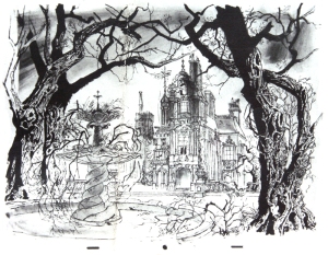
starting in the mid-thirties the disney studio had a CHARACTER MODEL DEPARTMENT. JOE GRANT was in charge of it. some of the artists in that department were – ALBERT HURTER, JAMES BODRERO, MARTIN PROVENSEN, KAY NIELSEN and GUSTAF TENGGREN. most of them were internationally well known illustrators. nielsen and tenggren had illustrated numerous books.

dev.comp 1

joe grant and his ‘think tank’ developed new story ideas, character designs and possible looks for future films. SNOW WHITE AND THE 7 DWARFS as well as PINOCCHIO are stylewise based on gustaf tenggren’s illustrations. kay nielsen was involved in designs for FANTASIA, but did lots of sketches as well for planned projects – like RIDE OF THE VALKYRIES and THE LITTLE MERMAID.

snow35_1

teng035

pinocchio02g

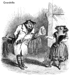
tenggren and the other artists were influenced themselves by some european painters and illustrators like – GRANDVILLE, HEINRICH KLEY, T.S. SULLIVANT, ARTHUR RACKHAM, EDMUND DULAC, CARL SPITZWEG, JOHN BAUER, LUDWIG RICHTER, GUSTAVE DORE and BEATRIX POTTER.

Grandville_Cent_Proverbes_page65

John_Bauer_1917

Gustave_dore_cendrillon4

dulac11

PICT0014

rackham401A

kley 1

spitzweg27

sullivant15-big

beatrix_potter_the_rabbits_christmas_party

© disney enterprises, inc


willows

29 06 2009

disney’s ICHABOD AND MR. TOAD was released oct. 1949. it contains two half hour parts, KENNETH GRAHAME’S THE WIND IN THE WILLOWS, narrated by BASIL RATHBONE, and WASHINGTON IRVING’S THE LEGEND OF SLEEPY HOLLOW, narrated by BING CROSBY. the following recreated pan over a snowy scottish city is from WIND IN THE WILLOWS.

ichab1026

© disney enterprises, inc


marionette

28 06 2009

this is the first of several recreated backgrounds from disney’s PINOCCHIO. fortunately I have seen what is left of these masterpieces in the disney archives ARL. they were painted with probably several dozens of layers of watercolor, more dirty water than color. that technique I guess is the most complicated way to paint and these artists in the forties mastered it with incredible skills. for me the PINOCCHIO BG’s create so much atmosphere in their style, like a short time later the oil-painted backgrounds in BAMBI as well.
this first longer pan was extremely difficult to recreate, because the 3 BG-layers move in different speeds, – so, eliminating the characters in foreground and background was some challenge. but it was worth the time, it is such a beautiful piece…

pino028-609

© disney enterprises, inc


london

27 06 2009

some more recreated backgrounds from disney’s 101 DALMATIANS

101Dal090

101Dal019PAN

101Dal003

101Dal091

© disney enterprises, inc


Nr. 250

26 06 2009

1BG test A3331aa

2cecile

3PICT0022

4PICT0172

6mul951

5tuscany001

6test 2

7gerard

8b+b 89-211

© bilderfabrik
© disney enterprises, inc


style 3

25 06 2009

it is not just the look of the environment that creates the style of a film, the characters are at least as important. both elements have to fit. once in a while you can see that apparently there was never any communication between the character-designer and the production-designer. or when you look at the characters of a recent major disney jungle movie, you can see, that 4 or 5 different character-designers were involved, but nobody coordinated them. at least those characters were well designed, what was not the case in disney’s LITTLE MERMAID. the environment was a disaster as well, no design-direction at all. the film looks like, every background-painter had a chance to paint the way they wanted.
mul017

mul152

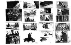
in MULAN’S case all characters were designed by CHEN-YI CHANG, we both worked very close together to make sure the film had ‘one’ look, character- and environment-wise. the leading animators of the main characters were asked to fine-tune their characters, so they felt comfortable animating them. but after that their designs went back to chen-yi to be brought back to the style.

horse066

horse0067

horse068

chen-yi was influenced by BRUCE TIMM’S style, they both had worked on the BATMAN-cartoon series – but as well by his cultural background, chen-yi is from taiwan. he was my most important partner on the film, because he explained the chinese culture to me and gave me always advice for my designs.

VisDev2006-06

VisDev2006-10

© disney enterprises, inc


forest

23 06 2009

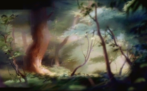
some more recreated backgrounds from disney’s BAMBI.

bambiCCC113

bambi BB45

bambi comp 90

bambi BB7775

bambi BG 22a

bambi reconstr.38AAA

© disney enterprises, inc


lone wolf and cub

22 06 2009

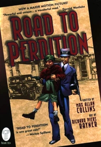
SAM MENDES directed this july 2002 dreamworks release – ROAD TO PERDITION. some critics called it one of the greatest achievements of film-making of this decade. it is not only the good story and perfect acting that makes this film special to me. as source of inspiration mendes and cinematographer CONRAD HALL drew from the paintings of EDWARD HOPPER, especially his NEW YORK MOVIE from 1939. the film has numerous very unusual shots and amazing compositions, with an interesting depth of field use. a big influence for a lot of shots were the panels in the graphic novel, illustrated by RICHARD PIERS RAYNER. I should not forget to mention the outstanding work in this film of production designer DENNIS GASSNER and costume designer ALBERT WOLSKY.

road to perdition

EdwardHopperNewYorkMovie1939 copy

rd to perd.comic

© DREAMWORKS
© edward hopper
© richard piers rayner/max allan collins


style 2

21 06 2009

from my experience it is a challenge to develop a style for an animated feature film, because you as the designer have to invent a unique look that fits the story, looks amazing, can be executed by the studio talent and is not too expensive ( …and fits in the marketing strategies of mc donald’s, mattel or whoever else will be involved in promoting the studio’s film ). besides that you better know what you where doing when you mixed some crazy ingredients in your first design, because you have to repeat it and you need to explain it to other artists.

china doll 5

china doll 6

mul1685

mul1696

once in a while a studio hires a designer to design a film for them in his/her personal style. that’s what disney did with GERALD SCARFE for HERCULES. but usually an artist within the studio, an art director or visual development artist, is selected in case he/she comes up with promising visual ideas for the new project. after the look is found and even management likes it, the toughest part starts – to keep the style consistent and under control. usually there are about 25 – 30 layout artists working on the basic linear design of the environment, and another 25 – 30 background artists to paint the layouts in color. to confront the audience with about 60 different versions of your style is not too good, as you might have seen once in a while on a cheaper DVD. a good film should look like the work of just one artist. that’s where the problems start!

mul1707

mul1683

mul1700

mul687

mul698

mul1702

I remember the major headaches I got when I needed to analyze what the hell I was doing when I painted that one landscape for MULAN and I knew – that was it. usually you don’t come up with a style like a scientist with a new chemical formula, it has a lot to do with feelings, subconscious stuff. and of course you are influenced by paintings, images, films you have seen. in this case it was of course chinese art, chinese caligraphy and a lot of two french painters of the BARBIZON school around the end of the 19th century, JEAN-BAPTISTE-CAMILLE COROT and PAUL DESIRE TROUILLEBERT. the final designer of BAMBI, TYRUS WONG, with his impressionistic and simplified interpretations of a forest-world, was a big influence as well. and then probably my amateurish way to paint with acrylics in that big 12 field size, what I had never done before. everything I ever designed before was about 20 x 10 cm, and done with feltpen. all that somehow got mixed the right way, with a lot of luck. now I had to explain the recipe to all the other artists.

mulan 1

mulan 2

mulan 3

mulan m1

we had started the film after some problems with relatively simple environments, like the army camp and mulan’s house. it was good that way, we got slowly used to a new look. later we were confronted with major problems, – the avalanche and the palace. at that point we needed to add more detail ( against the style-rules ), otherwise the mountains and the palace would have looked like toy-pieces. but it worked! because everybody went through a learning period, after a while it was everybody’s style. the mulan-look had nothing to do with my personal style, the work on it changed my understanding of design completely. even today I can see that experience in my work. the early designs were just a start, the mulan-style grew with the film. we just needed to follow the rule – poetic simplicity!

© disney enterprises, inc


midnight 9

20 06 2009

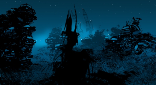
some of you wanted to know about the technique the MIDNIGHT designs were done with. as you can see here it was all sketched very rough with a black japanese brushpen on paper. some more texture was added in photoshop, as well as the color. lookwise I was inspired by german expressionistic films like CABINET OF DR.CALIGARI, DER GOLEM and FAUST.

after midnight sketches

midnight roughs

© bilderfabrik


more baghdad

19 06 2009

following are some more sketches for disney’s ALADDIN

alad 11.90-1391

alad palace garden0135

aladdin romance

PICT0134

PICT0125

PICT0153a

alad 24.8.90-1301

PICT0136

© disney enterprises, inc


style 1

18 06 2009

as I mentioned in one of the last posts, WALT DISNEY did not hide the fact that he hated the look of 101 DALMATIANS. well, I think he should have known from day one in visual development how the film might look like. as head of the studio he would have had the power to change the style of the film very early. but I am sure he knew that this look was the only way to combine the new animation-XEROX-technology, that made it possible to show 101 black-spotted characters, with a more modern non-fairytale environment, and – for a very low budget! a MARY BLAIR-style fifties-london would not have worked. even a LADY AND THE TRAMP-like more realistic BG-style would have been too soft and probably even more expensive. I admire the solution these artist, especially KEN ANDERSEN, came up with.

ken98

ken099

ken097

when I met KEN ANDERSEN in 1991 he talked about the first test screening of a part of the film. walt disney was with his back towards him and said to someone ‘I hate this stuff, KEN did!’ for ken andersen that was like a shock. he worked for another year to finish the film and during that time walt disney never talked to him anymore. ken remembered, walt always wanted to have nearly 3-dimensional animated characters, like in live action films, so the audience would forget they watched animation. that’s why he hated clear contours, especially the ‘inches-thick’ xeroxed outlines blown up on the big screen. ken said, walt disney was not willing to finance more films for over $ 8 million after SLEEPING BEAUTY. that’s why he, ken, had pushed the development of that very complicated and revolutionary technique,that made it possible to produce the DALMATIANS for only $ 3.5 million. he recalled the moment when he saw walt disney returning from the hospital after his lung-surgery. ken saw him shortly on the stretcher, walt did not look very good but he was happy to see ken. so, said ken, finally 2 weeks before his death he did forgive him.

ken91

ken92

ken093

© disney enterprises, inc


more jiri trnka

17 06 2009

trnka 0

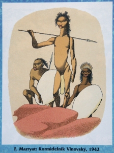
you might have noticed that JIRI TRNKA is one of my favorite artists. a while ago I posted some of his puppet animation artwork and a few children book illustrations. here is some more, a lot of his earlier work…

trnka 2

trnka 1

trnka 4

trnka 3

trnka 6

trnka 8

trnka 10

trnka 11

trnka 12

trnka 13

trnka 14

trnka 15

trnka 16

© jiri trnka


farm

16 06 2009

this is one of my favorite scenes in disney’s 1961 released 101 DALMATIANS. the whole film is one of my favorites, it has a very good story, the animation is beautiful, and because of the by UB IWERKS developed new XEROX-technology you can even enjoy the original animation drawings. since I first saw the film in 1962 I was fascinated by the look of the film. KEN ANDERSON developed the ‘line-art look’, based on RONALD SEARLE’S caricature style. he told me that SEARLE was a close friend and they had exchanged a lot of sketches. the use of color, developed by WALT PEREGOY, is very interesting as well. the linear drawings, where thick and very thin sketchy lines are mixed, were xeroxed and superimposed on the background layer. the color-blocks in these BG’s were never matching exactly the linear outlines, they were slightly offset. without the lines they look like a CUBIST-style piece of art. for me it is the perfect combination of line and color. and it works very well with the characters, with their xeroxed lines. the color overall in this masterpiece is so well chosen, the characters always read in front of the BG’s with most of the time a lot of line-information. all these ingredients create an atmosphere that caught me when I first saw the film and it still does.

101Dal057F

101 dalm.0044l

101 dalm.0044aa

© disney enterprises, inc


midnight 8

14 06 2009

trash pan 609B1a flat

© bilderfabrik


1938

12 06 2009

the following recreated backgrounds are from disney’s DONALD’S BETTER SELF, released march 1938. beautifully painted in the common watercolor technique of that time.

better self003

better self004

better self021

better self025

better self031

© disney enterprises, inc


tiger 2

11 06 2009

the following sketches were part of my work for disney’s ALADDIN in aug. 1990. a stone-tigerhead was supposed to erupt out of the desert sand. his mouth was the entrance to the huge cave-labyrinth where the lamp was hidden. besides the tigerhead I could work on the cave, with the treasure room and the lamp-rock, as well as the chaos climax with lava eruptions, underwater scenes and the carpet flight through the cave. more designs later…

alad163

alad165

alad166

alad167

alad168

alad169

PICT0120

© disney enterprises, inc


H.K.

9 06 2009

several years ago I was asked to do some logo-designs for HONG KONG DISNEYLAND. a condition was, I had to use the typical disneyland castle design somehow. since the MULAN-days I had become familiar with chinese brushes and had even looked into their caligraphy. so I tried the castle in a ‘chinese brush look’. later I added some typical blossoms. the lettering, a combination of the famous disney ‘D’ and the H.K. – hong kong letters was fun too. unfortunately the client choose a different, less fancy version.

hongkong dis

© disney enterprises, inc / WDI


# 2 3 6

8 06 2009

nature comp AA

some statistics inbetween – this is post # 236 and the blog is about 9 months old. I found some very old artwork from BEAUTY AND THE BEAST and ALADDIN, as well as BALTO. will prepare it for some of the next posts.
there will be of course new recreated BG’s, and more historic documentation. the digital transfer of the color-slides takes a while, but more soon.


midnight 7

7 06 2009

harbour mood

© bilderfabrik


The Hidden History of Oz

Discover the Secrets of an Enchanted World

WordPress.com

WordPress.com is the best place for your personal blog or business site.

The Hidden History of Oz

Discover the Secrets of an Enchanted World

WordPress.com

WordPress.com is the best place for your personal blog or business site.