
roughs and final look from disney’s BAMBI –

© disney enterprises, inc
the left part of the combination is from the 1942 published book THE ART OF WALT DISNEY, by ROBERT D.FEILD, mc.millan company N.Y.
roughs and final look from disney’s BAMBI –
© disney enterprises, inc
the left part of the combination is from the 1942 published book THE ART OF WALT DISNEY, by ROBERT D.FEILD, mc.millan company N.Y.

from 1985 until 1991 I was one of the team-members who brought ALFRED J.KWAK alive. the others were HARALD SIEPERMANN and dutch entertainer HERMAN VAN VEEN. in some earlier posts I talked about the comic- and tv-series and how it happened. here now are some rare pieces, the first planned comic cover, some comic strip samples and calendar illustrations.


© harlekijn / herman van veen / harald siepermann / hans bacher
WILHELM M.BUSCH illustrated GIACOMO CASANOVA’S MEMOIRS in 1965. the technique – ballpoint pen with watered black ink. little masterpieces!


© wilhelm m.busch / bertelsmann publishing
the well known fairy tale of the hare and the hedgehog was first illustrated by GRANDVILLE, LUDWIG RICHTER and GUSTAV SUS in the 19th century. the BROTHERS DIEHL produced 1937 in their puppet animation studio in munic, germany, the ‘race between the hare and the hedgehog’, a 15 min animated jewel. in their characterdesign they were inspired by the earlier illustrated versions. like GEORGE PAL, the BROTHERS DIEHL had developed their own technique that allowed them to change facial expressions of their puppets.


in the late forties the hedgehog character became the mascot of a well known german radio-, later tv-magazine HOER ZU, the rights were acquired and in 1950 the drawing artist REINHOLD ESCHER started the first illustrations of the character for the magazine. soon the hedgehog character became a merchandise hit in germany and in september 1951 the first MECKI-adventure as a weekly comic strip was born, illustrated by ESCHER, who was supposed to draw these adventures for the next 25 years. he invented several new characters as MECKI’S companions, CHARLY PENGUIN and the always tired SCHRAT. ESCHER succeded over the years to create his own universe with these characters.


in 1958 a well known illustrator, PROFESSOR WILHELM PETERSEN, was added to the weekly comic-strip team and from then on until 1969 the two illustrators were delivering the stories alternating.


additional to the weekly comics a series of childrenbooks was produced, starting in 1952. REINHOLD ESCHER illustrated the first book, all the following 12 books were done by PETERSEN. in later years several illustrators have tried to follow what ESCHER and PETERSEN had started, but nobody succeeded. the taste of the younger audience had changed as well and they preferred other heroes. here is a selection of historic photographs, magazine covers and comic/book illustrations.


© axel springer publishing / hoer zu
© reinhold escher / prof.wilhelm petersen
© eckart sackmann / comicplus
© F + H. diehl
here is a link to the REINHOLD ESCHER website with hundreds of pictures
if someone is interested, the reprinted MECKI books as well as the comic strip collections of the years 1958 and 1959 are available through AMAZON-GERMANY

© disney enterprises, inc
the recreated backgrounds are from the 1942 MGM short THE EARLY BIRD DOOD IT. it was the second cartoon TEX AVERY directed at MGM, animated by IRV SPENCE, PRESTON BLAIR, ED LOVE and RAY ABRAMS.


it is very interesting to compare the backgrounds of the different studios around that time. the recreated pan below is from disney’s THE PRACTICAL PIG, released three years earlier in 1939. painted in the same watercolor technique typical for that time, the backgrounds reveal big differences in painting skills as well as in layout composition and more sophisticated camera moves. the entertainment value though is much higher in the AVERY-shorts ( in my opinion ).

© MGM
© disney enterprises, inc
there are two reasons for this post – first – it is july 21 and I think it is about time to post some good drawings. second – I wanna give the ‘borrowers’, who never mention where they steal their posts from, a chance to borrow some more. the animation-drawing selection is from disney’s JUNGLE BOOK and THE SWORD IN THE STONE, the animator of course was MILT KAHL.


© disney enterprises, inc

here are some more layouts and final backgrounds to compare, from the disney animated feature films – BAMBI ( 1942 ), MELODY TIME – ONCE UPON A WINTERTIME ( 1948 ) and 101 DALMATIANS ( 1961 ). as usual it is very interesting to compare the changing styles as well, in layout and in background.


© disney enterprises, inc
SIR WILLIAM RUSSELL FLINT, 1880 – 1969, is probably one of the best known english watercolor artists. in the early 1900s he illustrated for the ILLUSTRATED LONDON NEWS, following were book-illustrations like SOLOMON’S SONG OF SONGS and a four volume edition LE MORTE D’ARTHUR. in his later work he concentrated on oriental themes. besides his beautiful watercolors he was a passionate drawing artist and published several books with studies and sketches that reveal his love for art and stunning models. he was member of the royal academy, president of the royal watercolor society and was knighted in 1947. below is a small selection of some of his watercolors.


© sir william russell flint


this is where it all started – in ESSEN WERDEN in germany, sept.1969. FOLKWANG SCHOOL, – a very well known artschool, follow-up-school of the BAUHAUS in dessau 1919 – 1933. I even had a few teachers they were taught by bauhaus teachers. that’s why the education-program was pure BAUHAUS, very academic. the selection process based on a submitted portfolio was tough – only 40 students from about 500 were accepted.
of course I could not believe how lucky I was when I got the news that I made it. it was the best time in my life, being able to draw all day together with others as obsessed as I was, learning from teachers we admired. and the school itself was something, it had been a monastery in the 14th century, a pretty big arrangement of very old buildings, with that typical old smell. the mensa looked like AUERBACH’S CELLAR in THE TALES OF HOFFMAN. and the whole village of WERDEN in the hilly suburbs of ESSEN was very charming, with medieval pubs and traditional old houses.
we had lots of fun – some of the parties took place in a house, built in 1377, where two of my friends lived. a lot of the older semesters met during events like that, from all the other faculties as well. very similar to the CAL-ARTS school in valencia/L.A. we had MUSIC, THEATER, DANCE and of course DESIGN, what included GRAPHIC DESIGN, PHOTOGRAPHY, SCULPTURE, PRINTING, TEXTILE DESIGN, INDUSTRIAL DESIGN and PAINTING.
because I had friends in all the other faculties I had a chance to get some 2nd hand education in all those directions, especially PHOTOGRAPHY, TEXTILE-and INDUSTRIAL DESIGN. it was a very good school and a lot of the photography students at that time are today world famous photographers with MAGNUM and NATIONAL GEOGRAPHIC. the illustration and industrial design group was very well known as well, leading in automobile- and camera design. anyway, at that time we had a lot of different things than to study in our minds.
funny is, that a few years later I started to teach there myself, part time, animation and comic strip illustration. and I became very close friends with a lot of my former teachers. the school had been integrated into the university of essen and the old charme was gone.

may 1958 an eight minute special – MAGIC HIGHWAY U.S.A. – premiered in the DISNEYLAND tv-show, it was directed by WARD KIMBALL. like common in those days and like in OUR FRIEND THE ATOM, it showed a very optimistic future of the american street- and freeway-system. at that time it was ‘science-fiction’, today we laugh. so don’t look at it for the content. I always liked the style of the backgrounds though, very close to architectural renderings. following are some stills and recreated longer pans.


© disney enterprises, inc

today I will compare the different looks of trees throughout the world of classical art over a period of about 600 years. when you look at these trees you have to separate the different elements – the ROOTS, the TRUNK and the CROWN. sometimes parts of the ROOTS are above of the earth and create nice curvy shapes against the usually pretty straight TRUNK. the TRUNK with its BARK can have a smooth or very textured surface. the CROWN is sometimes shown just as a shape or with the FOLIAGE, with all the different leaves on smaller branches. you have to differentiate as well if they are DECIDUOUS TREES ( leafs ), NEEDLE– or PINE-TREES or tropical PALM-TREES. then the SEASONS make a big difference, in shape and color. in winter you only see the tree skeleton in case of the leafy trees with a lot of thinner branches, in summer you have a big mass of foliage. in spring the leafy trees develop blossoms first, very important in japanese and chinese art. autumn adds some bright red, orange and sienna brown colors, spring shows juicy yellows and greens. as you can imagine and see in some of the paintings as well, all that creates already an incredible variety. the early paintings in the western world were done for religious reasons, the figures were more important. that’s why the backgrounds are more the idea of the environment. throughout the medieval times that changes, the worlds becomes more and more realistic. then in more modern years it develops again the other way, portraying and abstracting the idea of nature, this development is similar in all different cultures. the paintings I combined show you how rich our world of art is, how beautiful and very unique the artists from around the world and through times painted what they saw. this time I wanted to concentrate just on TREES, in some future chapters I will do the same with different elements.
![]()


JOSEPH CHRISTIAN LEYENDECKER was born 1874 in montabaur, germany and died in 1951 in new rochelle, united states. he is probably best known for his SATURDAY EVENING POST cover illustrations, between 1896 and 1950 he painted more than 400 of them. but he created as well numerous posters, book- and advertising-illustrations ( the ARROW COLLAR MAN and KUPPENHEIMER SUITS ). NORMAN ROCKWELL was a good friend, and you can see in his early SATURDAY EVENING POSTERS a strong resemblance to LEYENDECKER’S style. the mainstream image of santa claus as a jolly fat man in a red fur-trimmed coat was popularized by leyendecker, as was the image of the new year baby.


© j.c.leyendecker / saturday evening post

continuing with the series TREES IN ART I show you in this chapter a selection of illustrations from children-books and comic-strips, covering a period of about one hundred years. from ARTHUR RACKHAM and KAY NIELSEN to artists I found in recent years through their blogs. RACKHAM and NIELSEN influenced the background style of the early animated films, NIELSEN even worked at disney for a while. JIRI TRNKA is best known for his stunning puppet-animation films and EDELMANN styled the animated feature YELLOW SUBMARINE and influenced probably a whole generation of artists. stylistically it is a wide range, the pen+ink children-book style from the beginning of the last century, RIEN POORTVLIET’S very realistic nature studies and on the other end CHARLY HARPER’S extreme graphic style. for me some of the most interesting styled illustrations are from HEINZ EDELMANN, JORGE GONZALES, TADAHIRO UESUGI and FREDERIC BEZIAN. most of them have their own blogs and it is worth to check their work. the influence of different ART-styles in general is obvious, more about that in the next chapters – TREES IN ART.
![]()


probably around 1950, when I was two years old, I got a very simple childrenbook DORNROESCHEN ( SLEEPING BEAUTY ). the paperquality is typical ‘post-war’ and the printing is not better, below are the few pages that survived all these years. I found them some years ago buried with other old stuff, and I was shocked about the incredible bad illustrations. pure horror! it’s not only that there is not one appealing character, the way they are drawn is the worst, not to talk about the color choices. I can’t excuse that with the poor post-war times. anyway – since those days and after that horrific childrenbook experience ( you might see it in my 2-year old comments I left on the drawings ) I have collected the best childrenbooks I could find in bookstores all over the world. I have to admit, even today you see once in a while something that should not be printed, especially not for children…


EYVIND EARLE explained how he found the style for disney’s SLEEPING BEAUTY, a combination of medieval gothic art with persian miniatures mixed with his own vision. it is very interesting to look at the different animated films of the past and analyze their style development. their designers were of course influenced by the different arts of their time, some had their own style and used it for the look of the films they worked on. but a few of these artists wanted to create a style that fit the story and the culture where it took place. naturally they used elements of existing arts from these cultures and mixed them with interesting other ingredients. it shows that most of them had a good knowledge of art in general, a lot did some extensive research.
the disney studio had for that reason a huge library that still exists, the WDI research library. I spent hours there and found copies of all existing art- and design-magazines from their first edition on from all over the world. tall shelves filled with the swiss GRAPHIS magazines, the english PUNCH, the german NOVUM, all NATIONAL GEOGRAPHIC editions, the american old LIFE magazine, specialized magazines about painting, sculpture, architecture, photography, fashion. then in a different room the vast collection of reference books, thousands! there was even a ‘cut-out’-archives, personal collections of artists who gave them to the library. it was like being in heaven! you could spend hours. and going through the books you could find the disney-designers names with the dates when they borrowed the books from the library. when I visited the library I was usually alone, not too many artists used the chance and the offer of all these treasures.
it is easier today to get some of that information through the internet, but – you have to know what you are looking for. to give you some ideas I chose as a start one theme – TREES – and followed their very different styling through the arts. in the compilation below I mixed very different films from different studios and from different years to show the incredible variety of styles. in the next posts I will analyze where some of these looks were borrowed from.
![]()

© disney enterprises, inc • richard williams animation • miyazaki • UPA


© sullivant • herriman • watterson • hirschfeld • steadman • searle • feiffer • scarfe • moebius

© bilderfabrik


© eugene galien-laloue
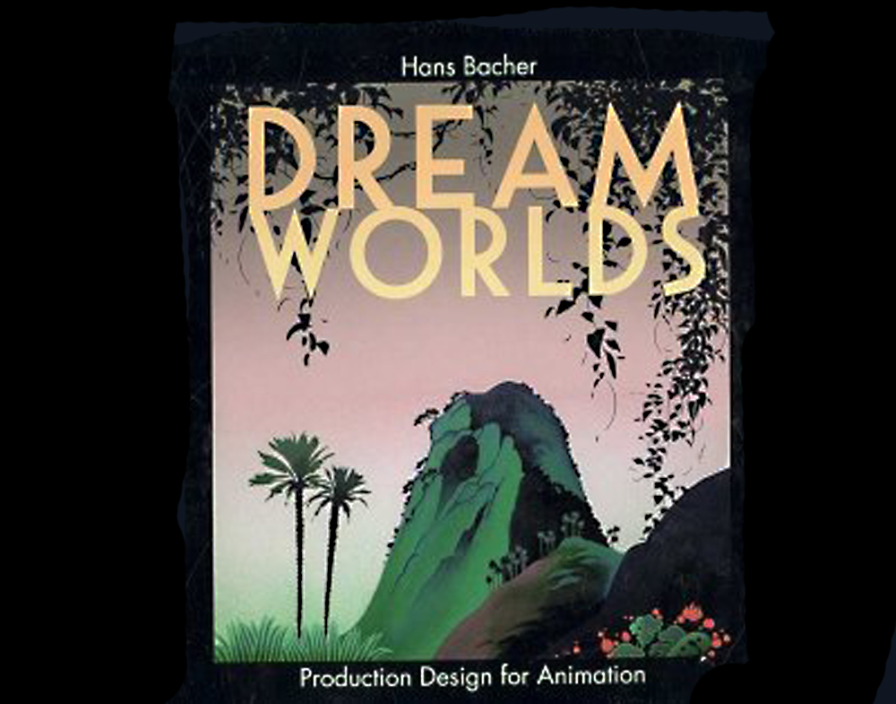
my name is hans bacher, – I work as production designer in the animation film industry. for the last 45 years I lived and worked in exciting places around the world. after 7 years of teaching in singapore I am back at my homebase in manila, working on a few more books.

Discover the Secrets of an Enchanted World
WordPress.com is the best place for your personal blog or business site.
Discover the Secrets of an Enchanted World
WordPress.com is the best place for your personal blog or business site.


Recent Comments