film composition

10 02 2021

this is a bigger post, I could have spread it into smaller ones over several days. but it is just more work, wordpress doesn’t make it easy nowadays to post, it’s not fun anymore.
anyway – following you gonna see 34 comps with in total about 700 captured scenes from live action films and commercials. I selected them mostly for composition, sometimes for color or because the shot was just very interesting. in one of the next posts I am gonna explain a bit more about the main ingredients of a good composition. but for now – take your time…


composition 3

30 05 2020

today some more composition ideas from major comic strip artists – moebius, jim holdaway, dino battaglia, hugo pratt, alex nino, john watkiss, sergio toppi, al williamson, alberto brecchia, john burns

© moebius, jim holdaway, dino battaglia, hugo pratt, alex nino, john watkiss, sergio toppi, al williamson, alberto brecchia, john burns


composition 2

29 05 2020

comic strips usually work with the same rules that apply for film, especially when it comes to the composition of the panels. interesting placements of the characters, their framing, viewing angles, the general readability and depth of the scene, balance of elements as well as a dramatic use of light can be found especially in comics done by the masters. I collected some interesting ‘shots’ from a wide diversity of artists – MOEBIUS, HUGO PRATT, ALBERTO BRECCHIA, JIM HOLDAWAY, AL WILLIAMSON, SERGIO TOPPI, JOHN BURNS, ESTEBAN MAROTO, DINO BATTAGLIA and others. first I only concentrated on their black/white work.

© MOEBIUS, HUGO PRATT, ALBERTO BRECCHIA, JIM HOLDAWAY, AL WILLIAMSON, SERGIO TOPPI, JOHN BURNS, ESTEBAN MAROTO, DINO BATTAGLIA


composition collection

10 07 2016

composition sketch comp 2016 A

composition sketch comp 2016 B


composition studies 2

20 01 2016

compos.4 blog

screen captured composition studies from a variety of commercials

comm.compos.BB 1012

comm.compos.CC 1012


composition studies 1

29 10 2015

compos.2


scenic composition 1

2 04 2009

ipcress-comp

wings-of-dove-comp

© RANK ORGANISATION
© MIRAMAX FILMS


composition 1

14 03 2009

composstudies2894


interesting choices 1.1

2 01 2021

to continue with my series about composition in film I have collected hundreds of examples from feature films, documentaries and tv-commercials. together with good composition you will find interesting color and light choices.

here first, as a reminder, the basic ingredients for good composition in film –

PLACEMENT + READABILITY golden section/rule of 3/triangle
LIGHT IN FRONT OF DARK AND VV
FRAMING
YIN + YANG / BALANCE positive/negative…
ANGLES up + down/tilted
STAGE EFFECT
RHYTHM + FLOW / EDITING
DEPTH

there is way more information in my book – VISION, COLOR AND COMPOSITION FOR FILM,
details on the right side of this blog


abstract 1

19 05 2020

in abstract art composition and color are much clearer without the distraction of figures and environment. I find a lot of ideas for new brushes and my own abstract studies in there as well.

below are some of the paintings I created with my new brushes, inspired by abstract art

we are here in manila, where I live, in month 3 of a total lockdown. I hope it helps and we can fight this pandemic. please be safe, wherever you are, we need to get through this – hopefully alive.
I wish you luck and good health
hans


vision – japanese edition

8 06 2019

I am very happy to let you know that VISION-color and composition for film will be on the shelves in japan in a japanese translated version in a few weeks. below a few pages of the translated edition


black friday…

23 11 2018

just noticed – it’s BLACK FRIDAY today, the freaking shopping go crazy day! in case you still have room in your shopping carts, a reminder – my book VISION – COMPOSITION AND COLOR FOR FILM  is available. here is the amazon link


# 33

8 04 2018


a sketch a day 17

23 03 2018


a sketch a day 4+5

11 03 2018


vision 1.3

21 12 2017

here now a few pages of VISION – color and composition for film, together with the cover and the reviews on the rear-cover…


vision 1.2

16 12 2017

‘VISION – color and composition for film’ was printed in singapore, using a relatively new printing process – STACCATO printing.

as you can see the new method of a very sophisticated texturing instead of the before used halftone printing process results in nearly photo-like images. even with a magnifying lens it is hard to see any dots, the typography is more crisp as well. this STACCATO printing method is resolutionwise similar to 175 Ipi ( lines per inch ) in the old halftone printing, and equivalent to 400 dpi in digital resolution.

the paper quality is from the best, 190 gr/sqm matte. I remember criticism about the ‘toilet’-paper quality of DREAM WORLDS. the VISION pages are something else, the images seem to be three-dimensional in their quality and shiny on the matte paper.

enough of the ‘advertising! it just looks good.
below some pictures from the printing, the 15m long printing machine, the different color plates and the quality check.

tomorrow I am gonna show some of the pages and reviews


vision 1.1

15 12 2017

finally – the book is printed, bound, finished! VISION – COLOR AND COMPOSITION FOR FILM is available for pre-order at amazon and probably available in bookstore early next year. I will keep you posted about the latest release news. some details about the book – written by SANATAN SURYAVANSHI and myself, 240 pages, hardcover. approximately 700+ illustrations, same format as DREAM WORLDS and SKETCHBOOK, COMPOSITION FOR FILM. tomorrow some more about the book.


vision 1

18 10 2017

since my new book will go into printing in about 2 weeks I want to give you some more information about it. the title is VISION – COLOR AND COMPOSITION FOR FILM. my co-author is SANATAN SURYAVANSHI, will soon tell you some more about him. my first plans for a book about film-design go back about 10 years, after the publication of DREAM WORLDS. during all my lectures I realized there was a need for some guide where to start with the design process in films, and to explain more about the VISUAL LANGUAGE.

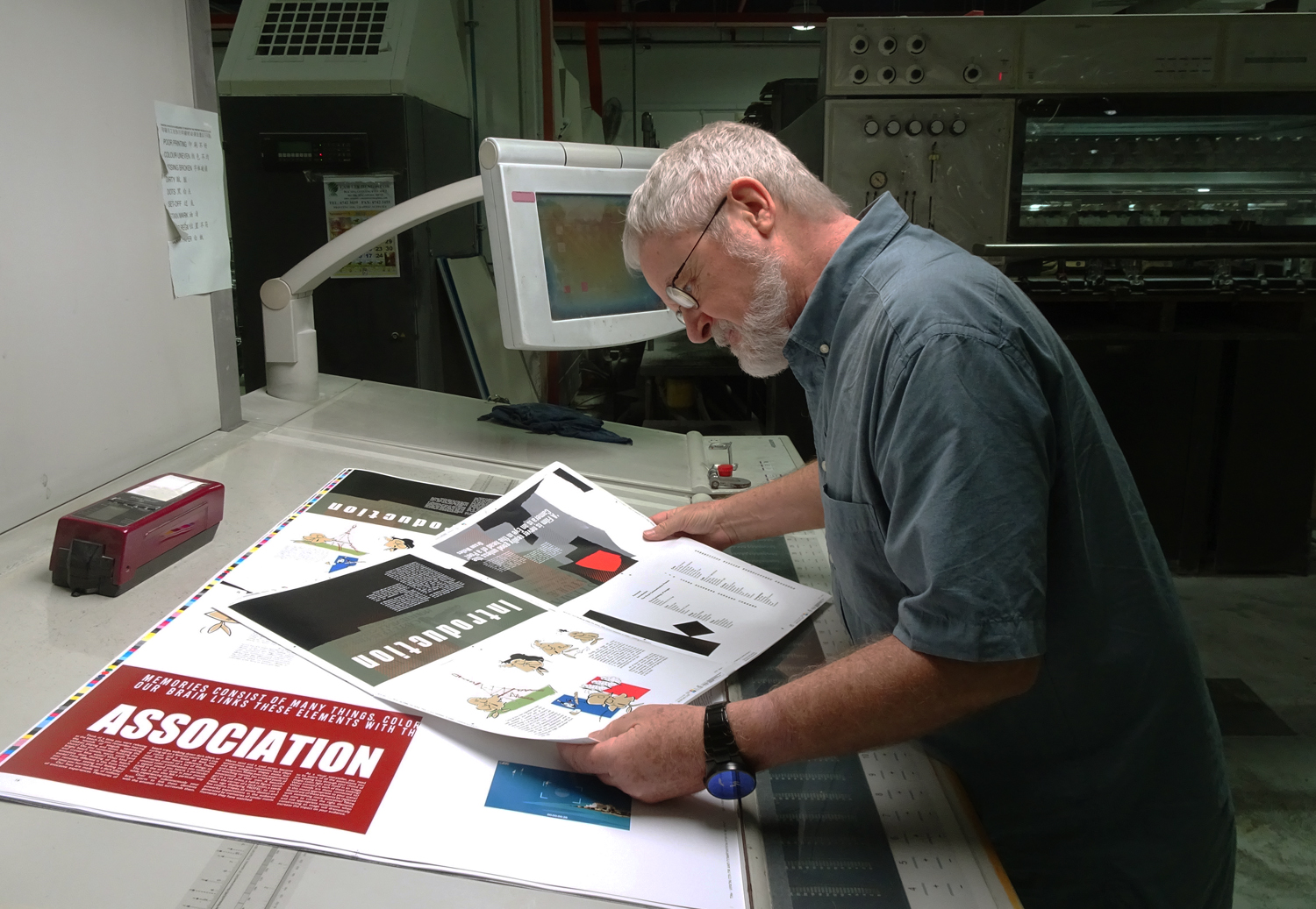
after I had met sanathan in 2010 we discussed the idea to work together on this book, because it seemed to be a bit overwhelming. it was a lot of fun, extremely difficult and time consuming. until now the book was over seven years in the making. we did probably one third of the book twice, reworked chapters, threw complete sections out and developed new ideas. for me, and I guess for san as well, it was like going to school again. I learned a lot, and of course it helped to improve my lectures at the university immense. since I concentrated mostly on the illustrations after a while – there a over 700 in the book – I needed to develop a style for the illustrations that would fit the content and was not overloaded with realistic detail.

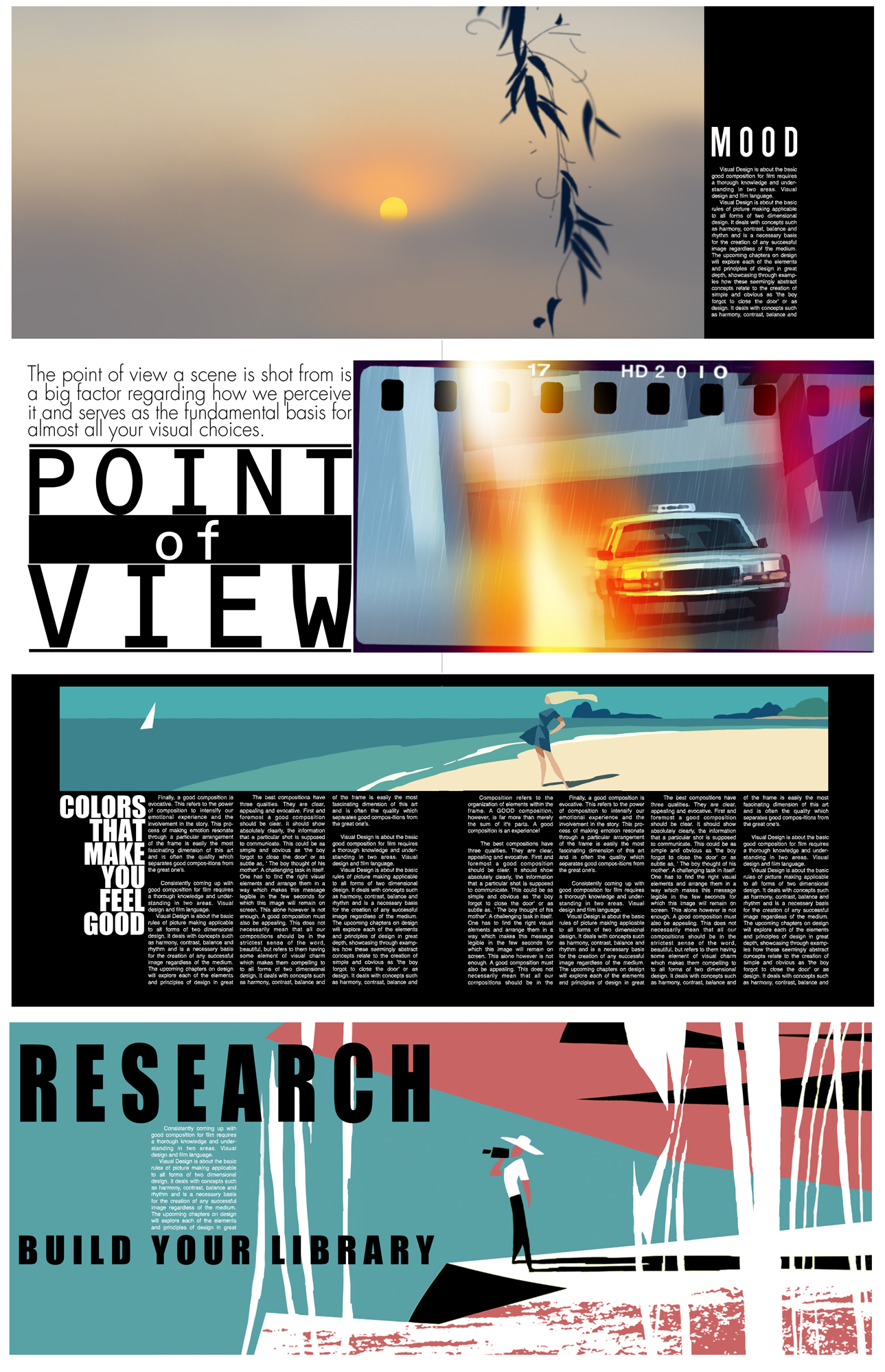
another problem that had to be solved was the layout of the book, we did not want to make the mistake of most books I remembered from school, where the huge amount of text and a boring layout was not inviting you to start and work with it. I wanted the book to look like a magazine, where you could search for interesting spots and get hooked to read more.

I probably created about 100 test pages, where I experimented with different combinations of typography and images. some of those ideas went into the final book layout. because I learned so much about all different aspects over these years I went back and forth changing many pages. you will probably feel that evolving process when you look at the book, what makes it a real text-book – I learned from it as well.

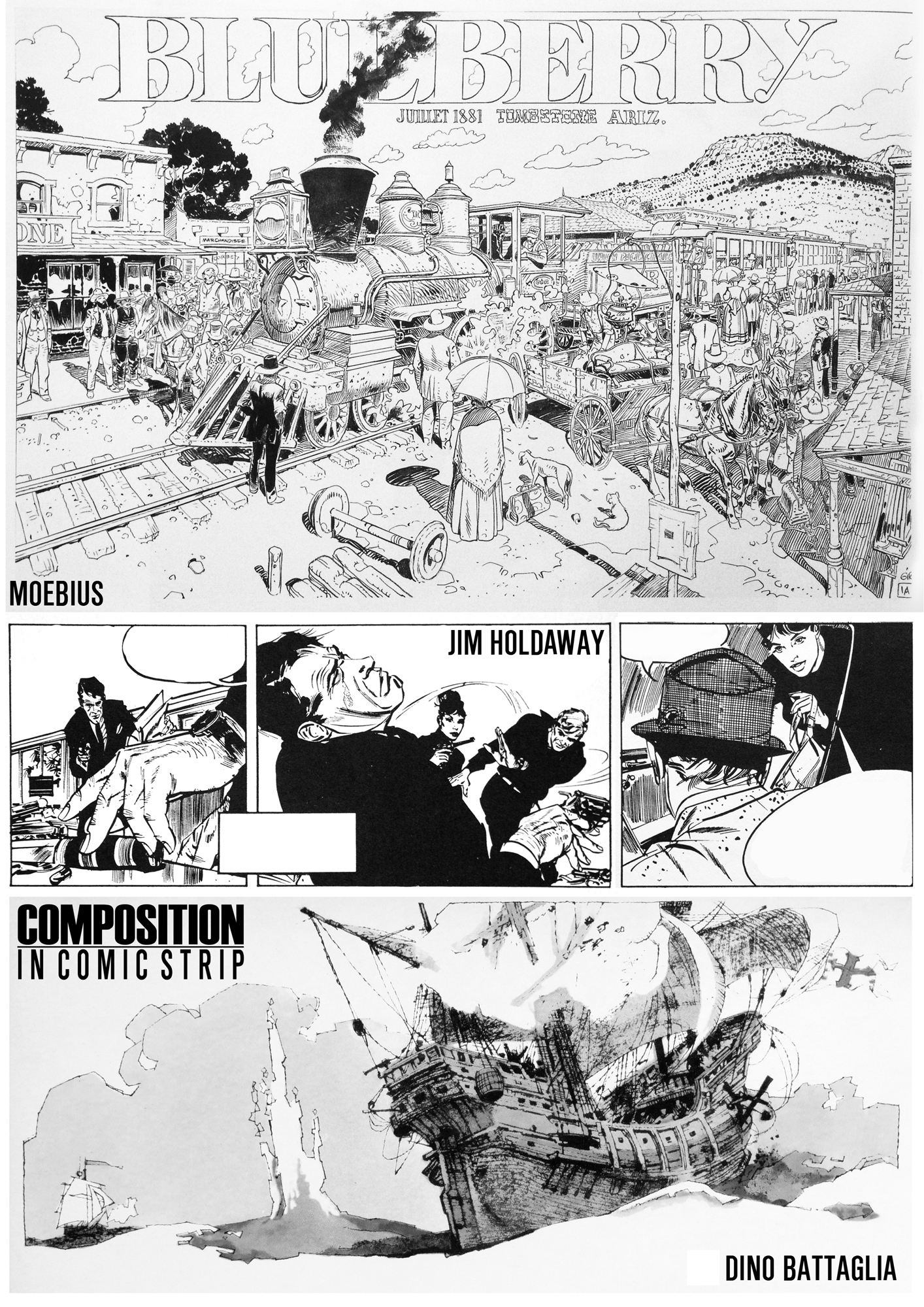
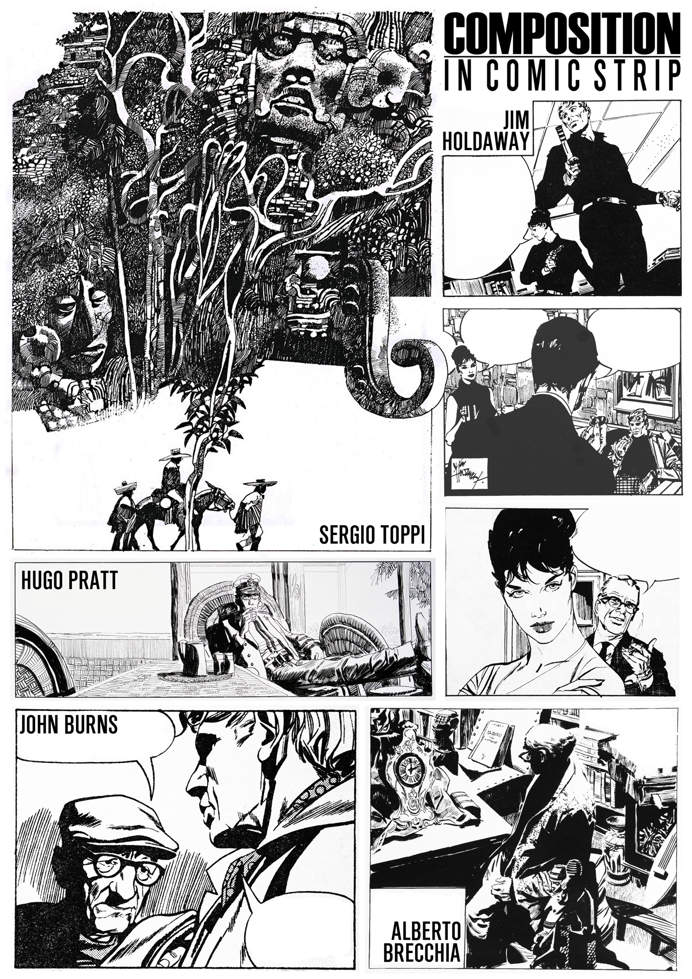
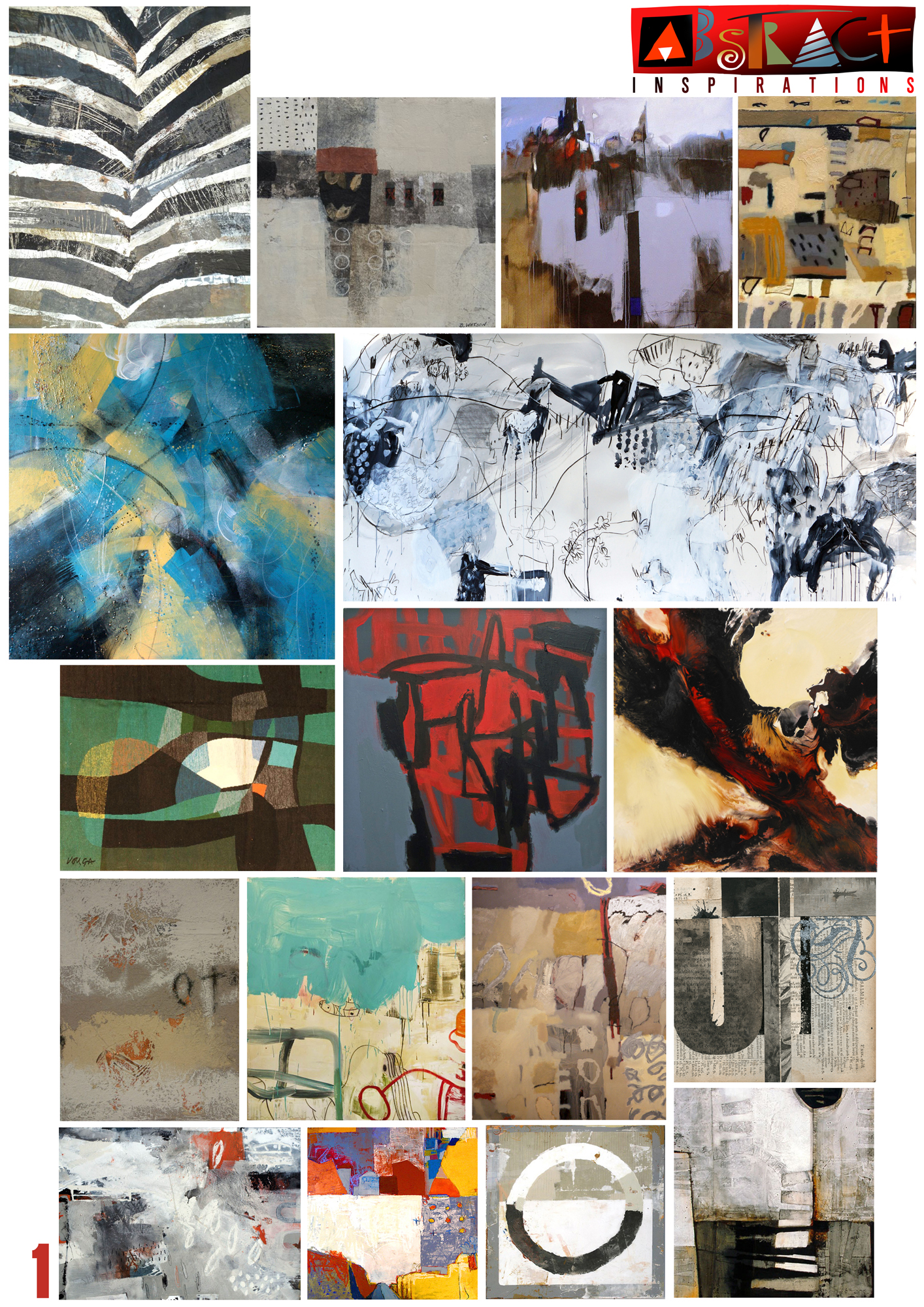
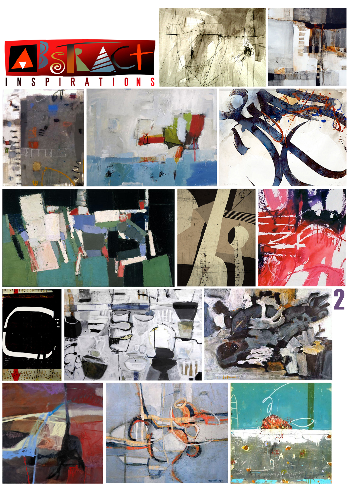
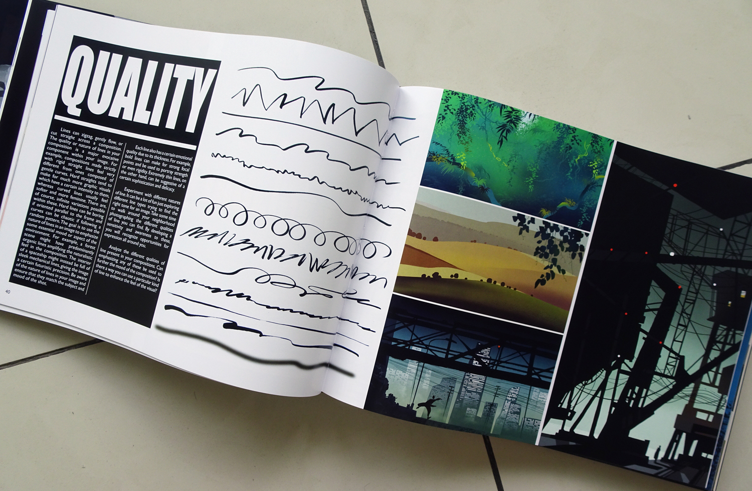
following are some of those test pages to give you an idea

© bilderfabrik


official

11 10 2017

today my new book VISION, COMPOSITION AND COLOR FOR FILM will be presented at the FRANKFURT INTERNATIONAL BOOKFAIR. over seven years in the making it finally will be available in bookstores internationally next year march/april. the immense amount of work was one of the reasons for my lack of new posts. I will have more information about the book very soon, for everybody who might be interested. some more official news on a personal level, I will stop teaching at my university here in singapore the end of november this year, and I will move back to my homebase in manila. hopefully I will have some more time, inbetween several planned engagements, to write 2 more books. will keep you updated.


The Hidden History of Oz

Discover the Secrets of an Enchanted World

WordPress.com

WordPress.com is the best place for your personal blog or business site.

The Hidden History of Oz

Discover the Secrets of an Enchanted World

WordPress.com

WordPress.com is the best place for your personal blog or business site.