© disney enterprises, inc
comparison 9
20 02 2016Comments : 3 Comments »
Tags: animation, bambi, disney, layout, recreated BG's
Categories : Uncategorized
comparison 8
18 02 2016rough small sketches in black/white like the following were done to define the value range, the light and shadow, as well as the staging of the animation in the scene. this is from the disney animated feature BAMBI in 1940. later that step was part of the WORKBOOK, the translation of the storyboard into ‘film-language’, where every single scene is prepared in staging, size and camera movements, as well as rough indication of light/shadow and a floorplan, to go from there into layout and later into the background department. during BAMBI that process was more simplified, because every major sequence had an own art director, who was the one defining these staging sketches, as well as the color script for that sequence. they supervised every single step during production, in a way they were ‘directing’ the visuals behind the animation. you can see little differences in handling the staging in this film. for example the climax of the film, the shooting of bambi and the fire was art-directed by john hubley, a master in cinematography. you get an idea when you look at his personal work later in new york.
here you can compare the initial rough planning of that scene and the final result…
look at the little blue thumbnail on top, it is the rough for the next shot, the reverse camera angle…
© disney enterprises, inc
Comments : Leave a Comment »
Tags: animation, art direction, bambi, disney, layout, workbook
Categories : Uncategorized
basics
21 01 2016floorplan, scene planning, color script, storyboard
from THE ART OF WALT DISNEY, ROBERT D.FEILD, 1942
© disney enterprises, inc
Comments : 2 Comments »
Tags: animation, bambi, disney, pinocchio
Categories : Uncategorized
masterpieces
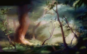
10 05 2013so far I guess I have recreated more than one hundred backgrounds from disney’s BAMBI. you probably know that only a few originals from the film are left because most of the scenes where shot in levels with the MULTIPLANE-camera, had to be painted in oil on glass, and after the shots were successful some poor guy had to scrape off the master-paintings from the glass. glass was rare during WWII and had to be reused. the recreated BG’s below were seen the last time in original around 1941/42. the first one is about one third of the full length of the opening pan of the film, shot in 8 levels to create the feel of depth.
© disney enterprises, inc
Comments : 13 Comments »
Tags: animation, bambi, disney, multiplane camera, recreated BG's
Categories : Uncategorized
shades of green
17 06 2012after a long time some more recreated backgrounds from disney’s masterpiece BAMBI. all of them were painted in oil, most of them on glass for the use in the multiplane camera.
© disney enterprises, inc
Comments : 1 Comment »
Tags: animation, bambi, disney, style
Categories : Uncategorized
comparison 6
26 08 2010whenever I look at the layouts and backgrounds from disney’s BAMBI I am not sure what I admire more – the graphite ‘painted’ black/white layouts on vellum paper or the final oil-painted BG’s on glass or cardboard.
LISA KEENE, who is a BG-artist and art director in the DISNEY-feature animation studio in burbank, send me a very interesting note about the BAMBI BG-painting technique, and I want to share it with everybody. she writes –
I just thought I would tell you what I know about these BAMBI BG’s, I thought you may be interested. the first time I saw the glass plates, I think it was around 1983 and they were housed in a corrugated steal building where the ABC-building is now in the far west corner where the grass is. a dark drafty building where the low level light showed the dust partials in the air. it really left an impression on me because BAMBI is my all time favorite Disney film and I was shocked that they were treated so casually. I was surprised they weren’t all broken. I can’t remember what else was in the building but there was lots of other stuff.
many of the BGs that were not multiplanes were of varying mediums. of course the paint on the glass was oil but many were painted with watercolor or thinly with oil. it seemed that what ever the artist was more comfortable using it was just fine. we had to use these BG’s to copy from and learn the technique so I was surprised that they weren’t all the same.
I suspect that often the glass plates were covered with a neutral color, grey, so that when the glass moved over another plate nothing showed through a thinly painted level. we still did that when we painted on cel and oddly enough still do when we are on the computer. also if the paint is thin on the sides of an area whenever that overlay level passed over the one below and the below level was dark the edges on the one above would appear to ghost when the camera lights would hit it, so it needed to be backed carefully. you see some of that especially in the opening shot.
transferring the layout with a metal stylus was used with graphite paper turned downward and the layout used on top using the stylus so not to ruin the layout. If no graphite paper could be had we often made our own.
Anyway I’m sure you know all of this but I though if you hadn’t seen the old building where the glass plates were you might enjoy the story.
thank you so much for that insight, LISA.
© disney enterprises, inc
Comments : 3 Comments »
Tags: animation, background, bambi, disney, layout, style, technique
Categories : Uncategorized
comparison 5
14 08 2010some more layouts and the recreated corresponding backgrounds from disney’s BAMBI and 101 DALMATIANS.
© disney enterprises, inc
Comments : 1 Comment »
Tags: 101 dalmatians, animation, background, bambi, disney, layout, style
Categories : Uncategorized
comparison 4
31 07 2010roughs and final look from disney’s BAMBI –
© disney enterprises, inc
the left part of the combination is from the 1942 published book THE ART OF WALT DISNEY, by ROBERT D.FEILD, mc.millan company N.Y.
Comments : 3 Comments »
Tags: animation, bambi, disney
Categories : Uncategorized
meadow
14 06 2010the recreated backgrounds below are from disney’s 1942 masterpiece BAMBI. they were painted in oil, most of them on glass fro use in the multiplane camera.
© disney enterprises, inc
Comments : 2 Comments »
Tags: animation, bambi, disney, style
Categories : Uncategorized
comparison 2
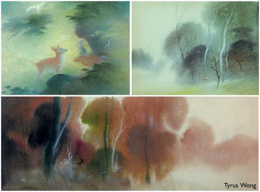
27 04 2010in case of disney’s BAMBI preproduction work started in 1936, the film was finally released august 1942. that is six years. I worked on MULAN for five years, so I know what it means to be connected to just one film for such a long time. you prepare thousands of sketches, the style has to be developed, what means, the look constantly changes in the first years. the story changes as well, sometimes so drastically that you don’t even recognize the very first ideas. I went through that in WILD LIFE and FRAIDY CAT. it happened in BAMBI’S case as well. but for different reasons. it was a time when the disney studio prepared for the very first animated feature film – SNOW WHITE AND THE SEVEN DWARFS. nobody knew if it would work, if the audience would accept a hand-drawn film of that length. if the story and the characters were believable enough, if the artists were good enough to do it. training started in the studio, the artists went to school. you can see how much they improved when you look at the shorts they produced during that time. masterpieces! but BAMBI was a challenge. a world had to be created that was believable. a world that could not be cartoony, in big parts the film was too serious for that. but they realized very early that it could not be too realistic as well. it is very interesting when you look at the first designs of the forest-world, especially GUSTAF TENGGREN’S designs. they look beautiful, like his PINOCCHIO-illustrations. in PINOCCHIO it was ok to draw all the details of a european little village, in BAMBI it didn’t work. the thousands of leaves made the background look so busy that the characters got lost. well, as you might know, TYRUS WONG changed that with the chinese-style influenced designs he came up with. beautiful soft watercolor and pastel sketches, where you could feel the forest without every single leaf painted. in the following pages you can compare the early value sketches and layouts with the final look in the film. sometimes the little soft pencil thumbnails look even more convincing than the elaborate oil-painted background.
© disney enterprises, inc
Comments : 3 Comments »
Tags: animation, bambi, disney, layout, style
Categories : Uncategorized
analysis 2
15 12 2009some more about composition. I analyzed an establishing shot from disney’s MICKEY AND THE BEANSTALK, the scene where the three adventurerers see the castle in the clouds for the first time. it is a beautiful shot, perfectly balanced.
the composition grid with golden section markers

and two more examples for basic composition from disney’s BAMBI.


© disney enterprises, inc
Comments : 2 Comments »
Tags: animation, bambi, composition, disney, fun and fancy free
Categories : Uncategorized
analysis 1
4 12 2009this is the first of a series of new posts where I try to analyse animation backgrounds by their composition elements. it is in a way going backwards to the point where the layout artist started to plan the scene all the way to the selection of the right colors. here now the first example broken down into these steps. I chose one of my favorite pan background from disney’s BAMBI. the BG is a recreation using screen captures from the DVD release. the original BG does not exist anymore.
values – distribution of darks/lights

© disney enterprises, inc
Comments : 5 Comments »
Tags: animation, bambi, composition, disney
Categories : Uncategorized
style 5
3 07 2009disney’s BAMBI is stylewise a very unique film. it is a kind of nature film with cartoony elements. the story is pretty serious and wouldn’t work in a ‘fairy tale’ forest environment. that’s probably why the first background tests look very realistic. influenced by painters of the romantic epoch and illustrators like GUSTAF TENGGREN they show the forest with all its rich detail. and that was the dilemma – in the middle of all that very detailed world with foilage, branches, trees and grass the characters got lost.
the solution came accidentally from a young chinese/american artist, TYRUS WONG, who had just started as an inbetweener in the studio, but had his own ideas of a possible look of BAMBI. he showed his pastel sketches he had done after work to disney art director TOM CODRICK, who immediately realised that he held pure gold in his hands. with his chinese cultural background tyrus had done poetic interpretations of the forest world. he did not show you all the leaves and trees, he made you feel them. when you look at his hundreds of beautifully soft painted scenes you smell the moisture in the deep forest.
I don’t know how much tyrus knew about the BARBIZON-school, painters in france during the later part of the nineteenth century, who introduced the idea of IMPRESSIONISM. amongst them were JEAN-BAPTISTE-CAMILLE COROT ( 1796 – 1875 ) and PAUL DESIRE TROUILLEBERT ( 1829 – 1900 ). here is some of their work. compare and see the similarities.
to translate tyrus wong’s approach the layout- and background-artists had to completely change their techniques. graphite drawn layouts look like black/white paintings, the bg’s with their soft and very subtle look had to be mostly painted in oil, what was necessary anyway because of the layering in the multipalne camera.
in BAMBI you are surrounded by nature, just hints of trees and foilage most of the time, towards the action center a bit more definition, but very much controlled. sometimes only a few blades of grass in front of an out-of-focus color-wash are enough to tell you where you are. and in a whole that forest looks more interesting and has more variety than most films in a city-jungle environment.
© disney enterprises, inc
Comments : 2 Comments »
Tags: animation, bambi, disney, style, tyrus wong
Categories : Uncategorized
chaos
11 03 2009after a while two more recreated backgrounds from disney’s BAMBI. they are from the ending, the climax of the film – bambi’s race through the forest. these paintings are very different from all the moody, beautiful scenes before. there is nearly any color, harsh contrasts and blue-grey chaotic composed elements give us a very bad feeling what might happen. that is enhanced even more by the animation, bambi’s zig-zag run through the rocks and trees.
© disney enterprises, inc
Comments : 3 Comments »
Tags: animation, bambi, disney
Categories : Uncategorized
more spring
7 01 2009this is a pretty complicated recreated cameramove, a combined pan and truck-back with a cameraturn. from the springsequence opening of disney’s BAMBI. it is a true jewel…
© disney enterprises, inc
Comments : 1 Comment »
Tags: animation, bambi, disney
Categories : Uncategorized
romanticism
5 01 2009the 19. century is called THE ROMANTIC ERA, in music, literature and visual art. ROMANTICISM started with the french revolution and lasted until about 1900. artists like MOZART, HAYDN, BEETHOVEN, WEBER, BERLIOZ, SCHUBERT, CHOPIN, WAGNER and LISZT in music, GOETHE, HEGEL, SCHILLER, HOELDERLIN, VON EICHENDORFF and BRENTANO in literature, and DELACROIX, FRIEDRICH, BIERSTADT, COLE, WATERHOUSE and RICHTER in visual art are the most famous representatives of that movement. In germany the BROTHERS GRIMM collected popular fairy tales like SNOW WHITE, CINDERELLA and HAENSEL AND GRETEL.
GUSTAF TENGGREN, born 1896 in sweden, was influenced by scandinavian romantic folklore, and painters like JOHN BAUER with his elves and troll world.
tenggren brought that ‘old world’ look into the DISNEY films he worked on. you can see his influence in SNOW WHITE AND THE SEVEN DWARFS and PINOCCHIO, as well as in the SILLY SYMPHONIES – THE UGLY DUCKLING and THE OLD MILL. even BAMBI had a tenggren look in the very early stages with a detail rich illustration-style forest.
but the disney artists realized early enough that this look wouldn’t work for bambi. all the detail with foliage, trees and grass was working against a clear readability of the characters. and besides that it would have been a nightmare to finish over 1.000 workintensive backgrounds on time.
TYRUS WONG and his chinese art influenced soft style was the solution. he gave the backgrounds the feeling of a forest, with only a few leaves and grass painted. it was impossible to paint his stylized backgrounds in the traditional watercolor technique. to achieve the softnes the disney artists had to start painting the BG’s in oil, painted direct on different glass levels. to create depth the separation into different layers for the MULTIPLANE CAMERA made that necessary.
gustaf tenggren and KAY NIELSEN, a danish artist, who had designed parts of FANTASIA, left the studio during the strike in 1941. it is interesting to compare the styles of the later feature films without their influence. there were other very talented artists like MARY BLAIR, EYVIND EARLE and KEN ANDERSEN who took over and created the worlds of PETER PAN, SLEEPING BEAUTY and 101 DALMATIANS.
© disney enterprises, inc
© waterhouse, richter, bauer
Comments : 5 Comments »
Tags: animation, bambi, disney, pinocchio, snow white and the 7 dwarfs
Categories : Uncategorized
layout
16 11 2008back to disney’s BAMBI. I recommend to read FRANCK THOMAS’ and OLLIE JOHNSTON’S book BAMBI, THE STORY AND THE FILM. in my oppinion this film is a true masterpiece and the book gives you a lot of information about the creative process, written by two of the master-animators who created some of the most memorable animated moments. here I want to concentrate on what is behind the animation, the ‘stage’. following are the artists as shown in the credits of the film –
ART DIRECTION
THOMAS H.CODRICK, ROBERT C.CORMACK, AL ZINNEN, McLAREN STEWART, LLOYD HARTING, DAVID HILBERMAN, JOHN HUBLEY, DICK KELSEY
BACKGROUNDS
MERLE T.COX, TYRUS WONG, W.RICHARD ANTHONY, ART RILEY, STAN SPOHN, ROBERT McINTOSH, RAY HUFFINE, TRAVIS JOHNSON, ED LEVITT, JOE STAHLEY
the credits show no layout artists –
in BAMBI the art directors did a combined job, they were responsible for a certain part of the film, like JOHN HUBLEY for the whole fire sequence at the end, they created the layouts and supervised the painted execution of the backgrounds. interesting is TYRUS WONG’ story as told in the book. he was the real stylist of the movie, but didn’t get a credit for it.
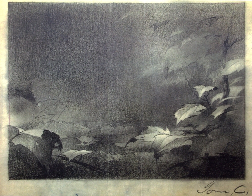
the layout below is my most favorite of all layouts I have seen so far. I show the corresponding recreated BG from that diagonal pan as well. because of the dark colors and the rain-effects on top the color version can not represent the simplicity and silent beauty of the pencil drawing. judge yourself.
© disney enterprises, inc
Comments : 7 Comments »
Tags: animation, bambi, disney
Categories : Uncategorized
excited
7 11 2008in my last post I wrote about inspiration and excitement. when I look at artwork like the following three simple pencilsketches for disney’s BAMBI, I get excited. the first time I saw artwork like that I was so depressed, because I was pretty sure I would never reach that artistic level. that still happens once in a while to me today, maybe it is normal. but at the same time it is the start of a process, to develop the right amount of energy to go through all the painful steps of a learning period. and the more excitement you develop the less painful it will be, it will be fun. the tiniest successful results will catapult you forward with lightspeed. and the more you learn the wider your eyes are open to appreciate what the world of art is offering you.
the pencil sketches following are called ‘tonals’. they were supposed to show the background painter the dark and light values in the scene. tonals had to be done extra because dark areas would have made it impossible to give the painter precise linear information. the sizes of these tonals varied, I have seen stampsize sketches, sometimes even framed with black cardboard. over the years from BALTO to MULAN I have seen a wide variety of tonals. but none of them came close to the ones that were created for BAMBI so many years ago.
© disney enterprises, inc
Comments : 3 Comments »
Tags: animation, bambi, disney
Categories : Uncategorized
rain
4 11 2008another multi-level pan up through layers of foliage. all the leaves in the foreground finally open the view up into the clouds and the starting rain. an amazing recreated pan from disney’s BAMBI again. below you see the layout drawing for the starting position of this shot. when you see these pencil drawings you don’t know what is more beautiful – the final painting or this incredible masterful drawing.
© disney enterprises, inc
Comments : 3 Comments »
Tags: animation, bambi, disney
Categories : Uncategorized


Recent Comments