


© disney enterprises, inc
© disney enterprises, inc

digging through my archives I found this caricature I did of VANCE GERRY in 2000. vance gerry, 1929 – 2005, had been with DISNEY since 1955, had worked in layout on 101 dalmatians and sword in the stone, and moved then to storyboard during the production of the jungle book. from then on he worked in story on most of the feature films. towards the end of his career he worked closely with JOE GRANT and BURNY MATTINSON on the development of new ideas for future productions. that was, around 2000, when we shortly worked together on an idea joe grant had brought up, MR.POPPER’S PENGUINS written by richard and florence atwater and published in 1966.

joe grant’s idea was a mix of live action and CG, with penguins similar like in mary poppins, just animated in the new technique. I created a few designs and then never heard about the project anymore.


much later I found out that the story had been produced and released in 2011 by 20th century fox, MR.POPPER’S PENGUINS, a live action/CG mix with jim carrey.

© walt disney enterprises © 20th century fox © richard+florence atwater

the layout in traditional animation is the ‘blueprint’ of a scene, the line and tonal version of a background including camera instructions and field sizes, as well as rough sketched key poses of the animation. in the past the dark and light values were drawn with blue or black soft pencils, in the forties ( BAMBI ) the layout was ‘painted’ with graphite dust and gasoline, highlights erased with eraser-pens. all that was done on vellum what made it easier to trace the lines onto background cardboard. a lot of those layouts from the old days are masterpieces, they look like painted in graphite. in the archives they were not treated as well as most backgrounds, folded several times, a lot of them torn because of the vellum thin quality. following I want to show you a few layouts from some of the older disney animated shorts and feature films. they are treasures of a lost art…
1937 clock cleaners

1961 101 dalmatians

1939 the practical pig

1942 bambi

1939 donald’s lucky day

1940 fantasia

1948 melody time – once upon a wintertime

1938 mickey’s trailer

1940 pinocchio

1938 the moth and the flame

1959 sleeping beauty

1947 fun and fancy free – bongo

1940 fantasia

1967 the jungle book

1955 lady and the tramp

2002 lilo and stitch
1999 tarzan

© disney enterprises, inc
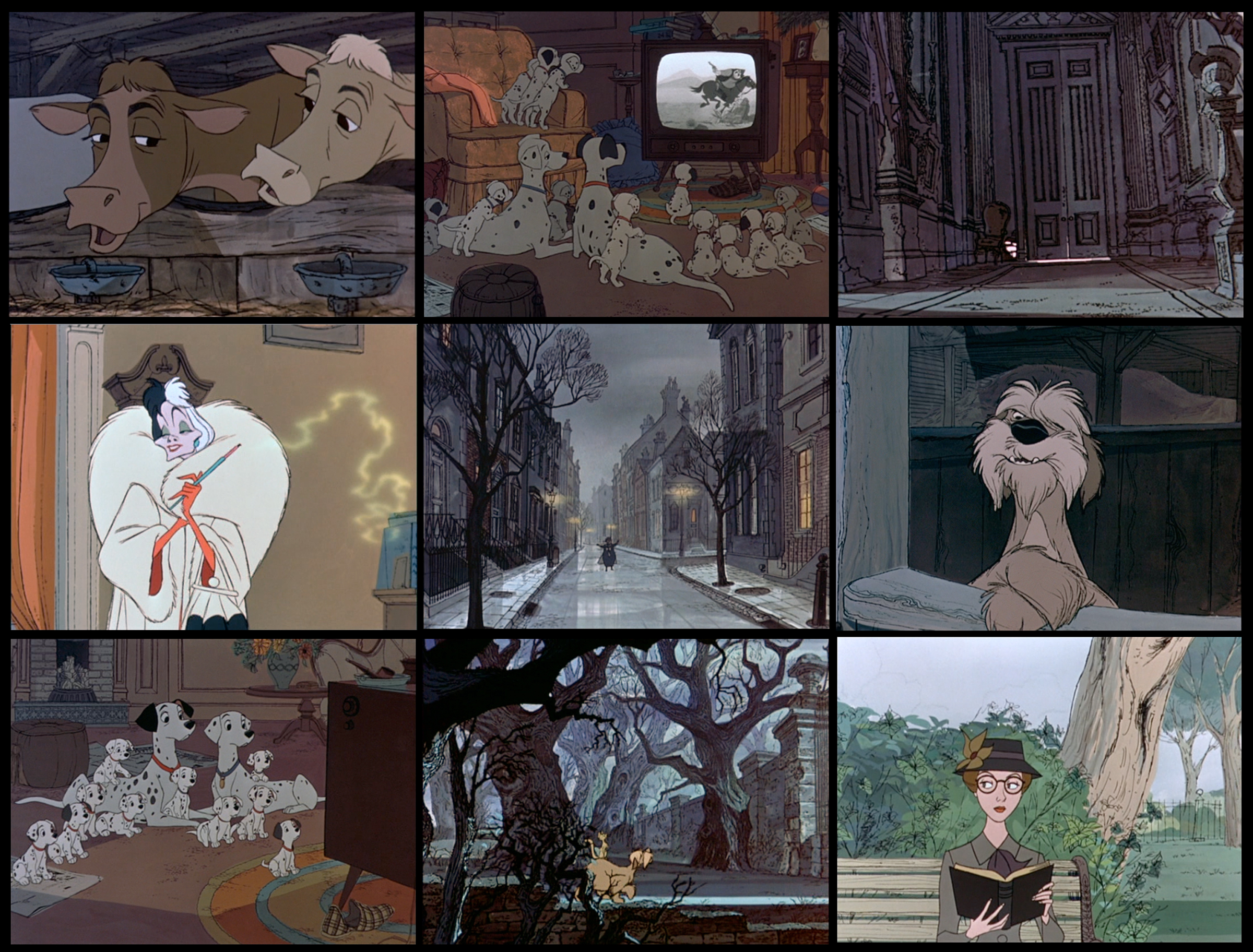
the following scenes from one of my favorite disney classic 101 DALMATIANS from 1961 show how far the artists in the studio had developed. not only in animation, especially MILT KAHL and MARC DAVIS at the peak of their art, – every single ingredient shows the same level of perfection. starting with a unique storyboard completely finished by one of the best – BILL PEET. the overall very stylized design of the film by KEN ANDERSON and an amazing layout and BG-department. all that combined in a new technology, the XEROX-process, that made it possible to bring 101 animated dogs to the screen, and – eliminated the ink and paint step in production, allowing us to see the original drawings of the animators.
the scenes that I selected are not in order of the story. they might show you the beauty of every single composition and color combination in those scenes. a true masterpiece.


© disney enterprises, inc

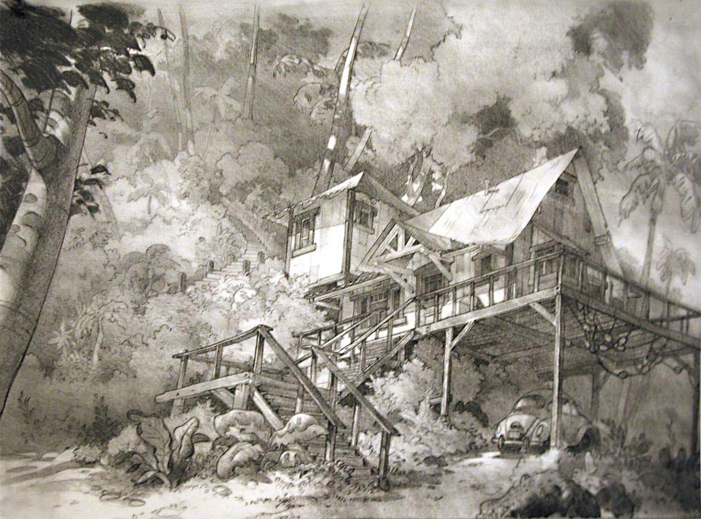
ANDREAS DEJA just posted his beautiful designs for the main characters on a project that was called FRAIDY CAT, and that was eventually shelved after the story had been systematically destroyed. when the story research group presented the rough 3 page treatment to me and aked me for my opinion, I thought first it was a continuation of 101 DALMATIANS. it was a charming crime story taking place in london of the sixties, a bit of HITCHCOCK’S ‘REAR WINDOW’ with animals. I told them it was the best treatment I read for a very long time and we should start immediately to develop it. what I did, andreas joined later. it was planned for CG, so I designed everything very stylized, a bit still remembering the look of another shelved project only a few months prior to that – WILD LIFE. the original author was apparently not good enough, another one was hired, and more followed – it went more and more down the drain. my interest followed, the charme was gone. well, I did not experience this for the first time – too bad. I still hear myself screaming in meetings, until I finally left. below some of my designs for the environment.


© disney enterprises, inc

here we go – another year. hopefully a good one, – I doubt it – too many dark clouds on the horizon! anyway, I want to start the BLOG-year with some beautiful artwork, already over fifty years old but for me better than most of the film-design artwork I see today. the disney animated feature film 101 DALMATIANS was released january 25, 1961, the first of the disney films that had a very different style. the animation was xeroxed and showed for the first time most of the original drawings of the animators. the corresponding backgrounds matched the loose lines of the animation perfect, the background details in line were xeroxed as well and the cels placed over the slightly offset gouache colored backgrounds. stylistically a masterpiece. following are a few layout drawings with the recreated backgrounds.


© disney enterprises, inc

three stylistically very different disney animated feature films and three layout-drawings created by masters. THE BLACK CAULDRON is not necessarily one of my favorite films, but it had some interesting preproduction artwork and some amazing layouts, like the first one below from around 1983, drawn by MIKE HODGSON. the next pan, drawn by the head of layout himself – DON GRIFFITH -, is from 101 DALMATIANS, around 1960. I wrote before about the RONALD SEARLE influenced style that KEN ANDERSEN had developed. and the last stunning pencil-‘painting’ was created by TOM CODRICK for BAMBI, around 1941/42. it is the 2.level of a multiplane set-up with another foreground and a BG-level below.


© disney enterprises, inc
the last project I worked on at disney was FRAIDY CAT. similar to 101 DALMATIONS it was a crime story around a cat and a bird taking place all over london. I was the first artist in visual development who was given the outline and a few pages of the script to read, and they even asked me about my opinion! I loved the idea and the script pages were promising as well. it had a lot of atmosphere, the same what I liked about the 101 DALMATIANS so much. well, as usual the executives in charge ordered re-writes of the script, ‘to improve’ it and it was systematically destroyed. finally, after several years the whole project was shelved, I had already left the company then.

anyway – during visual development I did just for fun some poster-designs to introduce the new concept to the rest of the crew. the story had some HITCHCOCK ingredients, so I chose some of the master’s well known older films and modified their advertising posters ( a lot of them had been designed by SAUL BASS ). my spoof versions were supposed to create interest among the crew, at the same time I worked with a very small team on the designs, the characters and the locations.

© disney enterprises, inc
© universal pictures / saul bass
he was described as THE TURNER OF HIS GENERATION, – ROWLAND HILDER, 1905 – 1993. you probably see the similarity between HILDER’S landscapes and the backgrounds in disney’s 101 DALMATIANS, together with RONALD SEARLE his artwork was used for inspiration. HILDER was born in long island in the US, but returned with his parents in 1915 to england, where he lived most of his life in a kentish country village. he illustrated numerous books and was a professor at goldsmith’s college school of art. someone described his style and technique as so recognisable that there are parts of England which, in tribute to his skill, seem to have grown physically like his paintings. he shares with JOHN CONSTABLE the distinction of having seen an entire region of England identified with his name and art. The description ROWLAND HILDER COUNTRY evokes a landscape as distinctive as CONSTABLE’S COUNTRY along the Suffolk Stour. That is as generous a tribute as any man could wish.


© rowland hilder
from disney’s 101 DALMATIANS some more recreated backgrounds, cruella de vil’s castle ‘hell hall’.


© disney enterprises, inc

some more layouts and the recreated corresponding backgrounds from disney’s BAMBI and 101 DALMATIANS.


© disney enterprises, inc

here are some more layouts and final backgrounds to compare, from the disney animated feature films – BAMBI ( 1942 ), MELODY TIME – ONCE UPON A WINTERTIME ( 1948 ) and 101 DALMATIANS ( 1961 ). as usual it is very interesting to compare the changing styles as well, in layout and in background.


© disney enterprises, inc
the two recreated pan backgrounds are from disney’s 1961 101 DALMATIANS, one of my most favorite films.
![]()

© disney enterprises, inc

as everything else the color is perfect in disney’s 101 DALMATIANS as well. responsible for the overall look and the production design, as well as the art direction of the film was KEN ANDERSON. but he relied on one exceptional artist for the right color choices in every single sequence – WALT PEREGOY. in hundreds of small mostly abstract color sketches he defined the right color combination of the characters and the backgrounds. see below some of his work compared to the final result in the film.


© disney enterprises, inc
more recreated backgrounds from disney’s 101 DALMATIANS


© disney enterprises, inc
some more recreated backgrounds from disney’s 101 DALMATIANS


© disney enterprises, inc
some more recreated backgrounds and corresponding layouts from disney’s 1961 101 DALMATIANS


© disney enterprises, inc
just found that very old german movie program I treasured for so many years, memories of how it all started.

disney released 101 DALMATIANS feb.1961. I saw it in summer 1962 when I was 13 years old, in a very small provincial movie theatre in southern germany. in those days, in germany, there was only one book about animation available, the art of walt disney. too expensive for my parents. I went nearly every day to the bookstore where it was displayed, got it finally many years later. there was nothing on TV, except some amateurish looking german tv-animation. no video yet, you could buy some short very expensive disney clips on 8mm. what really bothered me though, no other kid in my neighborhood had that same funny interest, animation. I thought I was an outsider because I wanted to see ‘kids’ – stuff in the movies and was drawing all the time.


anyway, coming back to 101 DALMATIANS, there was a display window outside that movietheatre next to the train station where I took the train ( still steam-engines, beautiful – and stinky ) to the close city, where my school was. every day, for the time they showed the film, I was in front of that window and copied on my schoolpaper the main characters shown on these beautiful black/white publicity photographs. a camera would have been easier, unfortunately nobody ever bought me one. at home I did ‘clean-up’ drawings of those rough sketches. still have’em. horrible. but that’s how it started. when I saw that film, I knew what I wanted to do later, when I was older. I had no idea where to start. the dream was more important.

much later I learned more about this film, about the artists who worked on it. and I was lucky to even get to know some of them. here is some of their work – KEN ANDERSON’S and DON GRIFFITH’S architectural sketches and floorplans, as well as WALT PEREGOY’S amazing color keys.


© disney enterprises, inc
going back to the sixties – here are a few recreated pan backgrounds from the opening of disney’s 1961 released 101 DALMATIANS.


© disney enterprises, inc
some more recreated backgrounds from disney’s 101 DALMATIANS


© disney enterprises, inc
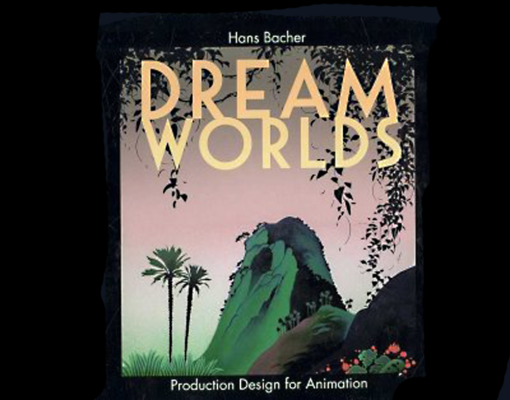
my name is hans bacher, – I work as production designer in the animation film industry. for the last 45 years I lived and worked in exciting places around the world. after 7 years of teaching in singapore I am back at my homebase in manila, working on a few more books.

Discover the Secrets of an Enchanted World
WordPress.com is the best place for your personal blog or business site.
Discover the Secrets of an Enchanted World
WordPress.com is the best place for your personal blog or business site.


Recent Comments